Schlumberger HR was pushing for more effective teamwork as part of the company’s digital transformaton. They developed a structured exercise that teams could execute during a meeting to surface how well or unwell the team was operating with respect to certain dimensions. The results would motivate the team to have the necessary conversations to improve over time and operate better.
Challenge
After an initial deployment of the exercise, several notable challenges surfaced. It was hard to incorporate remote team members & those working in the field into a co-located physical activity. Team members couldn’t express thoughts & feelings safely due to a lack of anonymity. Lastly, the activity couldn’t be adjusted easily based on user feedback since they depended on a physical deck of cards, it wasn’t easy to quantitatively track the teams progress over time.
Outcome
We digitized the exercise, with members participating via a mobile app in real time. It enabled remote & field based members to easily integrate, enabled the surfacing of unbiased feedback, could be run live or offline and provided means to monitor progress over time. While it had upward initial growth, its usage reduced and plateaued. Its usage is unknown today.
2656 Downloads
1357 Users
297 Active Users
Increase Month-over-month
Client
Schlumberger (Human Resources)
Industry
Oil & Gas
Duration
6 months
1.0 release
May 2018 – October 2018
Platform
Native Mobile – iOS & Android
My Role
User Research
Information Architecture
Interaction Design
Visual Design (creative direction)
Helped w/ QA, Business Analysis, Customer Success, Field Deployment, Training, Support, Digital Marketing & Content Strategy
My Team
12 members
Houston, TX
Pune, India
Sao Paulo, Brazil
Internal Team: Product Manager, Solution Architect, Lead Developer, 2 Mobile Developers, Backend Developer, 2 QA, Digital Marketing Specialist
Our kickoff meeting consisted of the usual. Getting a sense of the “ask”, business goals, clarifying the problem statement, project concerns, how success looked like for the client, timelines, budgets and high-level business requirements. All pretty standard, yet vital to the success of the project.
Client Developed the “Team Work Cards (TWC)” Team Building Exercise The developed the exercise as a way for teams to get an unbiased objective assessment of their team’s health. This would trigger conversations about the current team health, what was working on the team, what was not and how to improve things.
Exercise Was Implemented Using a Deck of Cards. It was Analog. The TWC exercise was entirely analog, relying on a physical deck of cards that was used in a meeting where team members were all physically present.
The “Ask”: Digitize TWC Exercise using a Mobile App The client wanted to use a mobile app to serve the same purpose of the desk of cards. It seemed like the app would address many of the challenges they’d encountered upto that point and it would leverage digital technology, inline with the push for digitization across the company.
Client Proposal
Product Audit & Usage: Experience the As-Is Analog Process
Implemented the TWC Exercise on My Product & UX Teams After a walk-through with the stakeholders, we reviewed the cards and instructions to become familiar with it, just as first-time users would. Additionally, we tried out the cards on our product team and with the greater UX team to see how it worked in a true group setting and so we got to experience what novice users would go through.TWC Exercise Consisted of 2 Phases:
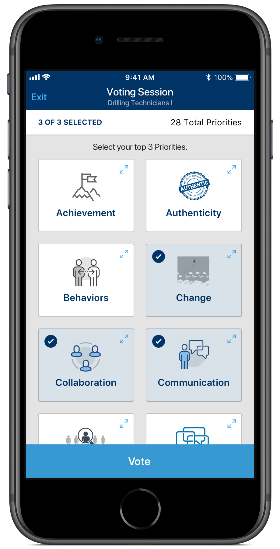
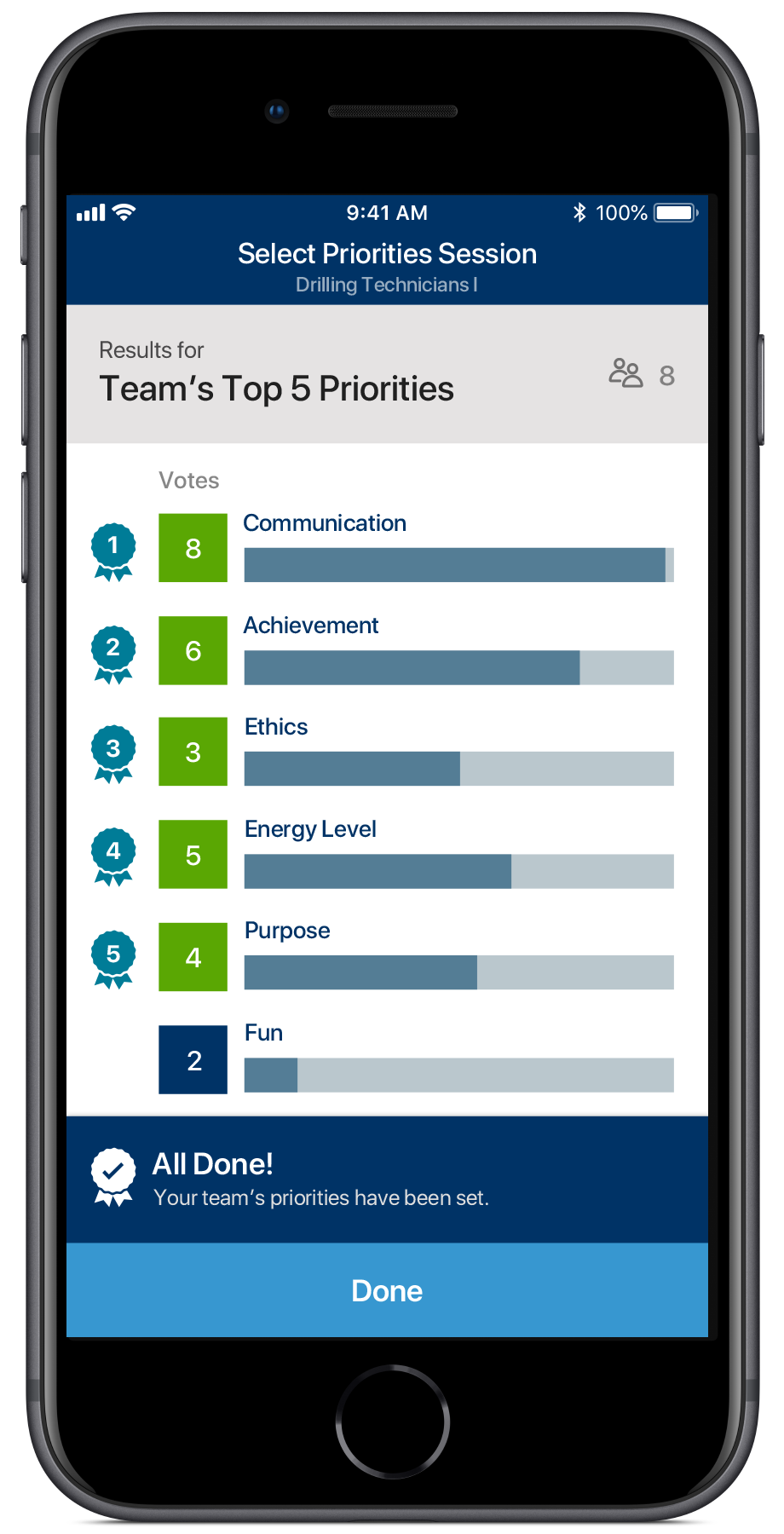
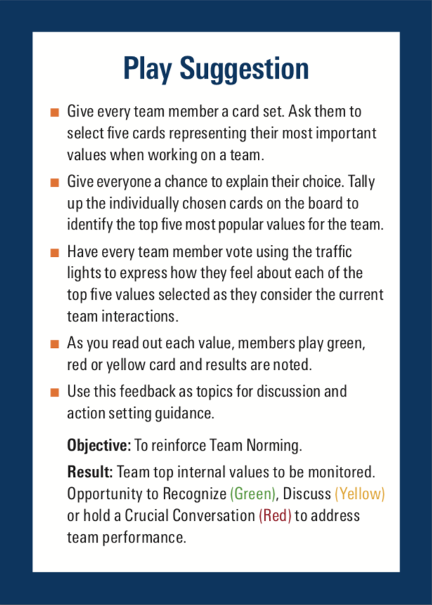
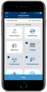
Phase 1: Value Selection Team decides on the 5 values (from a list of 24) that they wanted to focus on, through a democratic voting process. This was conducted periodically (monthly, quarterly, yearly).
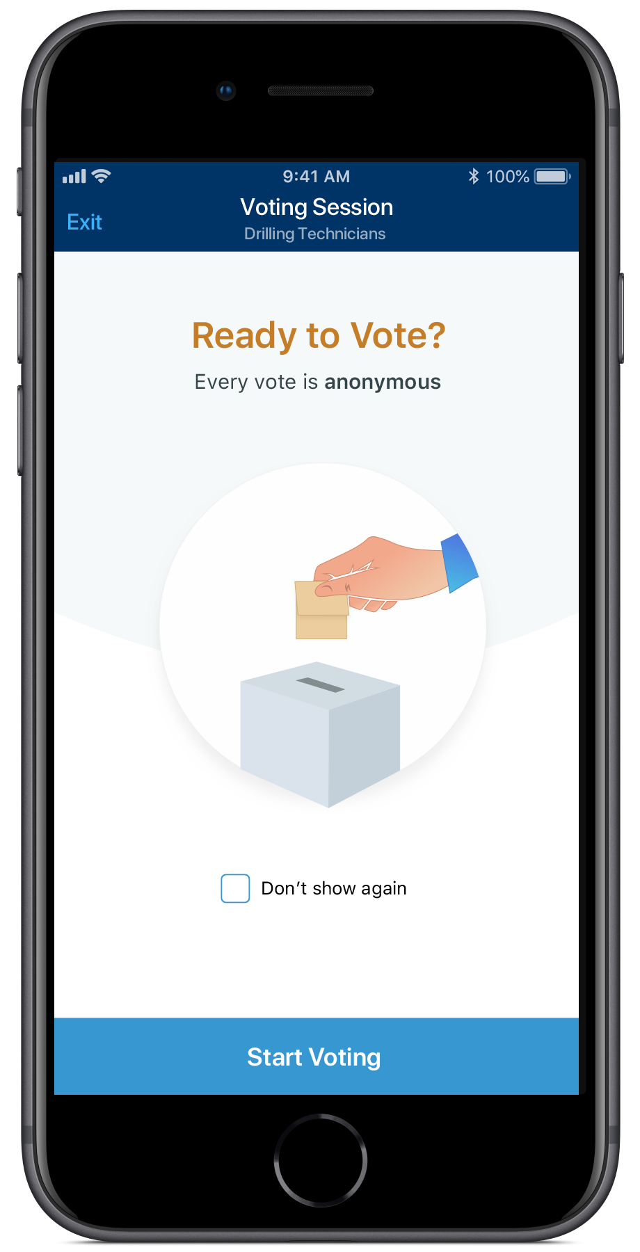
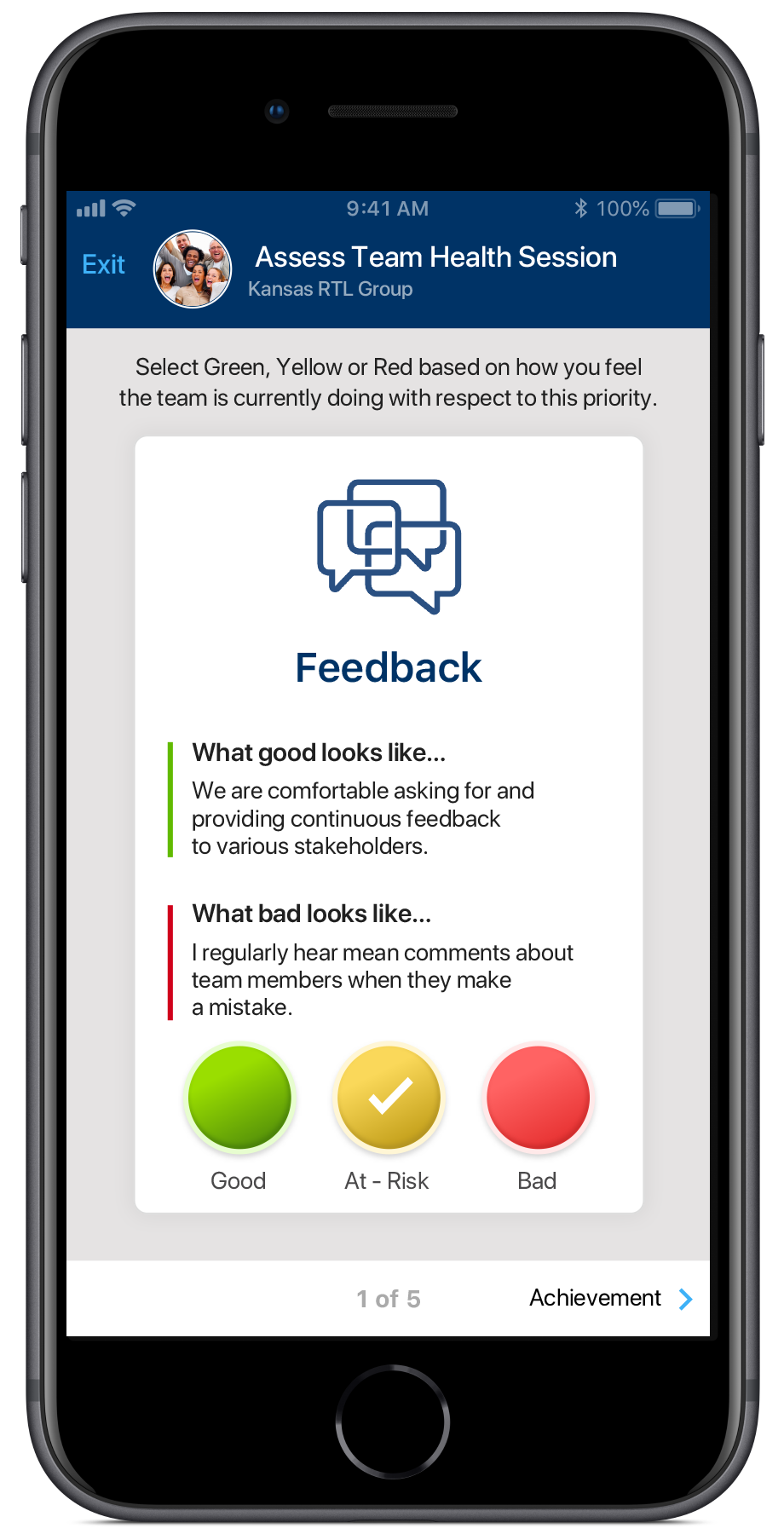
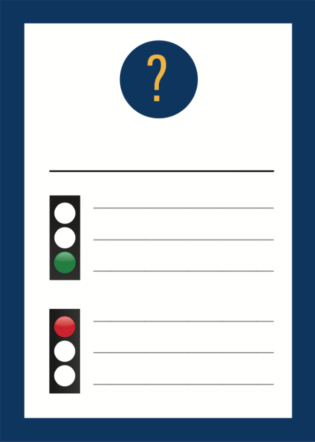
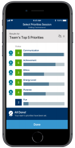
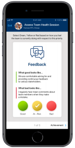
Phase 2: Team Health Assessment Team regularly assesses their health with respect to each of those 5 values, indicating whether things are Good, Bad, Neutral with respect to each. This was conducted on a more regular basis than Phase 1.
Title Card
Instructions
Custom Value
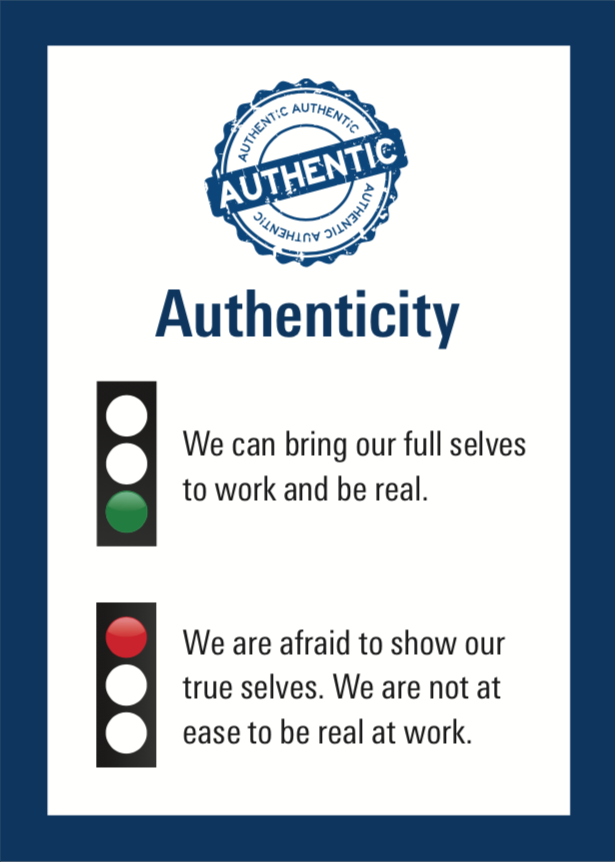
Authenticity Value
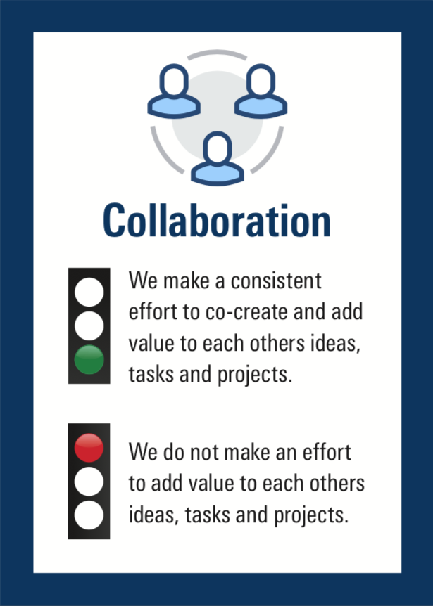
Collaboration Value
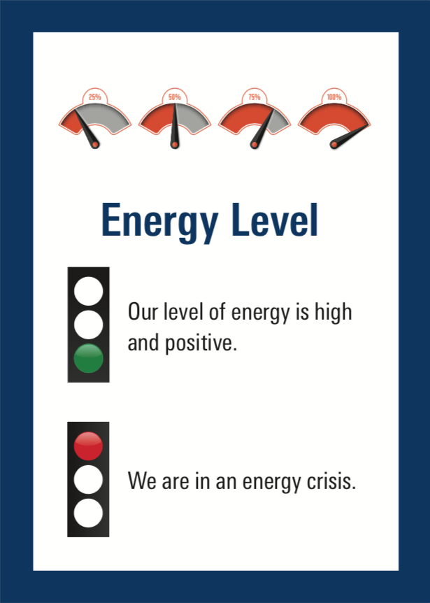
Energy Level Value
Problem Statement: Why do this? How will it help?
In spite of having recently deployed the exercise months earlier, they had already run into a series of challenges that they couldn’t solve easily with the existing format of the exercise.
Challenging to Integrate Remote Members While remote team members could join via phone, the most common way to join meetings in the organization, there was no easy or simple way for them to communicate how they voted. This made the activity harder & take longer to run.
Hard for Field Staff to Participate Members working in the “field” didn’t always have access to spaces where the activity could be run. They needed to have the desk of TWC cards with them, which can be challenging in the field environment.
Lack of Anonymous Voting Voting was held in the open and not anonymous, impacting how authentically people can express themselves through voting. As a workaround, users had devised ways to add anonymity to the process with varying levels of success, such as designating one team member who can see everyone’s votes or putting votes into a hat anonymously.
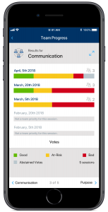
No Easy Way to Track Team Progress No easy way to track results over time for a team, which was crucial to see if the team was indeed improving over time. Several groups had come up with their own methods via Excel spreadsheets or worksheets where they tallied results after every session, so they can see trends easily.
Can’t Track Exercise Usage Easily or Accurately Can’t track usage of the TWC exercise by team, nor detailed behavior related to the TWC activity for the purposes of feedback & improvement. The feedback they did get wasn’t as useful. Since the activity was quite new, it had alot of evolving to do and without a strong feedback channel it became hard to evolve it, which negatively impacted adoption.
Proto-Personas: Targeting The "Right" Users for Research
Deployment Targeted Too Broad of a Userbase In spite of efforts to identify specific personas to target or segments of users, The planned initial deployment was to the entire global employee base, not a specific geographic area, business unit or team. Way too broad. This would make features too generic or uncover too many needs to address.
Target Userbase
Identify Relevant Attributes of Userbase Working with the client and given our understanding of the project we identified a set of relevant attributes that captured the diversity of the userbase. This would enable us to cast a broad enough net to capture the many of the diverse set of needs the app would need to address:
Geographic Location (80+ nationalities)
Team Size
Business Unit
Individual Contributor vs. Executive Teams
Remote to Co-located Team Member Ratio
Level of Adoption & Engagement
Level of Experience (College hires to lifetime employees)
Diversity of Team by Nationality
Field vs. Office Work Environment
Age Range (20’s to 60’s)
Facilitator vs. Team member
Not Many TWC Users Existed Given that the analog TWC exercise had been recently deployed, the userbase was small and with limited experience, so we were limited with the types of users we had access to. Nonetheless, we were able to speak to a “decent” amount of users with decent variance across the targeted attributes. “Decent” is relative. This was an IT product and not B2C, so we had to work with what we got!
We factored in some aspects of the userbase when building all the features. For example, we made sure to use UI microcopy in English that were understood by English speakers from other nationalities and we used more accepted interaction design patterns, as opposed to newer more recent ones.
User Interviews: Learn How It’s Being Used
Validated Features & Uncovered Needs We conducted 9 user interviews, asking about their backgrounds, their teams, team culture, structure and experiences around using the TWC exercise. In several cases, we asked them to show us how certain parts of the activity were executed. Additionally, we received feedback via email in a few cases, where participants were not available. Certain findings validated things we should bring over from the cards into the app. Other findings, spoke to the process tweaks, such as the number of values available. A few of the findings included:
Sample Interview Notes
No Way to Track Team Progress We noticed that one team that had fully adopted the activity, had designed and printed a large table that they used to track how the team’s health evolved over time with respect to each value. They wanted to see if their team were indeed improving or getting worse and then take actions accordingly. This was valuable to them and probably to most teams we learned.
Lack of Anonymous Voting We noticed that one team wanted to do anonymous voting to get unbiased feedback, but did not have a clear cut way of doing so, nor any guidance on how to do so. This led to an ad-hoc approach that was not fully anonymous. Remote team members had to send their votes via chat to a co-located colleague who would add their votes anonymously to the bucket of votes, but could see who voted how themselves.
Exercise Must Be Quick This exercise was extra work on top of daily duties, hence it needed to be quick. Teams tended to run them quickly at the end of a status meeting, when all the important discussions had been had. People were ready to go by then, so the exercise was run quickly.
Contextual Inquiry: Observe & Understand the End-to-End Experience
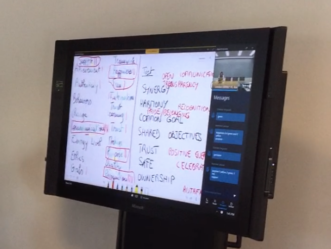
Observation Essential Due to the Collaborative Nature of the Process We chose to do a contextual inquiry over a user interview for several reasons. Lots of back & forth interactivity during the exercise. Physical & digital objects were involved. Long sequence of tasks to follow. Most were novice users, who wouldn’t have been able to recall all the details of a complex activity.
Friction Points, Workarounds & Pleasant Aspects All Discovered. We observed a team with 8 members (2 remote) work through the TWC exercise from start to finish. It was their first time, so we could really see what the novice users’ experience was like, as well as gain context about the end-to-end process. We learned about the friction points during the experience and the pleasant parts, as well as workarounds that were used and ways remote members were integrated into the process and the challenges around that.
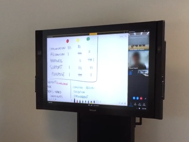
Difficulty in Selecting Values I noticed users were executing a crucial task, Value Selection, in different ways and they struggled to do it. If it wasn’t executed effectively, then that would negatively affect the outcome of the entire TWC activity. More specifically, the task required the most cognitive load compared to any other task in the app and they had limited time to execute it. More targeted research was needed!
Phase 1 - Select Values
Phase 2 - Assess Team Health
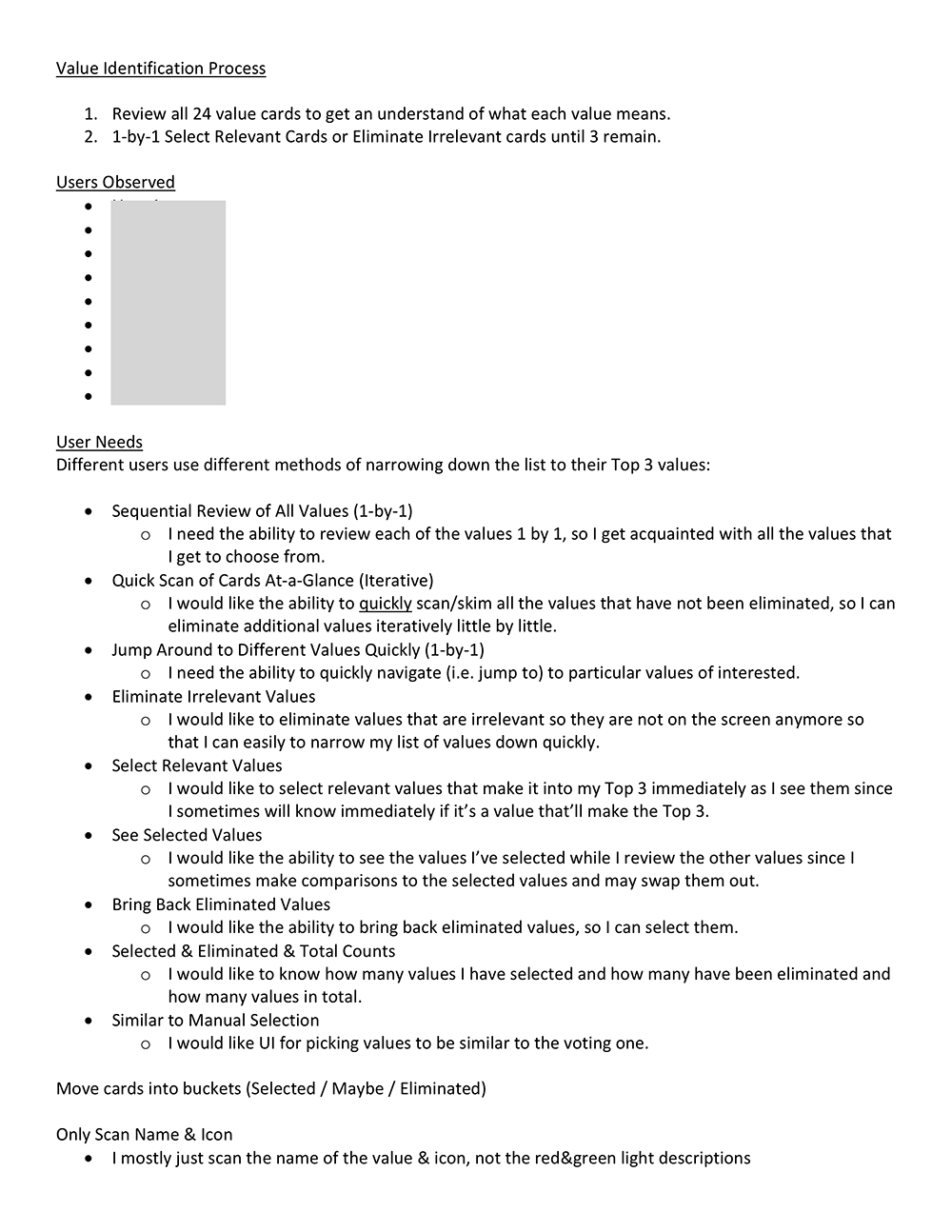
Simulated Contextual Inquiry: Clearly Identifying Needs Behind a Key Task
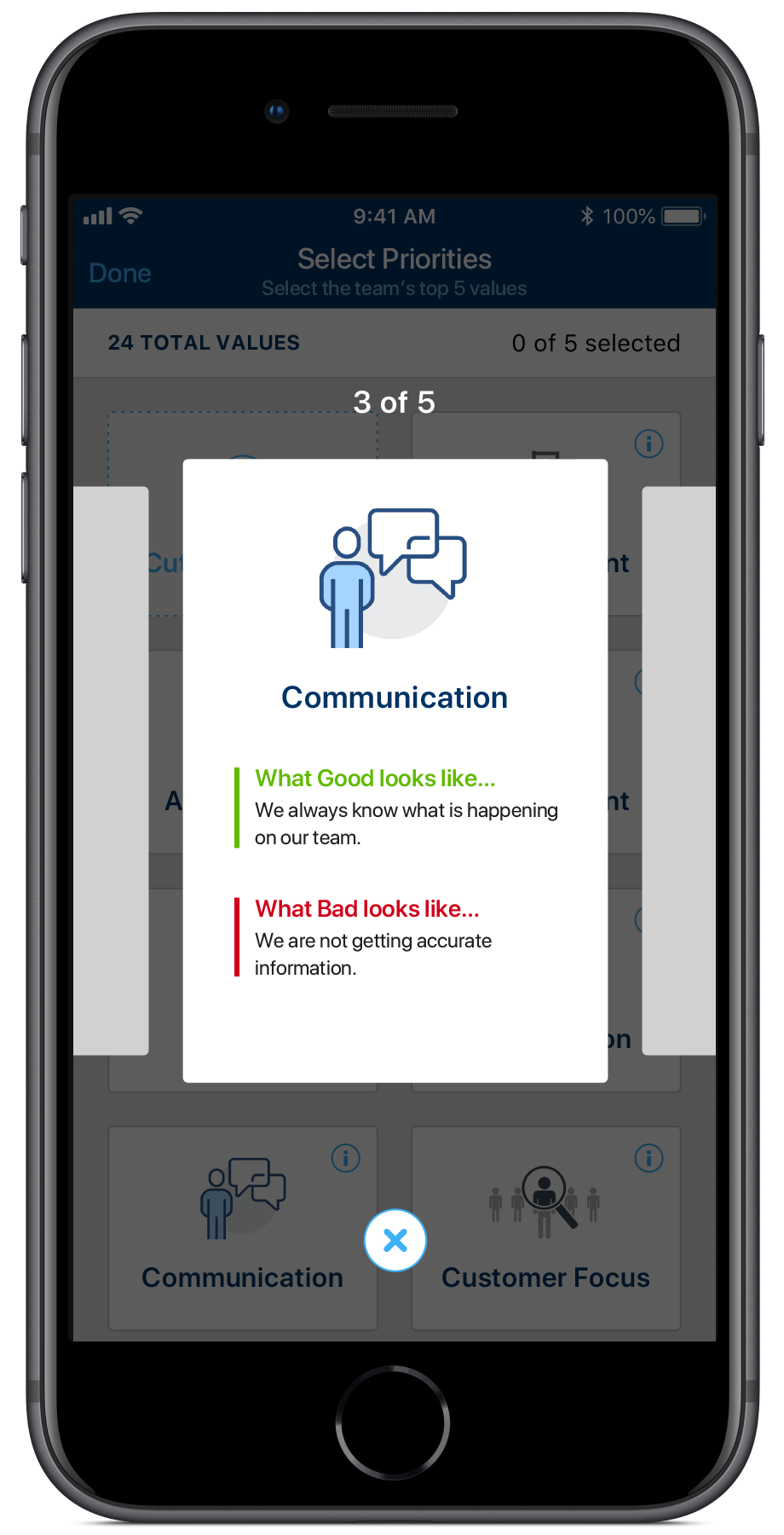
Users Experienced High Cognitive Load When “Selecting Values” During “Phase 1: Select Values” users had to select 3 values from a total of 24 values in short time period. The definition of many of the values were abstract and subjective to varying degrees. Additionally, the criteria users were to use when selecting them was subjective. Users should choose which ones they felt were relevant to the team because the team needed to improve with respect to them or that they were doing good with respect to them. All of this made it challenging since they had to evaluate each value again this criteria and do so in a short amount of time. This task resulted in high cognitive load to users.
Users Used Different Methods to Cope From the prior contextual inquiry, I observed different users apply different methods select values. However, it was inconclusive which methods were most common vs. one off methods, so we couldn’t figure out which ones to support in the app.
Observing Many Users Execute the Task Revealed the Most Common Methods Given how the task was executed solo by a single user, I realized I could simulate the task by itself without having to conduct the entire group activity and still yield reliable findings. Using some gurilla style research, I picked employees on my floor and asked them to execute the task, while I watched and then I asked them questions afterwards. The research session was short, so employees were willing to participate and I could conduct as many as I needed until I started to see a pattern around which methods were most common. After 9 users I found these 3 methods as being the most common.
User Needs
Method 1: Pick 3 Directly Layout the cards, visually scan them all once and then rescan the cards over and over until you’ve picked 3. In this example, users looked at the images, names and the definitions of the values and made most of the decisions in their head, heavily relying on their memory.
Method 2: Exchange Cards Poker Style Stack the cards in their hands, fan them out like in poker so they can see each one. Then scan over through them over and over until you’ve picked 3. In this approach, users didn’t have the full visual of the card after the 1st scan and relied on their memory much more.
Method 3: Iterative Process of Elimination Layout the cards, scan all of them once, then remove the irrelevant ones. If greater than 3 relevant cards exist, then scan those again and only keep the most relevant ones. Continue doing the same until they have 3 cards left. This approach relied on having alot of physical space to see all the cards, but also used the most, maybe since it had the least cognitive load.
We uncovered other nuances of the process, refined those into a solid list of user needs that the app would need to support.
DEFINE
General Insights & Findings: Context That Must Shape the Design
We uncovered many other findings that would need to shape the Content Strategy, Usage Patterns, Interaction Design, etc.:
Tasks Were Executed With Varying Frequency Certain tasks in the app would be more frequently used than others, so optimizing for those tasks would be essential. For example, Phase 2 would be executed much more often.
Global Audience. English Wasn’t Their Primary Language We observed confusing over the meaning of terminology associated to the TWC activity, to the values and several other areas. While English was the primary language for the company, for many of the user’s, English was not their first language, so finding the right English words for key concepts & actions that would be understood across the userbase would be essential.
The TWC Exercise Was Not Their Job This exercise was not part of their primary job role & responsibilities, it was not required and lower on the list of priorities.
Optimize the Member Experience Needed Users could be a Facilitator or Member, but most would play the Member role in the app, so the Member experience needed to be simple, easy and quick to use.
User Onboarding Key Given the scale of the deployment and the limited support resources. High-touch support would not be adequate.
Personas??? Nope! Target Audience 🙁
Beyond the proto-persona’s we didn’t discover anything more notable about behaviors to develop true personas. The small sample size, broad target audience and short time frame, all restricted our abilities to develop useful personas.
Scenarios: Needs NOT in the Requirements
Telling The Story of Users Using the App in the Future Thanks to the varied usage we witnessed and learned about through our user research, we identified many of the different tasks & activities people executed with respect to the TWC exercise. Most importantly, these weren’t in the business requirements and hence if they weren’t thought of or planned for, it’d would have led to an app that wouldn’t satisfy user needs or would have been frustrating to use.
We captured this in a series of scenarios, which were mostly all necessary for the 1st release, such as:
Scenerios
Change the Facilitator
Teams are always changing, so sometimes the Facilitator may move onto a new role in different part of the organization, so they would need to hand over the Facilitator responsibilities to a different team member.
Member Leaving & Joining Mid-Session Team members might need to quickly leave to take a phone call and then come back, so the UX should factor that in and allow for that.
Manually Select Values Instead of Voting
Sometimes the TWC exercise is introduced via a training and the trainer may want to select the values offline and then manually enter them to save time.
Synthesis: Converting the Research into Actionable Elements
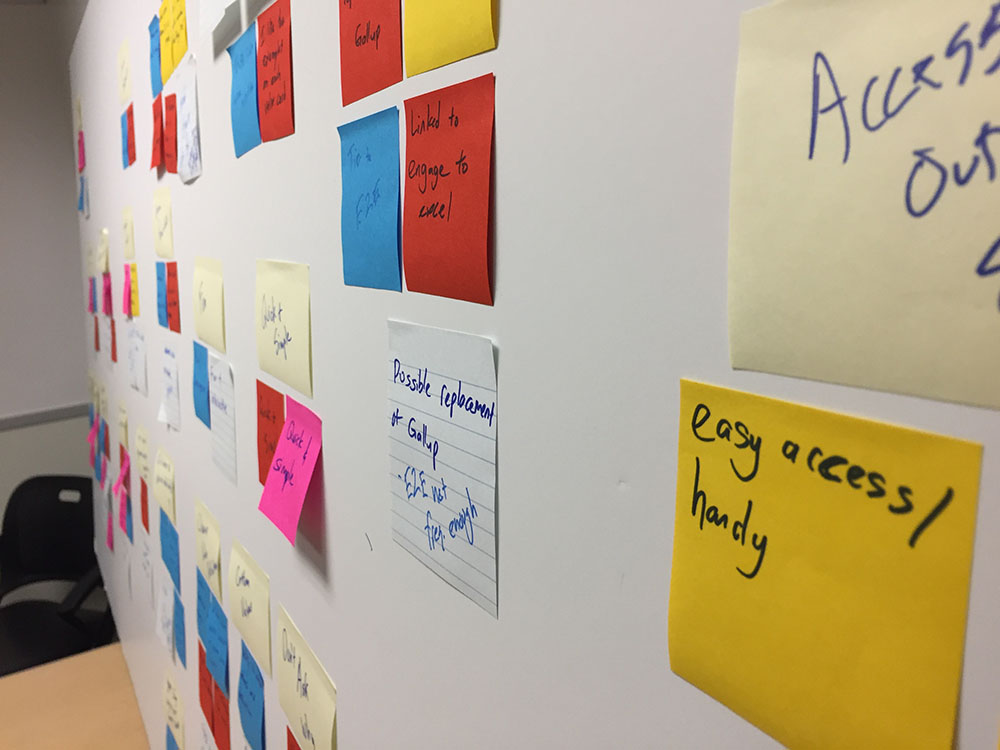
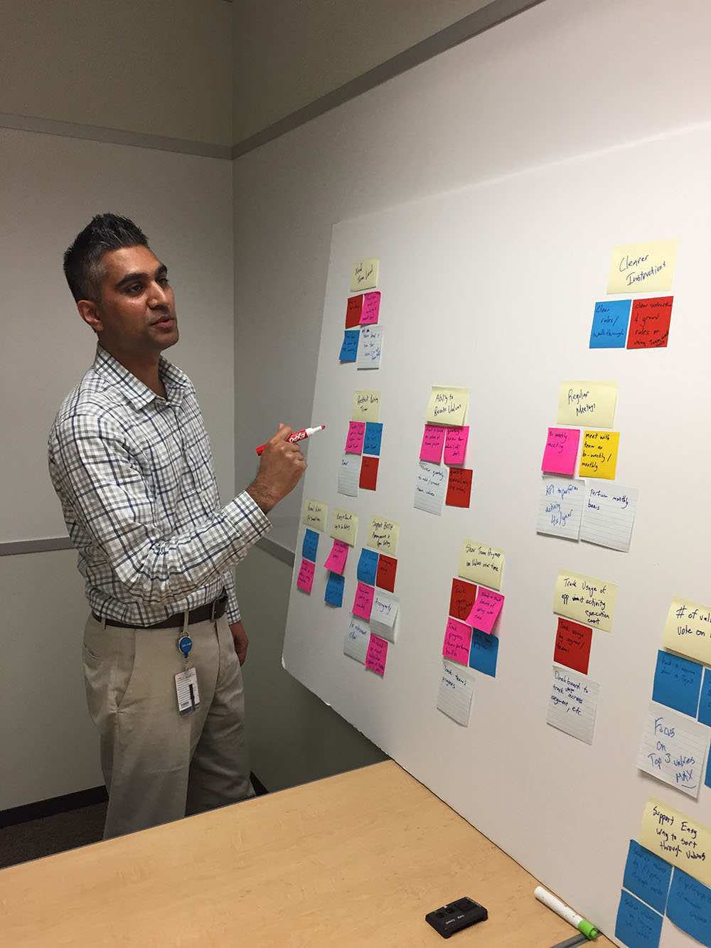
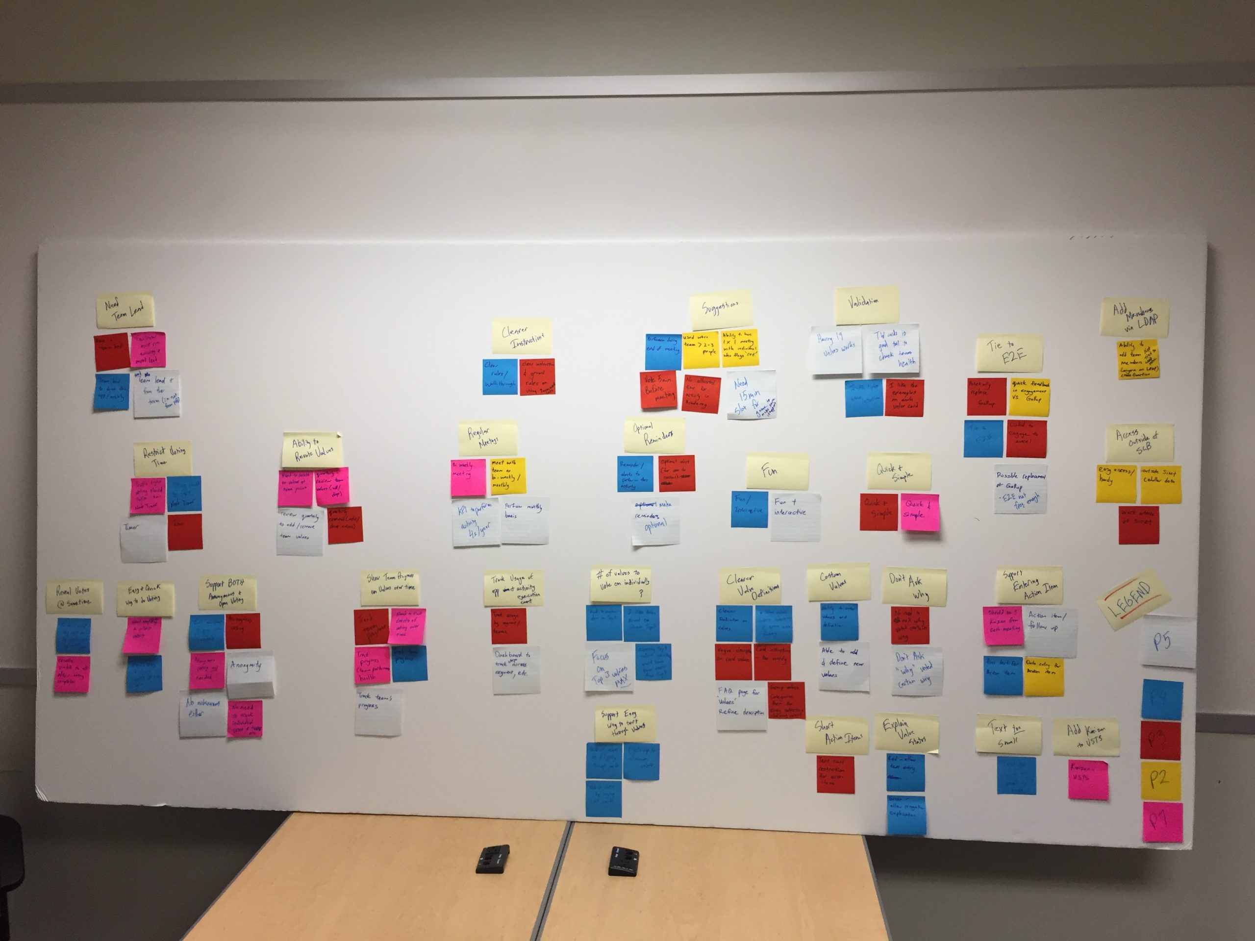
Uncovered Patterns & Themes That Would Shape the Design The Product Owner and I reviewed each session, transcribed our notes onto post-its, noting the anonymized participants on each post-it for traceability. This allowed us to see what themes were emerging from the data, as opposed to the other way around, while still being able to trace it back to a participant if we needed context at any point.We then clustered them together into themes, reclustered and labeled them. Each cluster mapped to a user need that could be addressed in one of several ways:
1) Features Functionality to address discovered needs.
2) Design Principles Used to shape aspects of the entire user experience.
3) Process & Rules Changes Aspects of the exercise that needed to be adjusted in some way to make it more effective.
Affinity Mapping to Uncover Themes
Final Affinity Map
UX Workshop: Determine Intersection of Business & User Needs
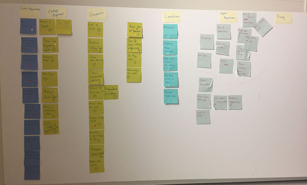
We held a mini-workshop with the client to walk through our findings, discuss priorities and the scope for the 1st releases. Then we organized them into 2 releases. and the backlog for our 1st release. We then went off and did tech feasability and estimation. We walked through the following process to arrive at features for the 1st 2 releases:
STEP 1 – Identify Business Requirements Description
STEP 2 – Extract Features from Research Findings Each post it documented how many users this represented and the theme. Filtered out features
STEP 3 – Identify Overlapping Requirements & Features we identified which needs were in-common Group findings that overlap with requirements
STEP 4 – Identify New Discoveries which ones were solely uncovered from the research. This showed the value of conducting user research. Group findings that are new discoveries, items that weren’ tn th eoriginal requirements.
STEP 5 – Identify Contradictory Features Those that contradicted a requirements. Group contradicting insights w/ requirements
STEP 6 – Determine In-Scope Features Both stakeholders voted on their items that would be in-scope for the initial releases.
STEP 7 – Prioritize into Releases We went through a prioritization exercise with the clients had them identify which of those were must-haves vs. nice-to-haves
Features Releases
IDEATE
Process Map: Envisioning the End-to-End Experience
Mapping Out the Process Led to Greater Clarify In Several Areas With a clear idea of the current TWC exercise, the scenarios and other user needs, I worked out how the end-to-end process could work & look like with a digital app integrated into the TWC activity, as a replacement for the cards. The experience involved multiple members engaging via their phones in real-time, so I needed to envision the sequence of activities occurring on each devices in response to each other. It captured and let me think through the following and validate it with the team and stakeholders:
Sequence of Tasks What tasks must occur before the next, which are optional, which essential.
Offline Tasks Offline tasks that occur at different points outside the app, but have baring on the app UX.
Easily Identify Facilitator & Member Tasks Tasks that the Facilitator & Team Members would execute in the app, so as to optimize those experiences.
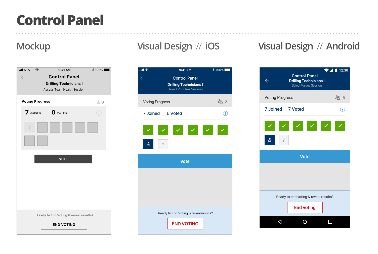
Situational Awareness Certain tasks were dependent on other users completeing certain tasks, so gaining awareness of this was needed. Revealed aspects of the experience we need to think about. For example, a control panel to know whats happening.
Multiple Sessions An ability to enter into sessions and out of sessions, as there are different teams.
No Time to Make this into a Proper User Journey It would have been easier to depict this in a visual diagram, but I didn’t have time to translate this into that format. Nonetheless, the diagram allowed team and better envision the experience.
Process Map - Page 1
Process Map - Page 2
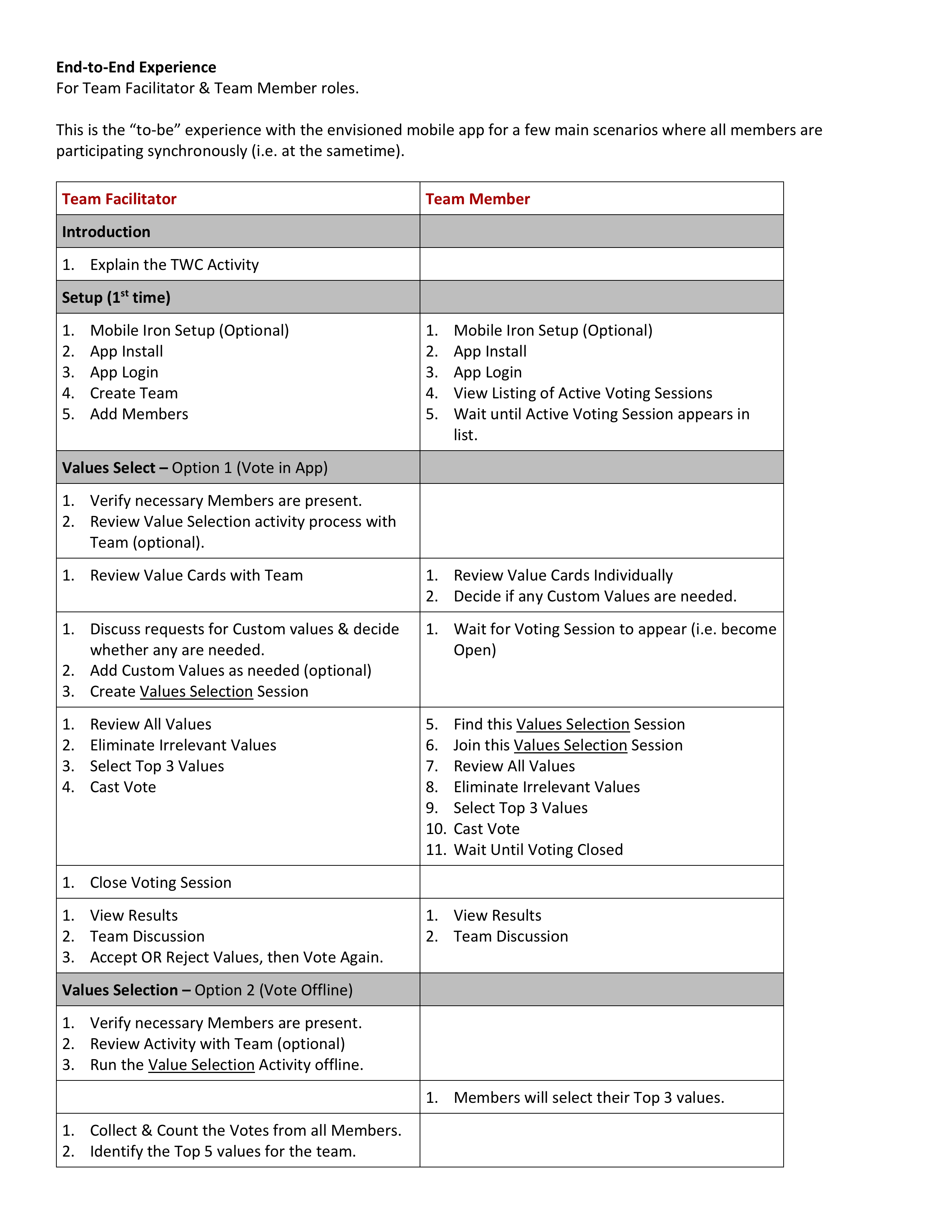
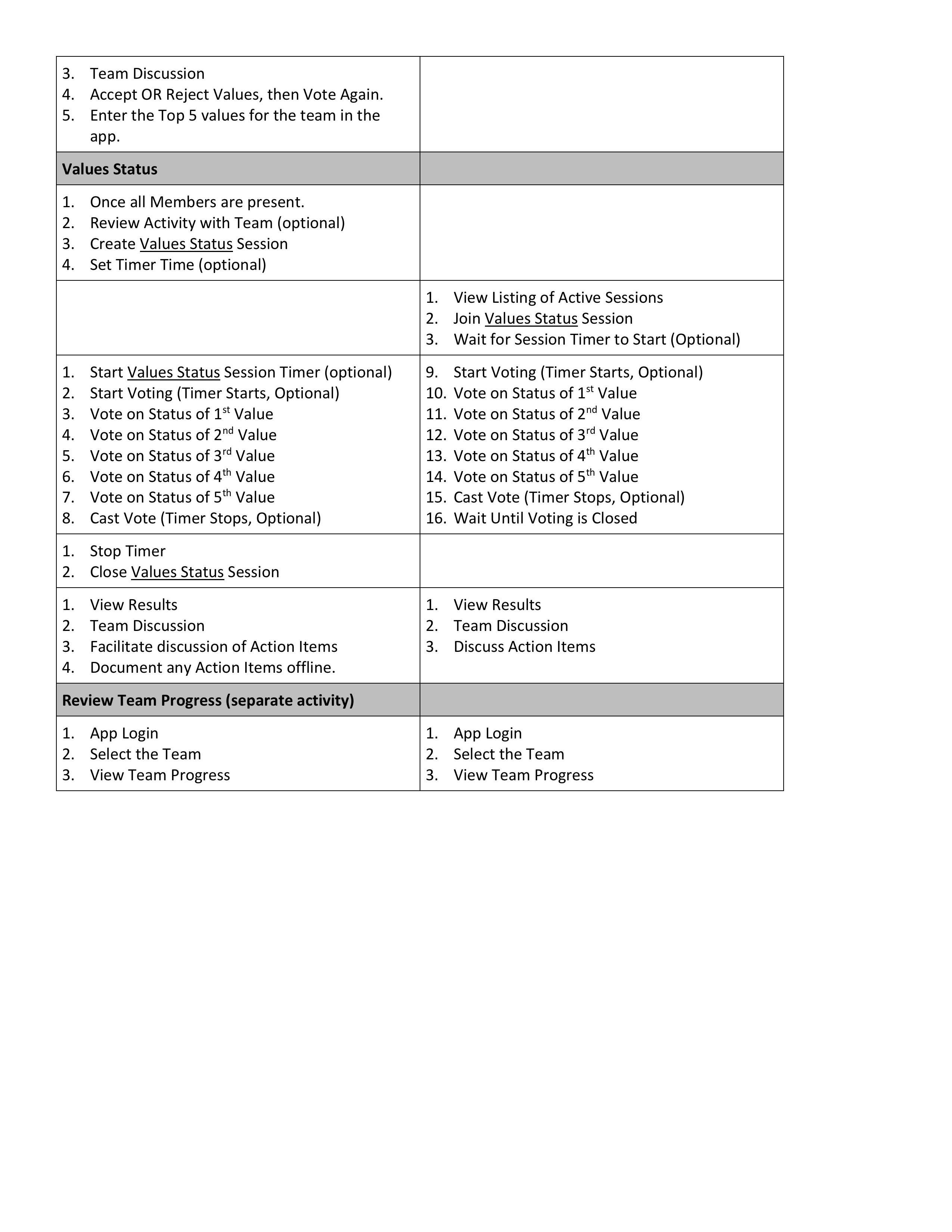
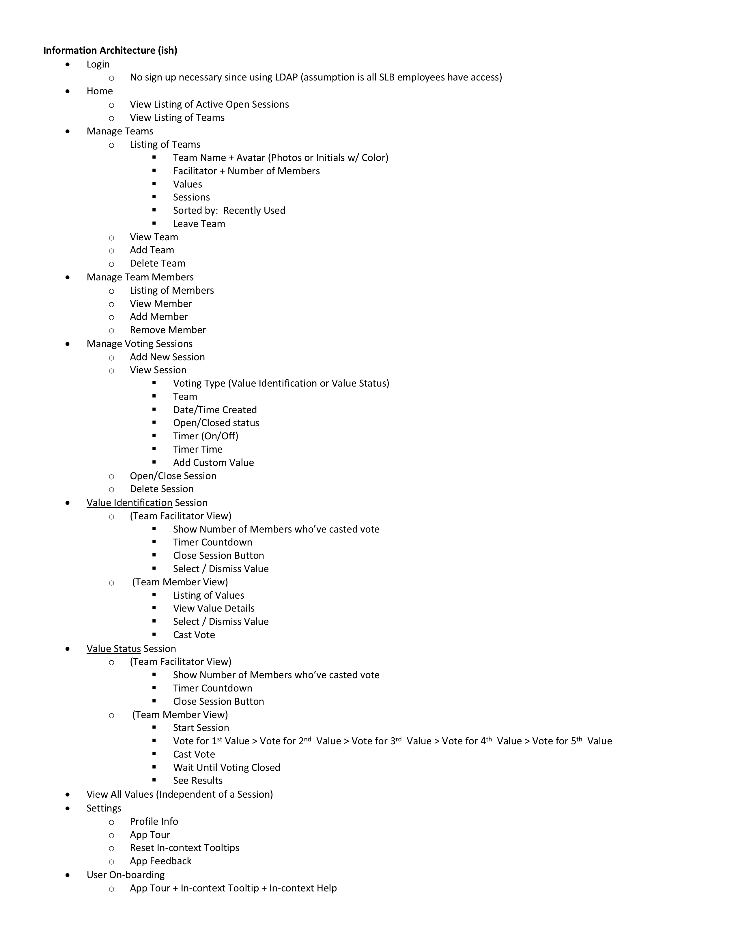
Information Architecture: Establishing the Structure & Flow
Organize Functionality for Workflow Efficiency Next, I came up with how the app would be structured to support this experience and all the scenarios captured earlier in an efficient manner. The intent at this stage was to focus on the overall flow and navigation of the app, before getting into the weeds of the interactions. There were 3 main workflows with the 2nd two being executed the most
Manage Teams
Phase 1: Select Values
Phase 2: Assess Team Health
Bulleted List VS. Visual Diagram. The approach of using a bulleted list allowed me to layout the high-level structure really quickly. However, this format did make it challenging to visualize the flow adequately, since it was hard to get into the details when needed. I didn’t have the time to convert this into a visual chart.
Information Architecture
Ideate + Prototype
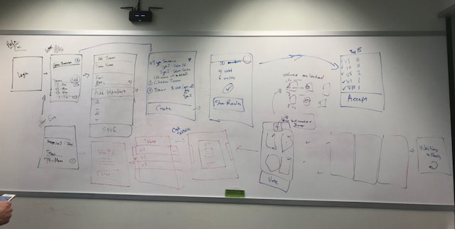
Interaction Design (IxD): Evolution Through Design Reviews
We whiteboarded the key workflows through the app with the team, since its much easier to iterate and collaborate via this medium. Sketch was what I used for interaction design, so its hard to collaboratively design there (as compared to Figma).
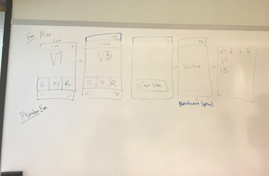
Manage Teams & Phase 1: Value Selection
Phase 2: Team Health Assessment
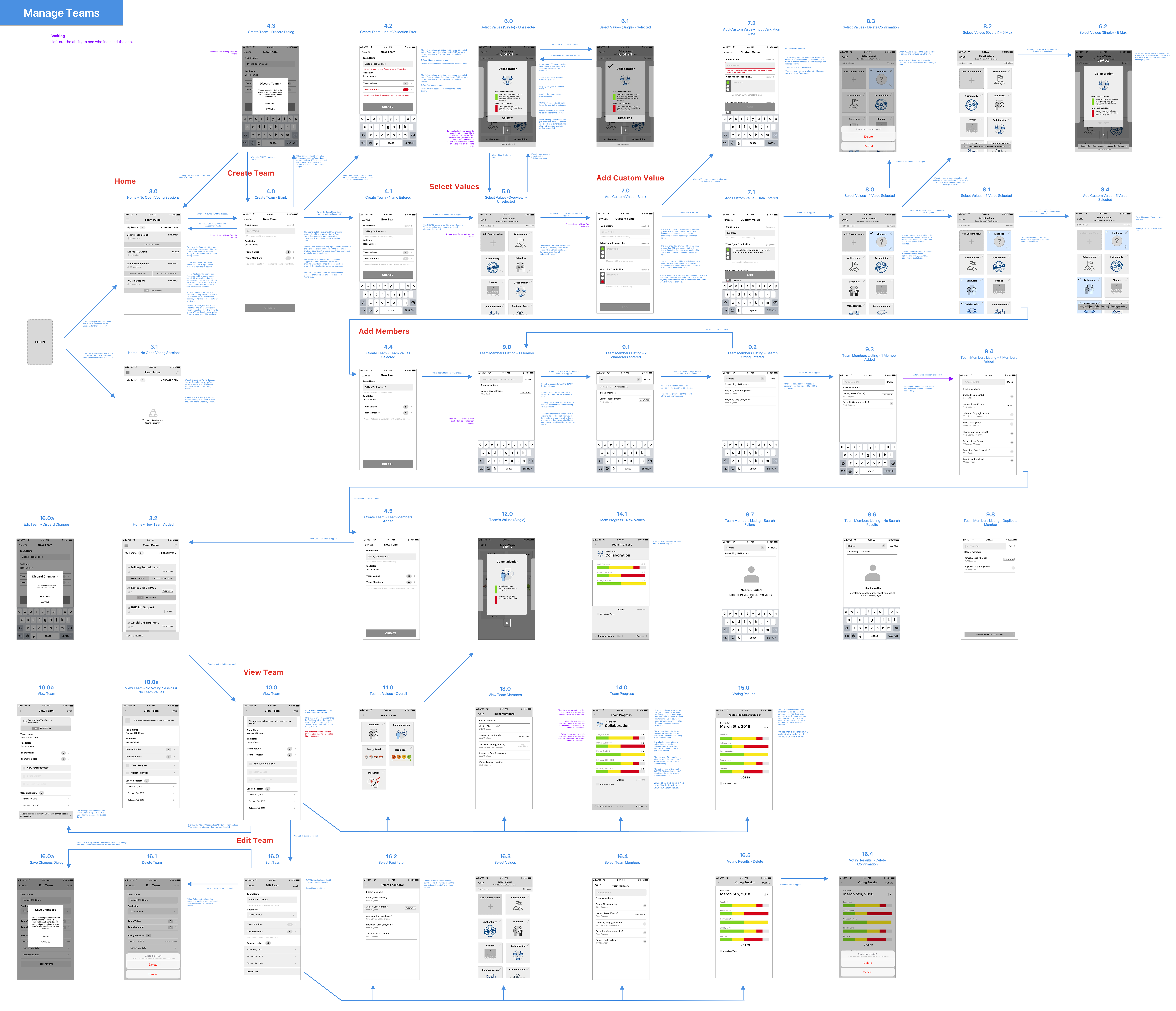
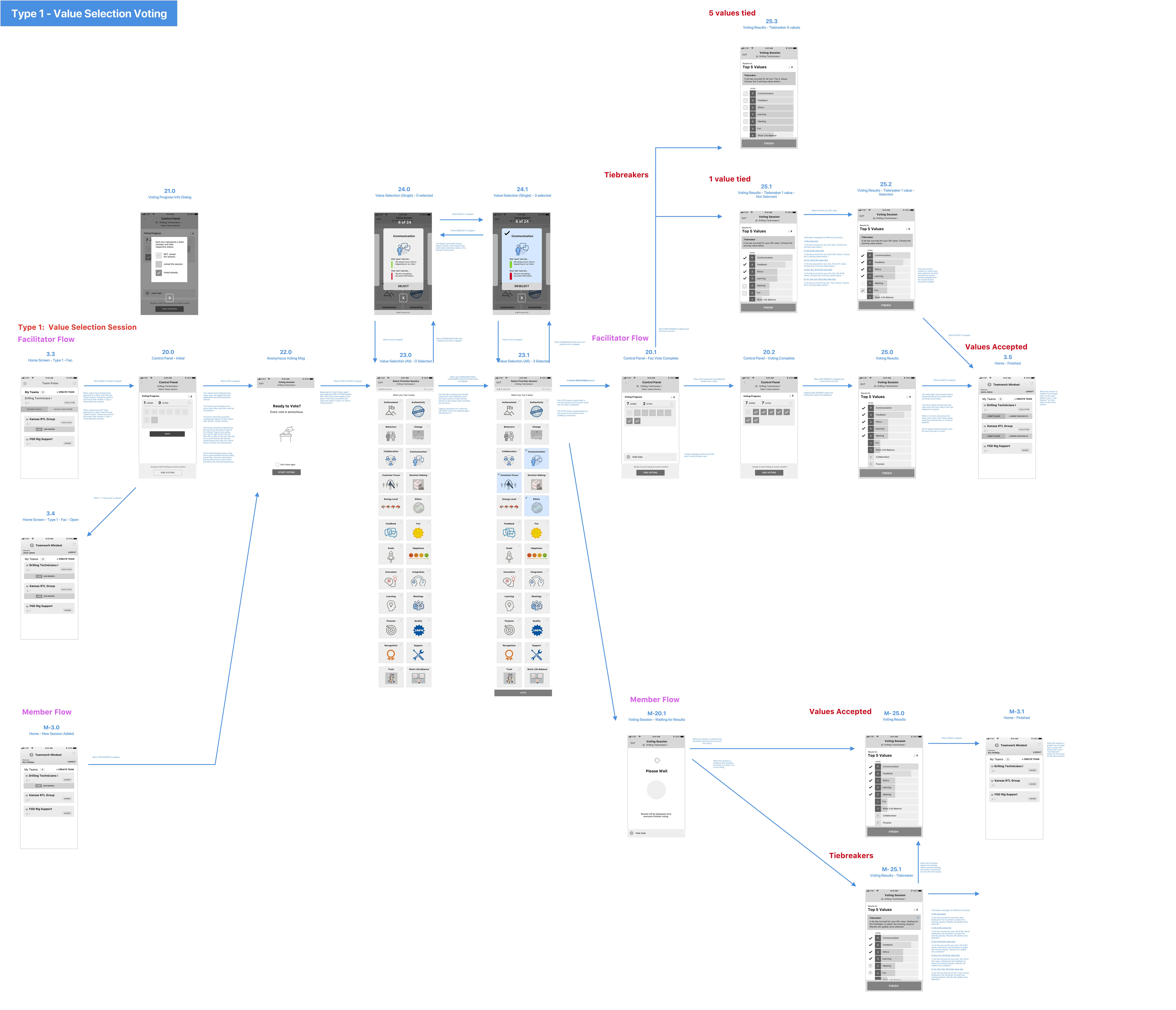
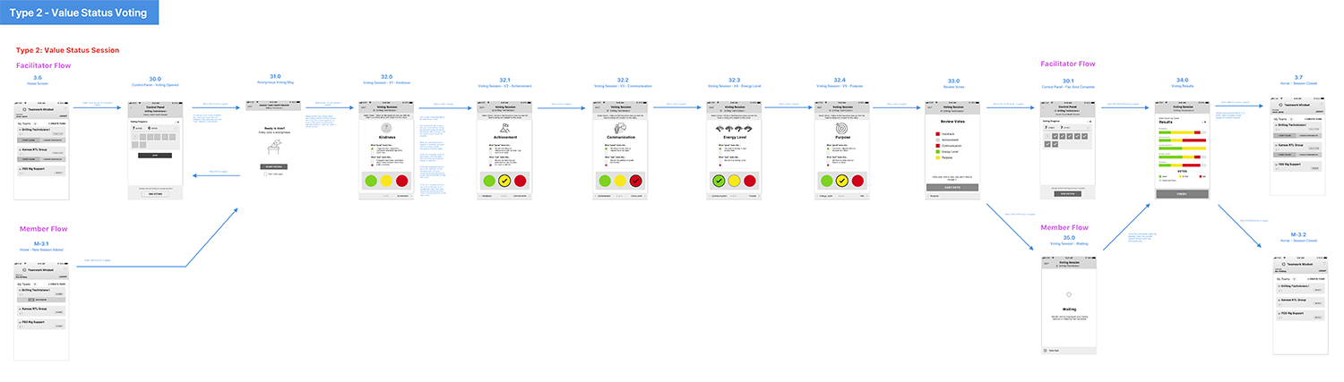
Wireframes To Capture All the Specs I translated the Information Architecture into a wireframe that captured the screens tied together in different flows. The wireframe had so many screens, annotations and flows, that it was hard to get a complete feel of how the facilitator and member experience would be in integrated. Particularly, it would have been difficult for the client and/or team members to grasp during a 1 hr design review, while still having time to provide relevant and useful feedback.
Wireframes for Manage Teams
Wireframes for Phase 1: Value Selection
Wireframes for Phase 2: Team Health Assessment
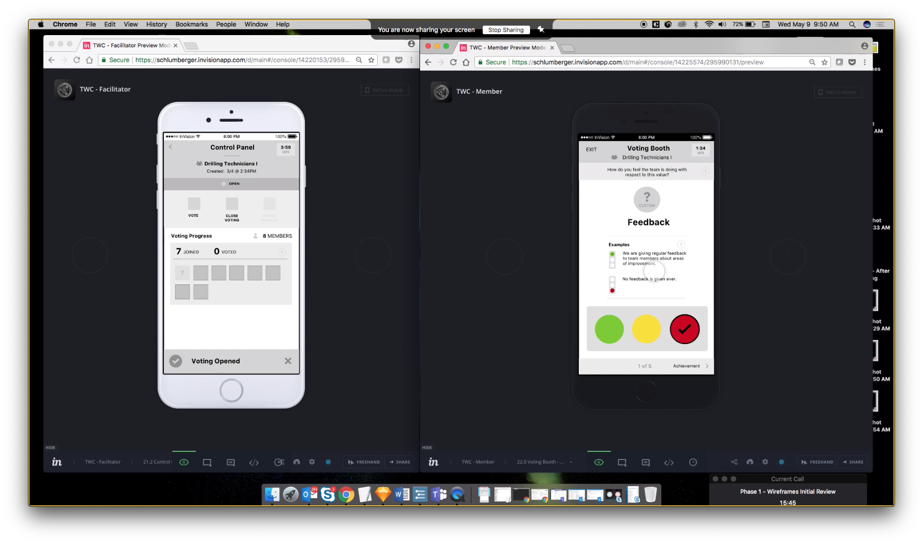
2 Prototypes to Simulate the Full End-to-End Experience I wired all the screens up in an Invision prototype to better simulate the end-to-end experience and surface any gaps in design. I created 2 separate prototypes, 1 for the Facilitator and 1 for a Team member to work out the timing of steps and actions. This approach also made it much easier during design reviews and demos to the client, so they can envision the design I we were building to. The design went through several major iterations to address gaps and issues that this approach brought out during usability tests with users and design reviews with clients, UX designers, solutions architects and the product managers.
Dual Prototype
IxD: Complex Value Selection Task
Must Enable Effective Phase 1: Values Selection Phase 1 was such an important step in the activity. If users could accurately select the right values, then they wouldn’t believe in the results nor trust the activity.
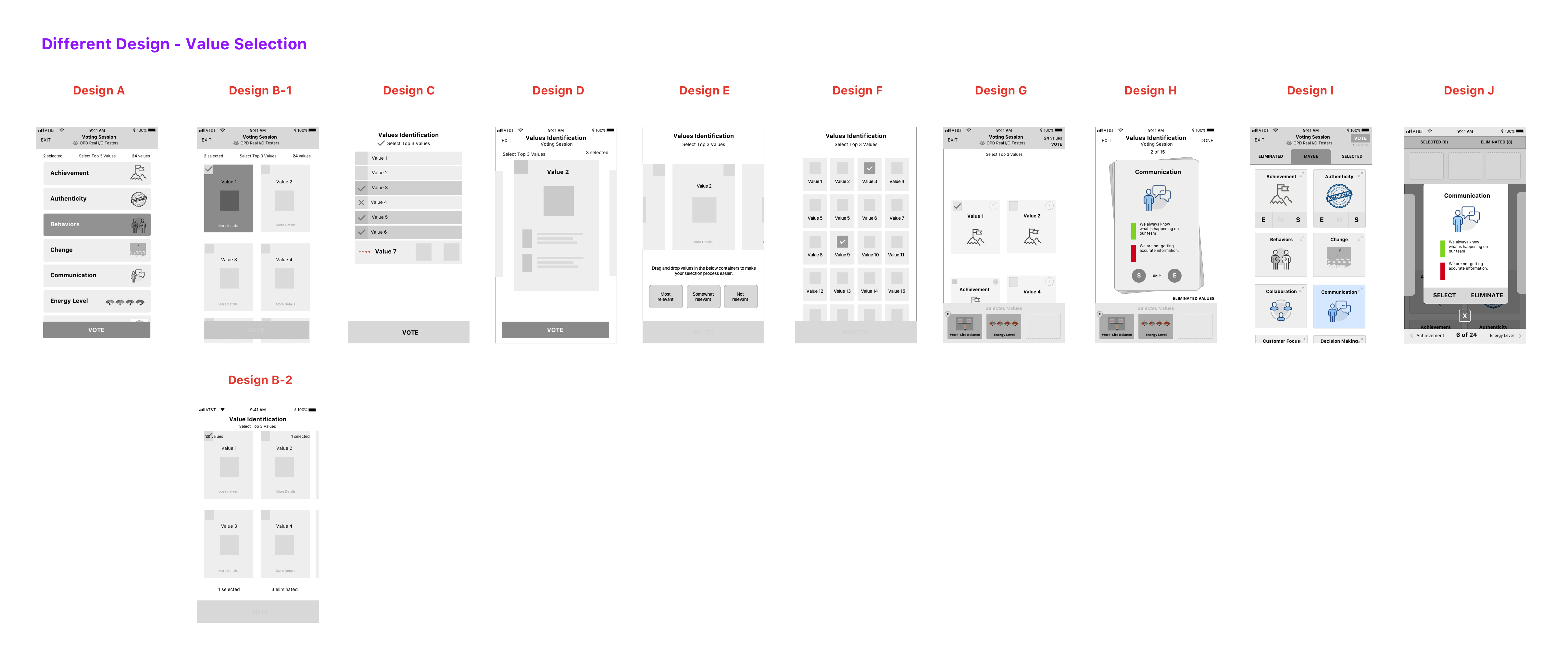
Diverge. Take Time to Fully Explore Solutions I wanted to fully explore the solution space to see what different ways we could address all the needs. I came up with several designs in collaboration with other UX designers, as we diverged, yielding 8 different designs.
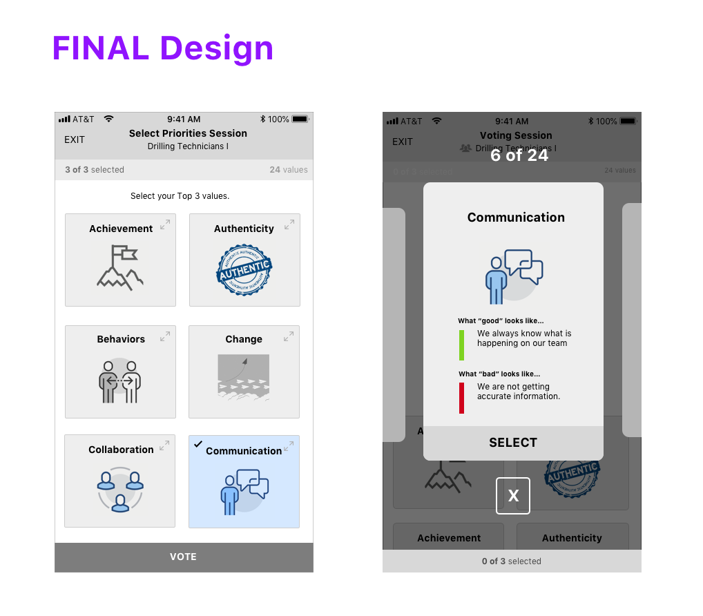
2 Designs to Address Most of the Needs Eventually we converged on 2 designs that incorporated elements of the others and collectively they would address most of the needs. We treated both designs as 2 different “views” that user could switch back and forth between, depending on their needs at that given moment.
Different Designs - Value Selection
Final Design
IxD: Process of Elimination During Value Selection
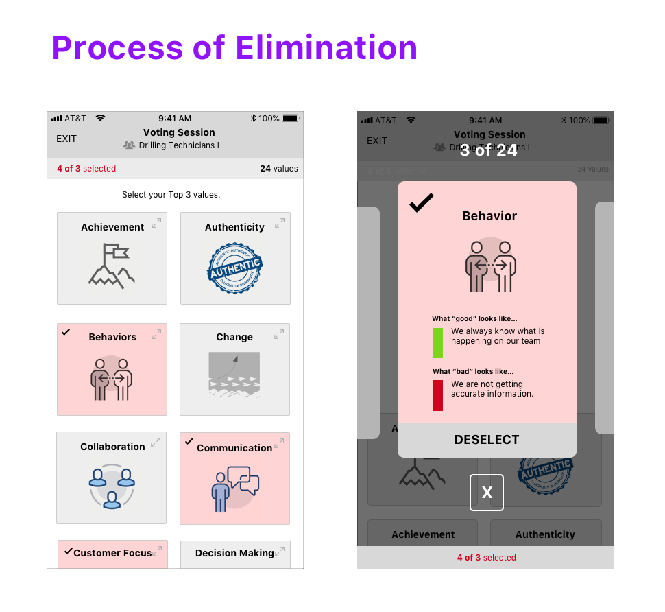
Users Used a Process Elimination Method Used to Reduce Cognitive Load As mentioned earlier, some users used a process of elimination method, to make it simple to select the right values. This reduced the cognitive load of the activity, since the user could reduce the number of total values they had to decide from. We wanted to support this behavior in the app.
Support This Behavior in the App Once the user had chosen their 3 values, instead of stopping the user from being able to select additional values, the app would let the user select additional values. At that point, we would visually communicate that they need to increase or decrease their votes.
Process of Elimination Design
Final Design
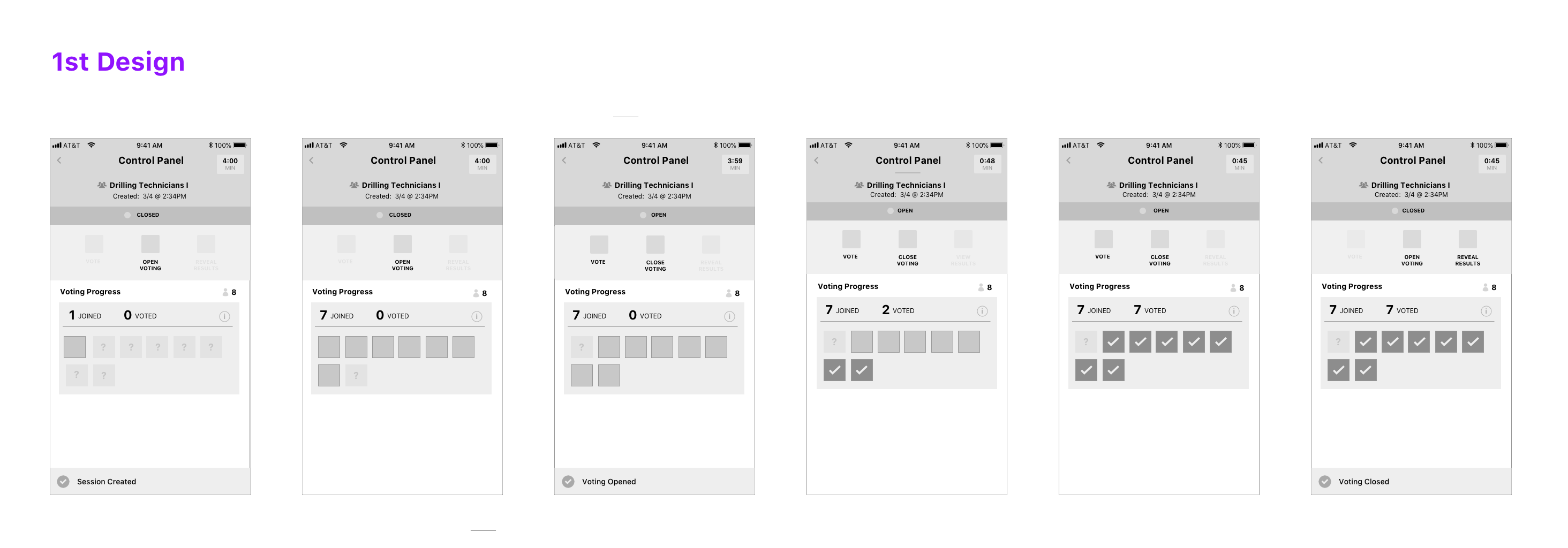
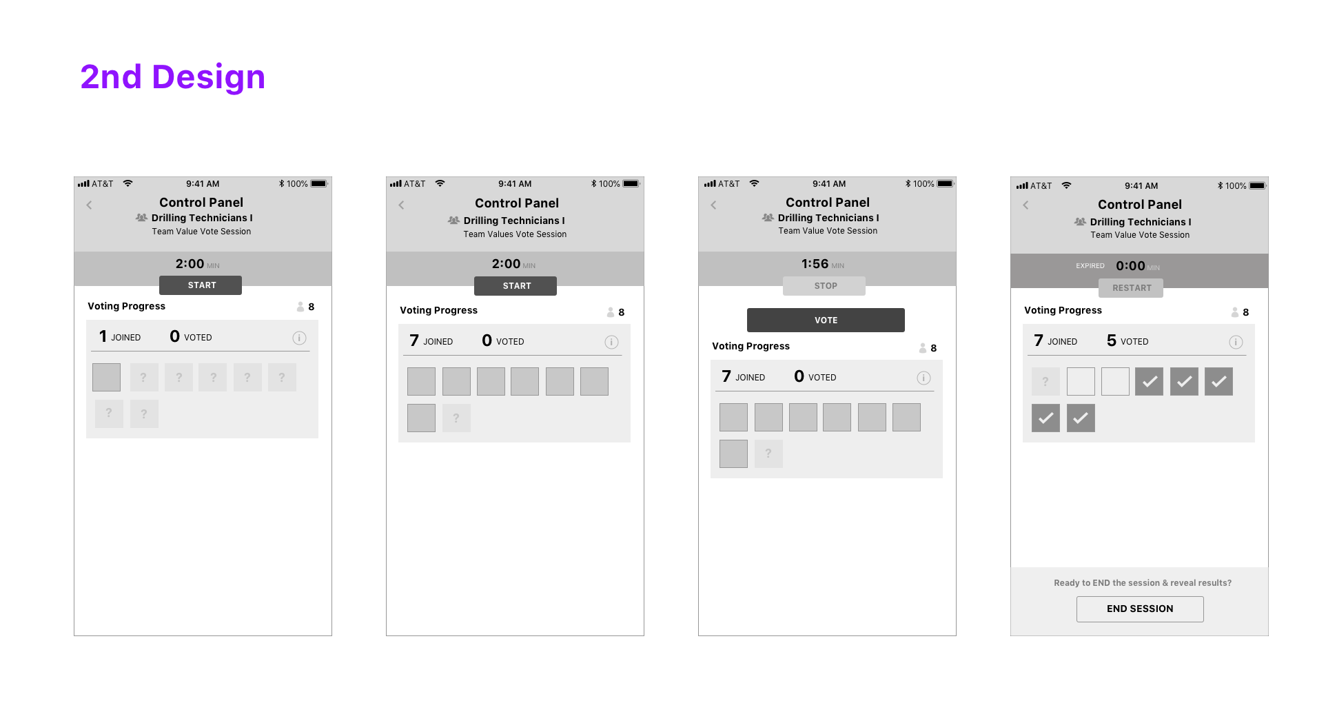
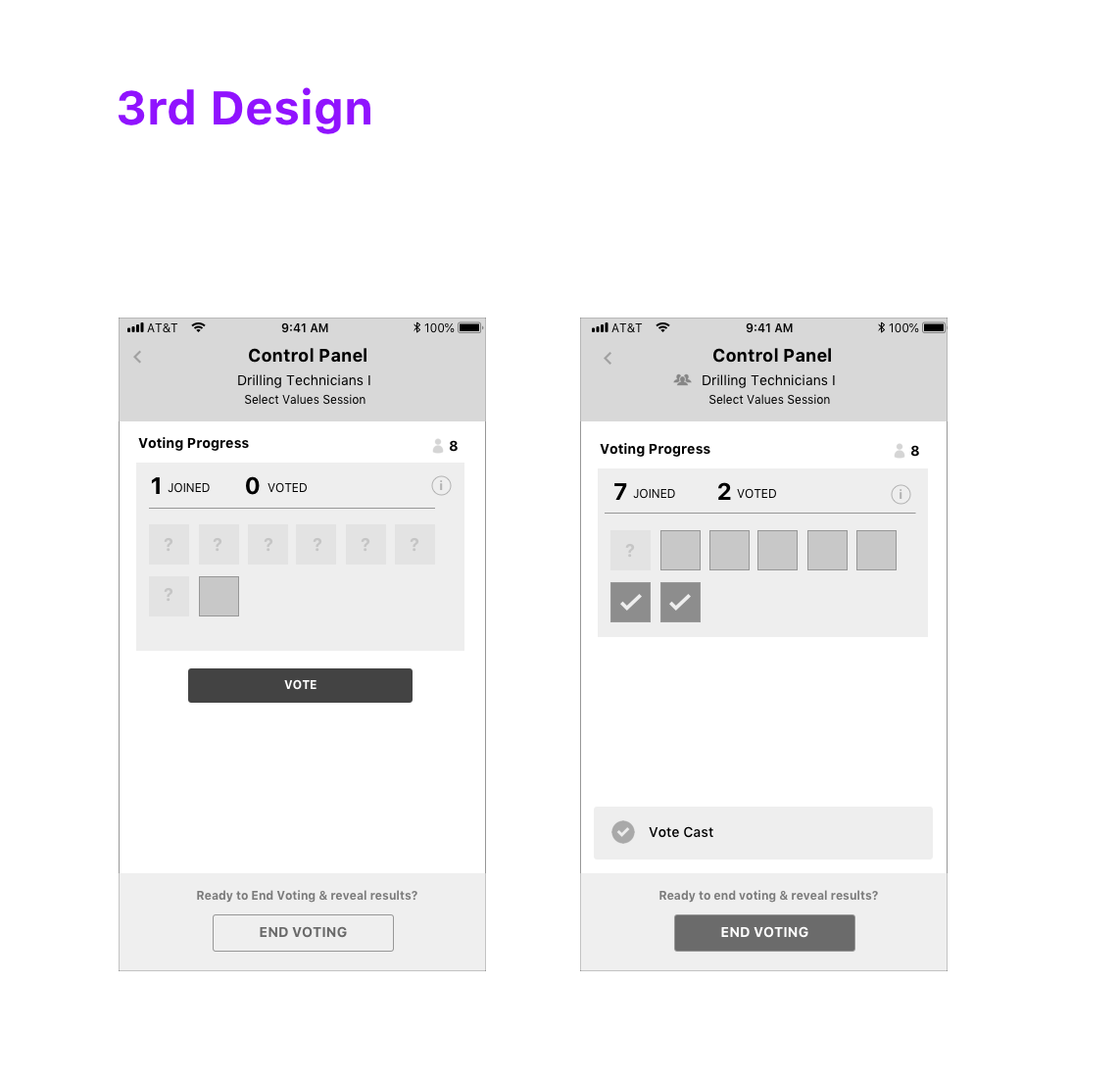
IxD: Confusing & Complex Primary Facilitator Flow
Primary Flow Caused Facilitator Confusion The primary flow for the facilitator didn’t direct the Facilitator adequately and instead presented secondary and tertiary actions equally with the primary actions. This resulted in confusion on what the user was supposed to do next at various points in the flow, based on user feedback. The primary actions should be emphasized and in scenarios where the user deviates, those should be supported in the UI, but not as prominently. So, I redesigned the interactions to simplify and clarify the steps.
Streamlined the Interaction & Eliminated the Timer The Timer added plenty of complexity to the entire user-flow from a technical perspective and user experience perspective. We decided to remove it for the initial release and if it was a genuine need, we’d build it back in based on learnings from the first release. It definitely simplified the flow.
1st Iteration
2nd Iteration
3rd Iteration
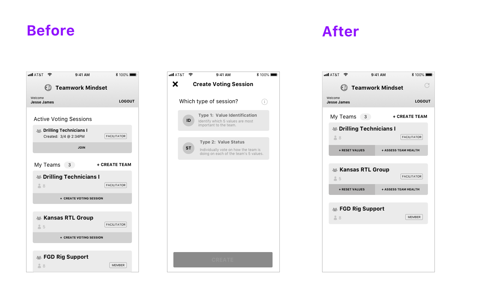
IxD: Use Task, Instead of Object Based Call-to-Actions(CTA)
Object-Based CTA Was Confusing, Although It Resulted in 1 Less Click During an initial design, the main call-to-action (CTA) on the Home screen was “Create New Session”, an object-based CTA, that relied more on a systems mental model. During design reviews and quick usability testing, users were confused on how to execute key tasks with the app due to a single object-based CTA. They couldn’t relate to how a “session” related to what they were trying to achieve.
Went with A Task-based CTA But Added an Additional Click This approach simplified the number of CTAs from 2 to 1 on the home screen since less options the easier & faster it is for the user to make a decision. However, it introduced an additional click into the Facilitator experience, which was already complex as it is. However, switching to 2 task-based CTAs reduced a click and was much easier for the user to figure out what action to take.
Before and After
Quick Usability Plan
prototype
Visual Design: Exploring the Possibilities
Multiple Visual Design Concepts & Design Reviews I briefed the visual designer on the background of the project, userbase, design principles and the wireframes & prototype and asked them to generate 3 divergent visual design concepts. Upon receiving the 3 visual design concepts, we had a few internal design reviews between me and my visual designer. I wanted to make sure the designs covered the main scenarios, followed sound visual design principles and that I was satisfied with all 3 designs. We also conducted design reviews with the product team before showcasing it to the client, to seek non-design perspectives.
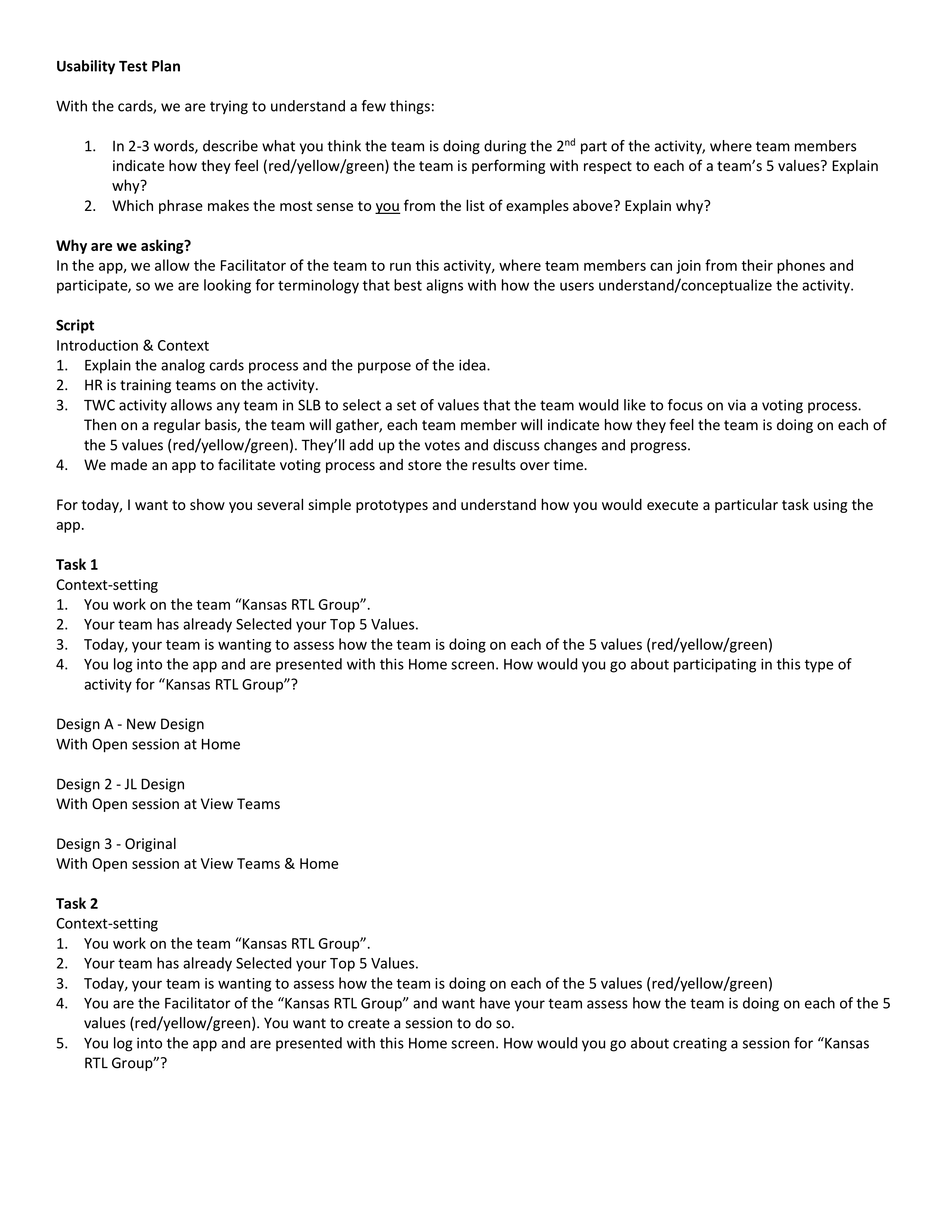
Concept 1 – Utility It relied on patterns with more traditional colors and more conservative in its approach, yet still colorful.
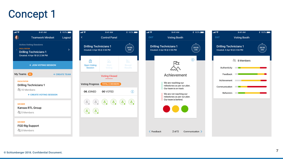
Concept 2 – Edgy Applied a dark mode, more vibrant colors and had more of a playful feel.
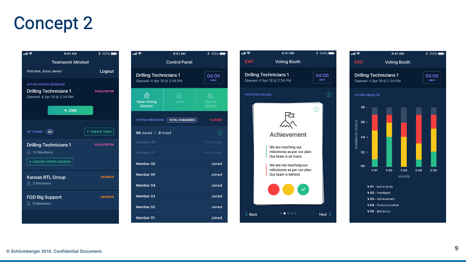
Concept 3 – Apple iOS The 3rd was one based on Apple iOS look & feel, as that was something the clients found appealing and it was based on iOS platform standards.
Concept 1
Concept 2
Concept 3
Visual Design: Heuristic Evaluation of Concepts
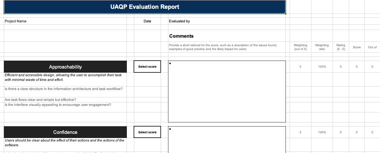
Evaluating Designs Using Industry Standard Usability Principles Prior to the reviewing the 3 concepts with the client, I evaluated the designs using elements of a heuristic evaluation, as a way to justify our recommendation using industry standard usability principles. t was applied as best as I could, as another input to use when making recommendations to the client that are based on factors they wouldn’t understand but were crucial to achieving the outcomes they desired. Schlumberger’s UX Center of Excellance, had developed their own Heuristic Evaluation system, mostly based on Industry Standards and that is what I’d used.
Heuristic Evaluation Snippet
Visual Design: Final Choice
Aiming for a Balance of “Modernity” & “Enterprise Utility” I briefed the visual designer on the background of the project, userbase, design principles and the wireframes & prototype and asked them to generate 3 divergent visual design concepts. It needed to have the “modern” feel of B2C mobile apps employees were using outside of work, while still being not too edgy to impact usability
The final chose, balanced those two things the best.
Control Panel 1
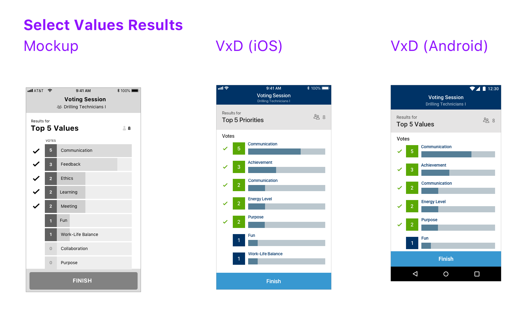
Select Values Results
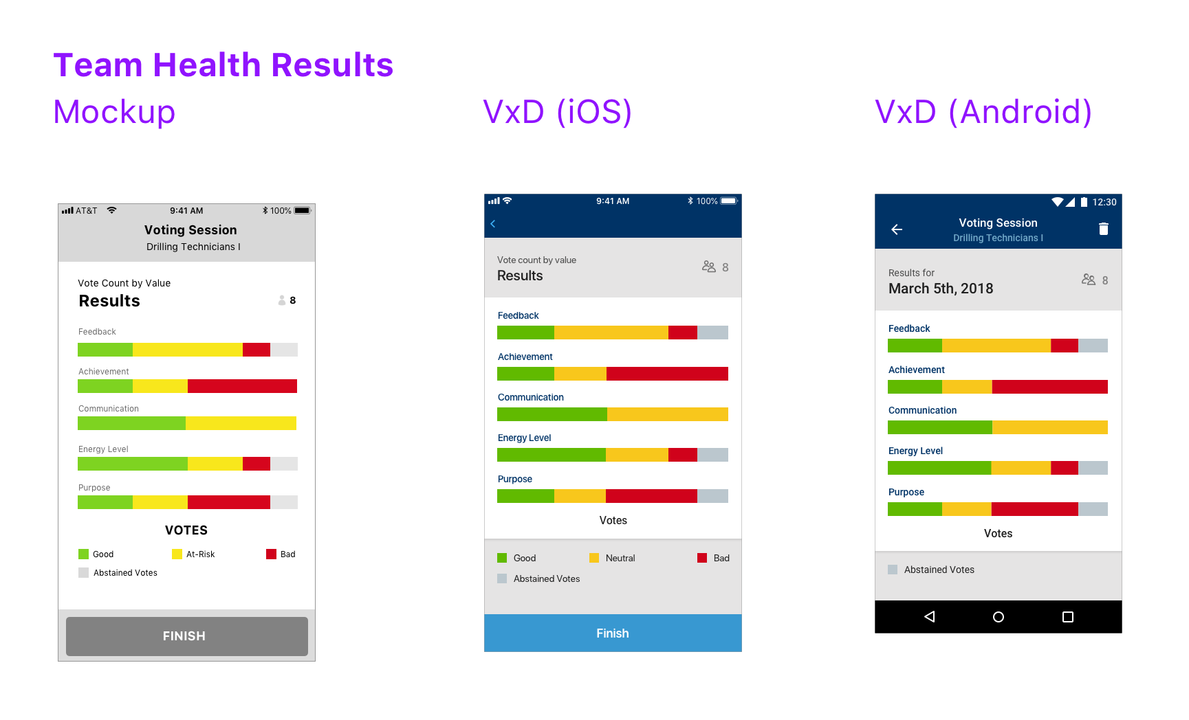
Team Health Results
IDEATE + PROTOTYPE
Functional Motion: Export Data without Disrupting Main Workflow
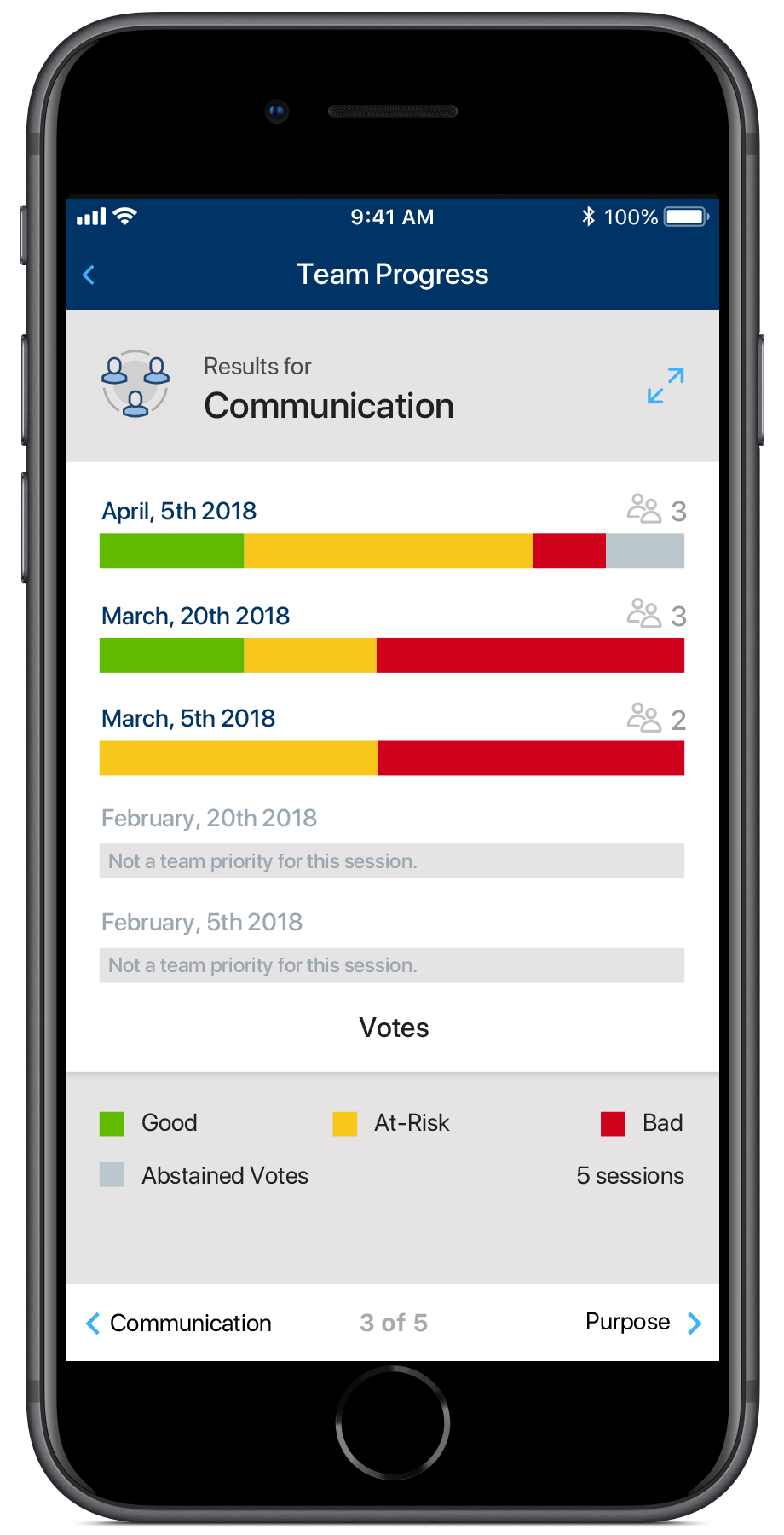
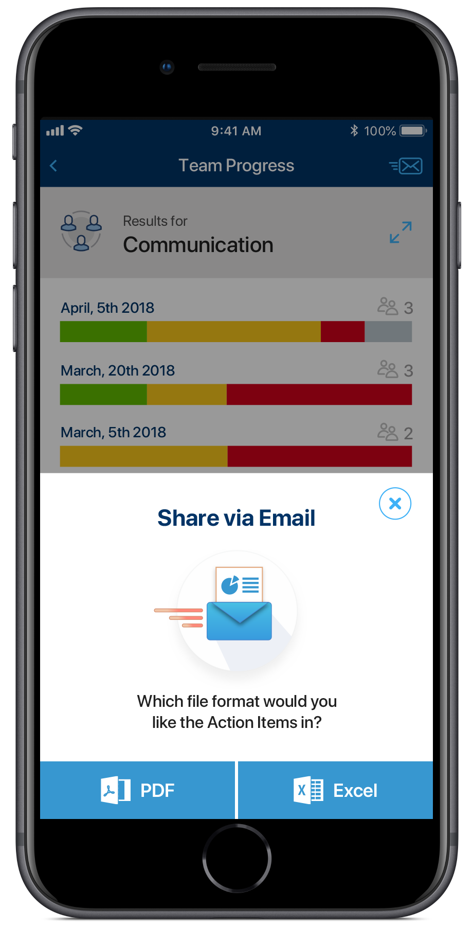
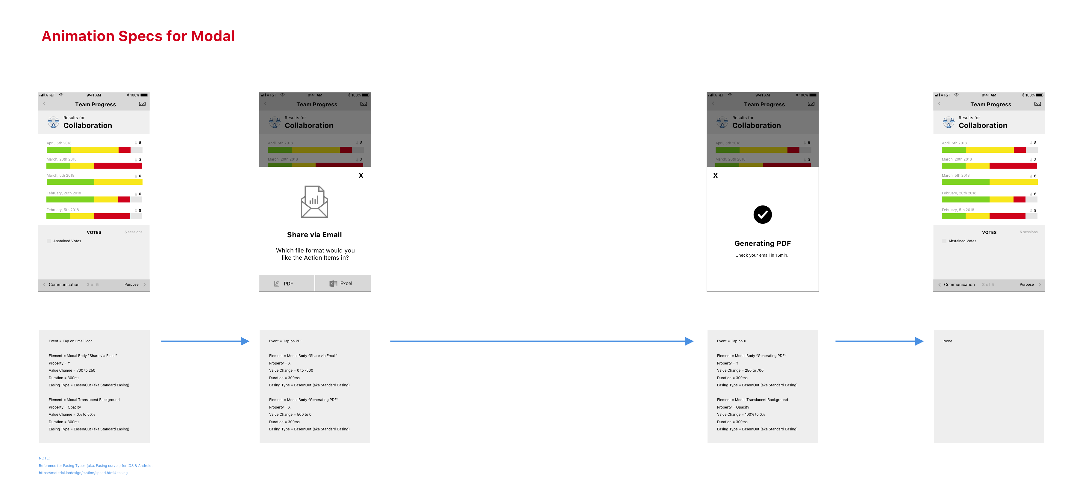
Users Needed to Export Data Quickly In the Middle of Reviewing Team Data The Share Results feature allowed user’s to export their team’s data into PDF or Excel format and have it emailed to them. It was a multi-step process that the user would decide to execute in the middle of viewing the data, so it needed to be quick and not disruptive to their current workflow.
Enable an Export, While Minimizing Disruption using Functional Motion We used common screen transitions in the app, but with increasing functionality packed into the app and since I wanted a way to compress this experience into a single section, an opportunity to leverage functional motion arrived. It was basic, but useful. I mocked up the screens in Sketch and prototyped the motion using Principle and provided the needed Motion specs for the developers. This allowed the multi-step process to occur in a small space and be clear and understood.
Share Data Modal - Animation Specs
IDEATE
User Onboarding: Essential Due to Limited Support Resources
The app introduced a new exercise, with specific rules, it wasn’t part of users’ job responsibilities and it was marketed as being something that could easily be integrated into existing team processes without much effort and minimal time. We needed to make it so easy that people could pick it up with minimal instruction, through experimentation as is done for most mobile apps. This is not typical of most IT related apps, hence my mention of this. It was analogous to a Business-to-Consumer (B2C) product.
Training & Support I collaborated with our Marketing Lead, who helped us with user adoption & engagement, to come up with approaches for user on-boarding: Informational Website, Quick Tips Document, Quick Start Guide and HOW-TO Videos. Additionally, I provided L3 support to our stakeholder, early adopters, facilitators and initial pilot users.
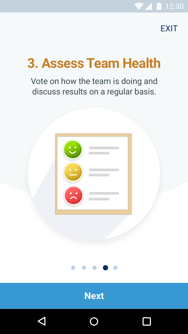
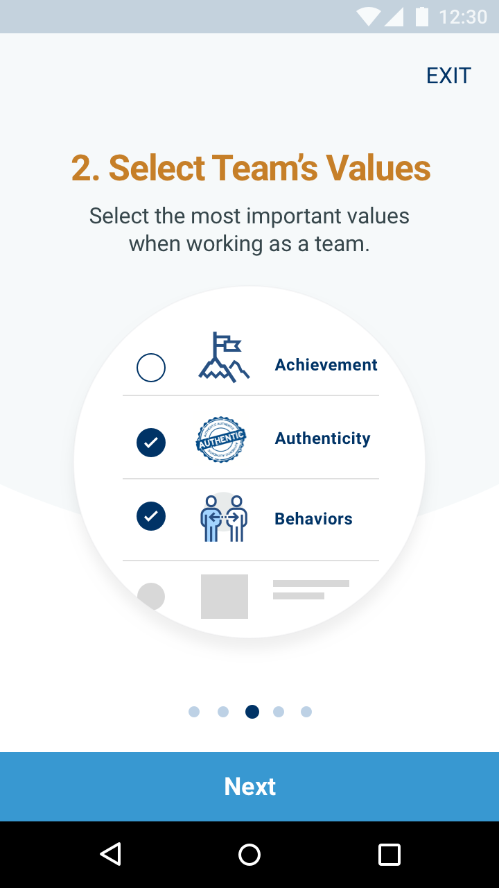
App Tour Provided an Overview of the Process We decided to include a 5 screen App Tour upon first launch of the app, to quickly explain the high-level steps of the exercise, so users had a lay of the land. The App Tour was mostly visual with minimal text. could take seconds to complete for the user. It needed to be short, since users prefer to learn how to use the app through exploration.
App Tour 2
App Tour 1
Tooltips Enabled Discovery of Hidden Functionality While Minimizing UI Clutter We had several features that were initially less discoverable, since they weren’t primary actions on the screen because most users wouldn’t use them and the screens already had too much functionality. We opted to use tooltips that only appear the first time the user lands on the screen, as a way to quickly make users aware of this visually hidden functionality.
Tooltips
TEST
Pilot: Feedback from Users & Stakeholders
We had an initial pilot where we validated the value of functionality, learned about pain points and unmet needs directly & indirectly and as result had 10-15 enhancements that were all driven from this.
Used the App in 30+ Team Workshops to Test It Out in the Real World The app was going to be used as part of 30+ multi-day Executive Leadership Workshops worldwide over a 4-6 month period. We were going to be supporting a subset of these workshops in-person and remotely, so it was a great opportunity to see and observe the first-time novice user’s experience of the activity and app. Although, alot of pressure since the guinea pigs were all executives!
Observed Direct & Indirect Feedback which Resulted in Many Enhancements, Features & Bug Fixes We received feedback directly via speaking with and observing users when we supported some of the workshops and via our stakeholders who ran every workshop. Troubleshooting was a rich source of feedback about the design and the activity itself. The feedback themes were noted and discussed with stakeholders periodically and solutions prioritized for future releases. A slew of other needs surfaced that resulted in features like, Push Notifications, Reminders, Actions Items, Sharing Results.
Wireframes for Enhancements
Dual Prototype
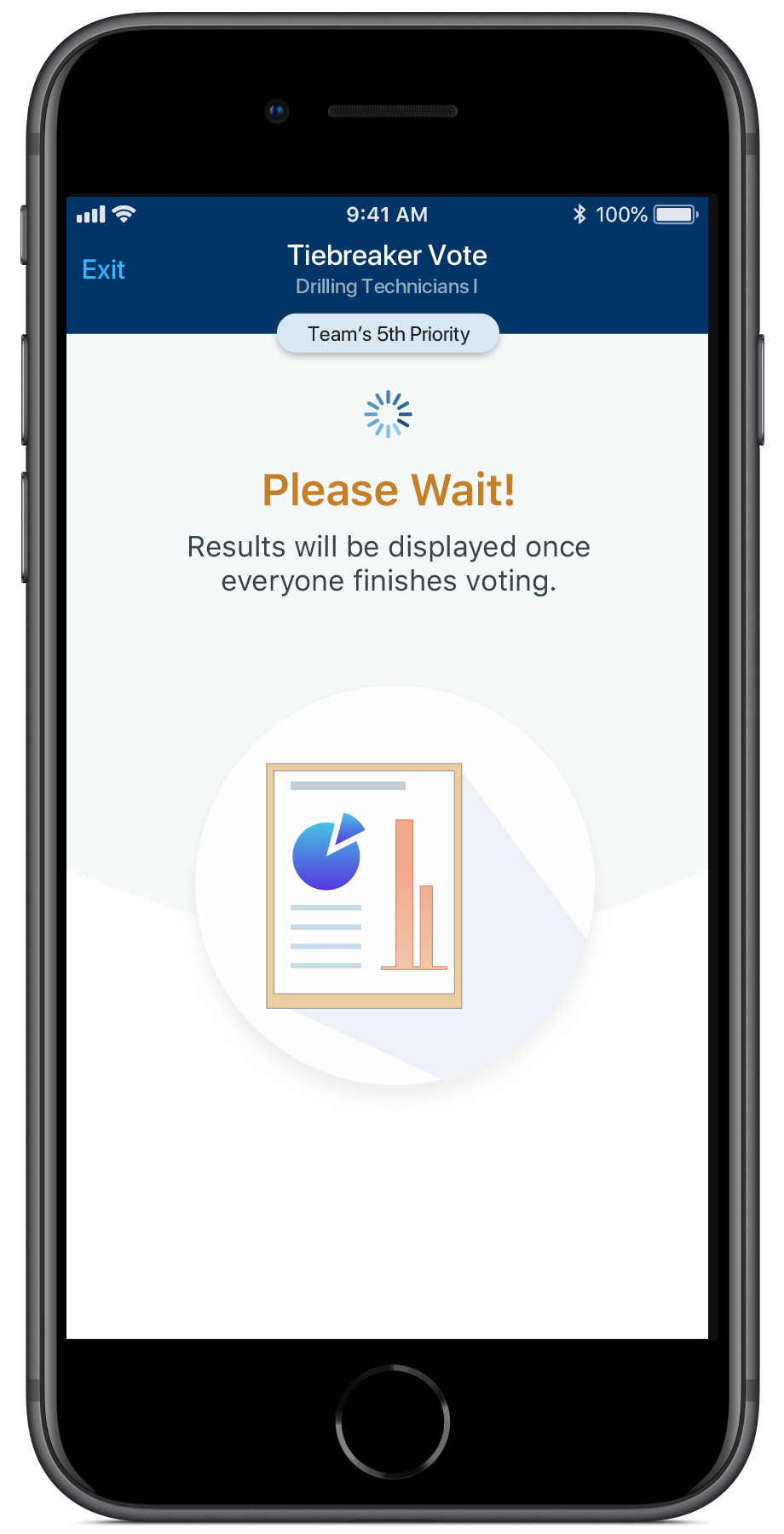
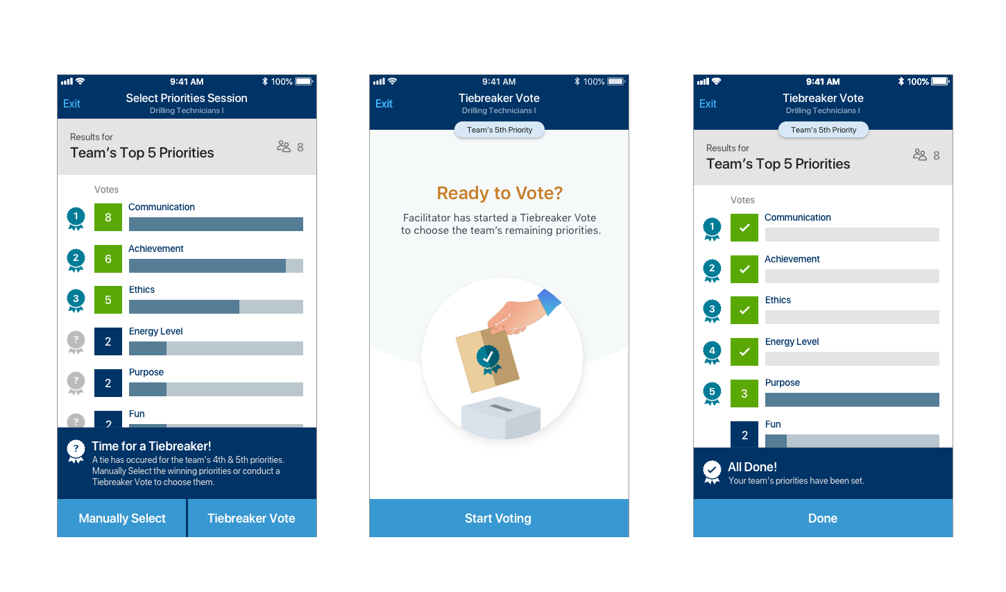
Unmet Need: Democratic Tiebreaking Method in the App
Ties in Voting Frequently Occurred, Yet the App Had No Method to Break Them. When users were voting on values, frequently a tie resulted. This required users to break the tie offline, inspite of having digitized most of the process. I researched real-world elections to see the different ways they break ties in elections and the terminology they use.
Adding Both a Manual & Democratic Tiebreaker to the App Completed the Experience. We decided to support tie breaking in 2 different ways. In some cases, users did want to just have a discussion offline and have the facilitator enter the results of the offline tiebreaker. In other cases, the team wanted to vote from the tied values, to choose the remaining values democratically and anonymously just as they did before. This was modeled after a Election Runoff. These tie could continue to repeat for a given session, so they functionality ended up being quite complex.
Tiebreaker Screens
Tiebreaker
Play Video
Facilitator Experience
Play Video
Member Experience
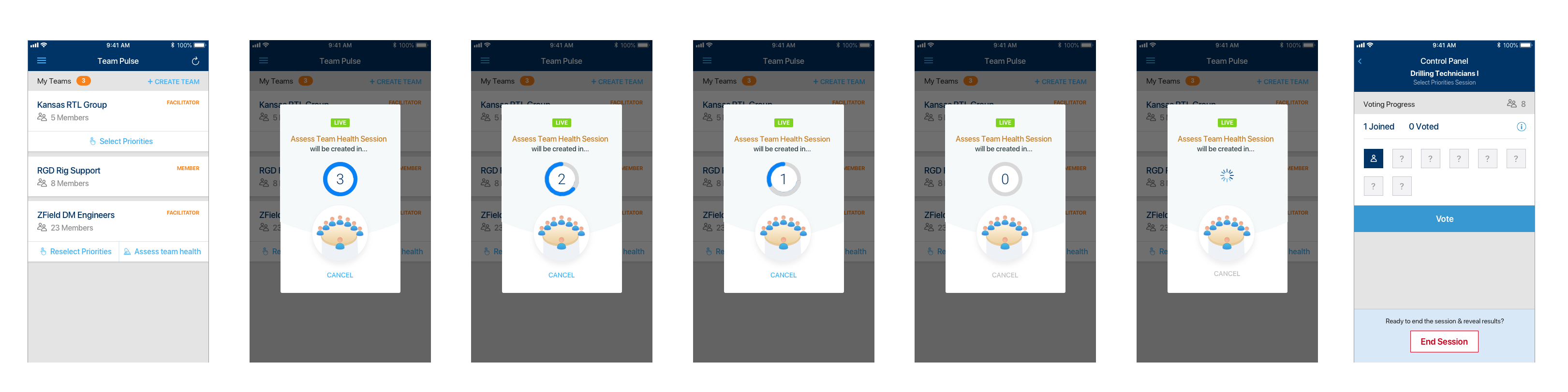
Usability Issue: Oops! I Accidentally Created a Session!
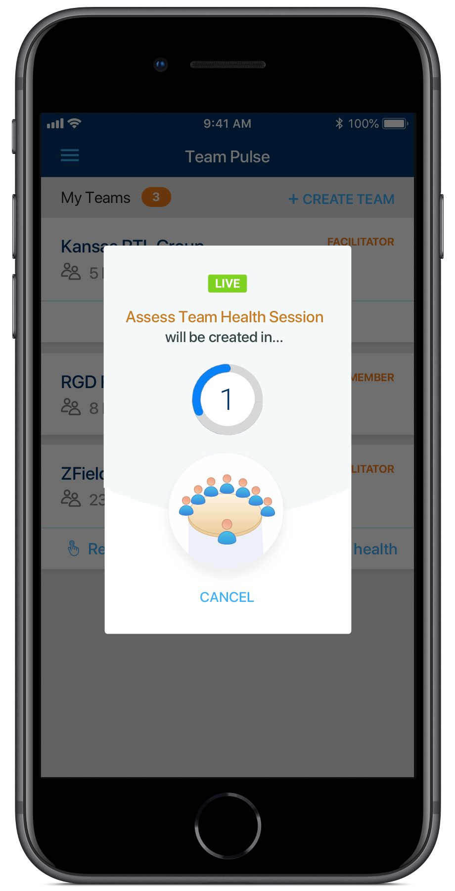
Sessions Were Being Created on Accident Without the User Knowing On the Home screen, Facilitator’s could create a session with a single click. I had designed it this way to intentionally make it quick to create sessions, since it would be a frequent task. However, novice users were learning about the app and how to use it by experimenting with different actions, typical user behavior in mobile apps, they’d create a session, not knowing the significant implications of such an action. In other cases, users accidentally tapped the button, creating a wasted session.
Unclosed Sessions Blocked Other Functionality & Blank Sessions Tainted the Data When a session is launched, the user needs to explicitly close the session or else other actions in the app are locked, such as adding members to that team or launching another session. Novice users didn’t realize this connection and when they attempted these other actions, they couldn’t figure out why they weren’t available. In cases, where a Blank Session was created, it was stored as part of the Team’s Progress, so it made it harder to see trends in progress and confused members at times.
A Countdown-to-Launch Provided a Clearer & Less Disruptive Way to Prevent Accidental Session Launches We explored several approaches to address the issue. First, we explored inserting the standard “Are you sure?” confirmation dialog after the user tapped the button to create a session. Most of the time, users would be creating sessions because they wanted to, but this message sent the wrong message of “you might be doing something wrong” and it interrupted the flow. Instead a team member suggested a countdown before executing the action, within which the user can choose to Cancel the action. This approach informed the user what was happening, gave them time to Cancel and also made it seem like this was a more major action with repercussions, as compared to other actions in the app.
Session Creation
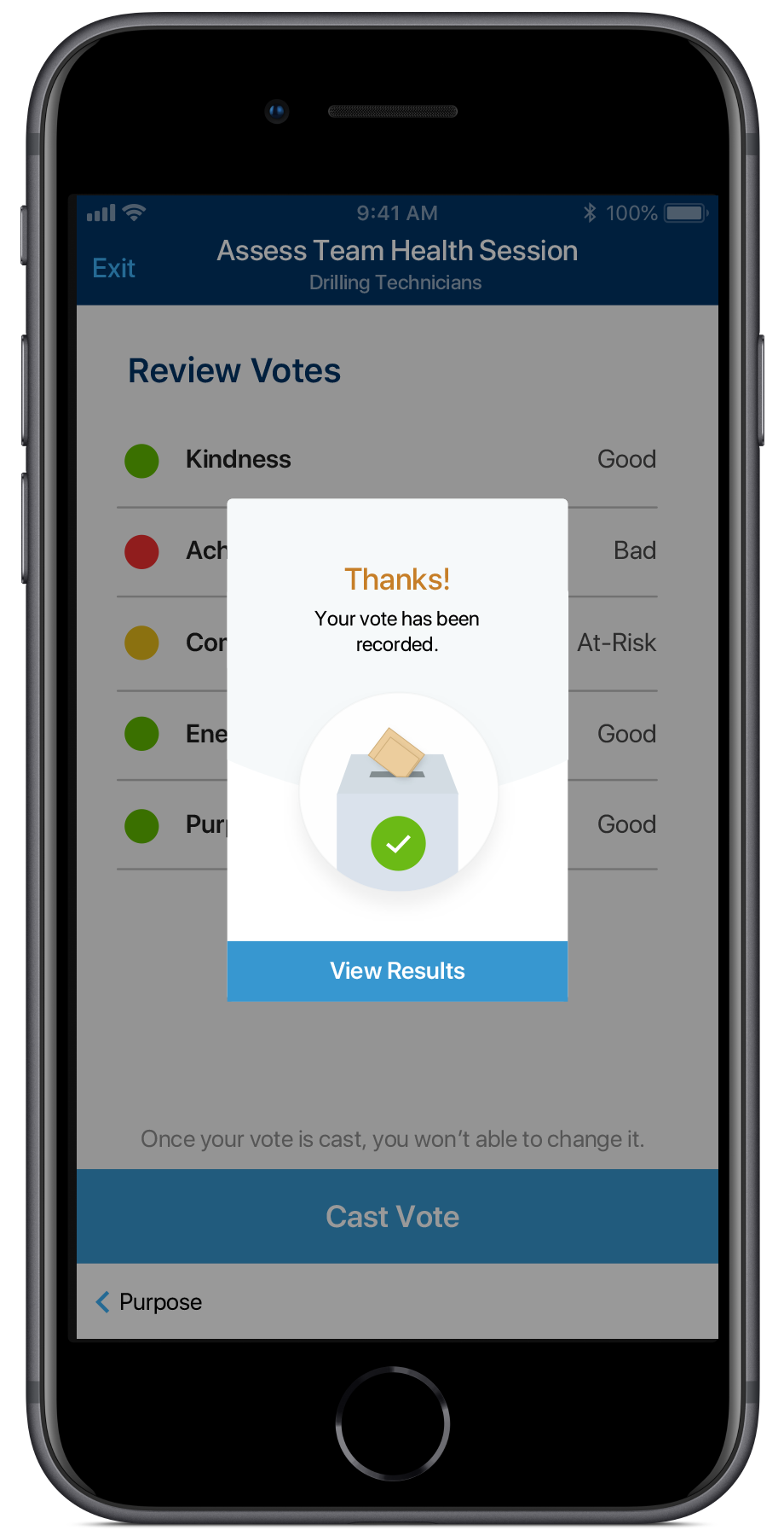
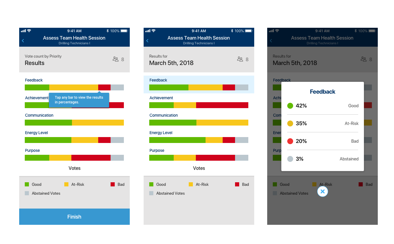
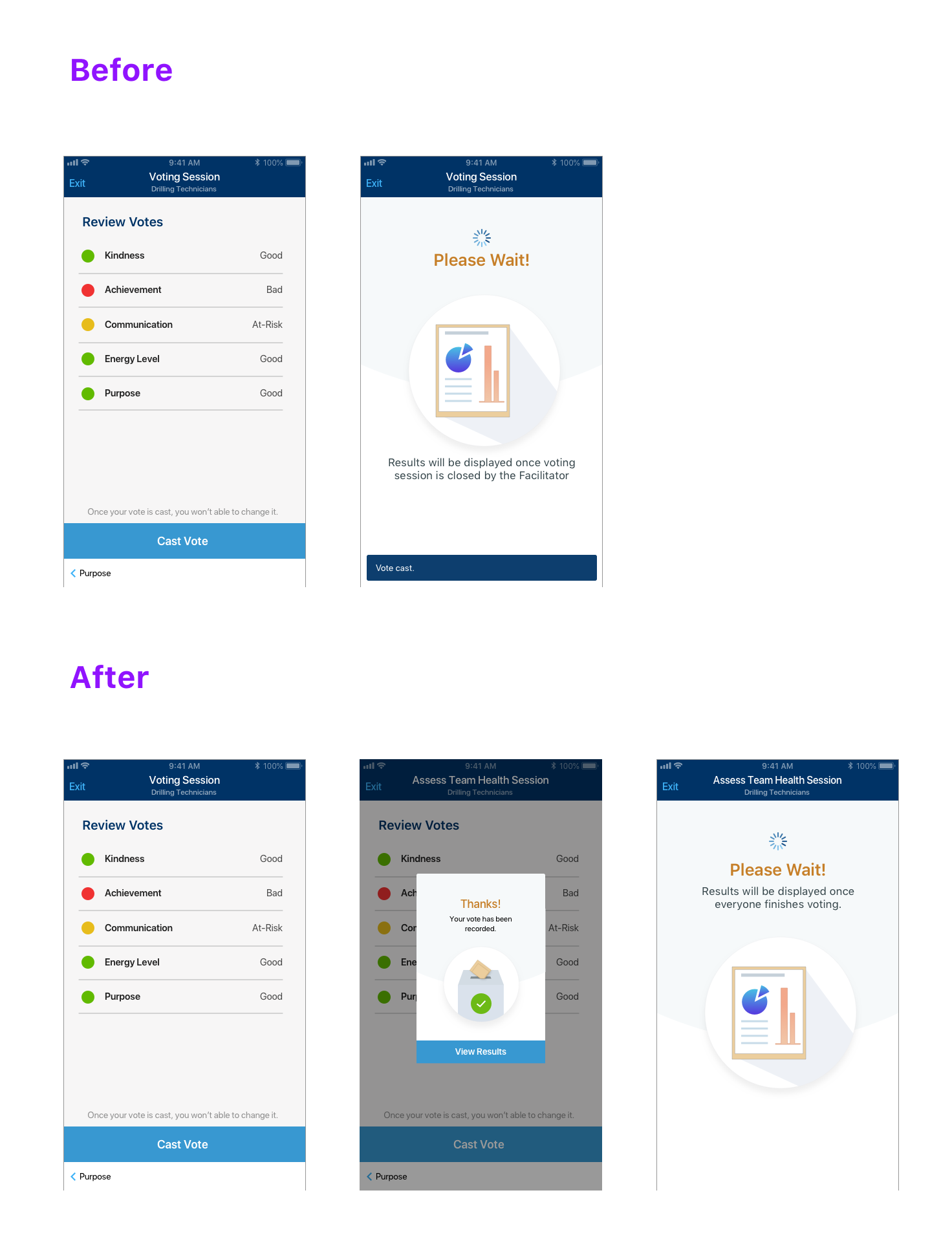
Usability Issue: Was my Vote Cast???
Users Were Unsure Whether Their Vote Was Cast After a vote was cast, the screen transitions to a new screen with an animation and a toast message appears at the bottom of the screen at exactly the same time. Since both changes in the UI state were happening simultaneously, the user wasn’t noticing the confirmation toast message and thus was unsure whether their vote was successfully cast. I saw this with my own eyes in workshops, where users asked me if their vote was cast with a sense of uncertainty on their face.
Explicit Confirmation with Acknowledgement Made it Clear We investigated several approaches to addressing the issue. First, we tried delaying the appearance of the toast message until after the screen transition was complete, but that was out of order with users expecting a confirmation before the transition. We investigated showing the confirmation toast message before the screen transition, but that would cover the “Cast Vote” button they just used, so it was a confusing interaction. In the end, we added a modal dialog that the user would have to explicitly dismiss in order to move forward. Furthermore, the dialog had a Title and Subtitle that clearly communicated “Success” with text and visually with a Check mark icon, a common convention used to indicate “success” in many mobile apps.
Vote Cast Confirmation
Final Product
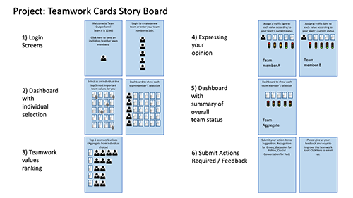
STEP 1: Select Values
To identify the team’s Top 5 Values, the Facilitator starts a “Select Values” session, Members join and everyone votes.
FACILITATOR
Play Video
MEMBER
Play Video
STEP 2: Assess Team Health
The Facilitator starts a “Assess Team Health” session, Members join and everyone votes.
FACILITATOR
Play Video
MEMBER
Play Video
Outcomes
Built a Modern & Intuitive User Experience for an IT Product We worked in IT and this was an IT product, so users expected a clunky ugly hard-to-use product. However, we were able to deliver an app that looked modern and was intuitive in many respects, had a dynamic & interactive UX and was nothing like a typical IT product. It felt like a B2C app users engaged with in their personal lives.
“We developed this internally??? (Wow, amazing job!)”
– VP of HR
App Showcased How Exceptional Internal IT Capabilities Had Become It was one of the 1st apps in the company, that provided a live collaborative experience across multiple devices simultaneously, applying the latest in modern mobile technology to the company. It really showcased our capabilities internally to address business challenges in modern & innovative ways.
Reliable Tool to Truly Understand How a Team Felt The exercise yielded a sense of how the team members felt the team was doing. It gave an anonymized palpable feel of the room and after seeing people’s faces when the results were revealed, at numerous workshops, and getting to talk to them after, you can tell they trusted what the results were telling them. They felt it was unbiased. It was information, that they could take action on.
“The app enabled us to have the difficult conversation in the team on how we weren’t operating quite so well as a team, and set us off in the right direction. Amazing!”
– Facilitator for a 20-person 2-day workshop.
Learnings
Factors Unrelated to the App’s UX Can Significantly Impede Adoption The company’s mobility & security policies, required that personal mobile devices must install certain software and be configured a particular way, before company mobile apps can be used. This is known as Mobile Device Management and it was conducted as a way to protect company data, however, users didn’t want to give the company partial control over their devices. They didn’t trust the company. As a result, many users refused to use company apps, while some hesitated to go through the complex setup process and others required support to even get their device setup. This created lots of friction during the onboarding process. In theory, a mobile app would be much easier to deploy to the entire company than a deck of cards, however, these obstacles indicated otherwise.
Always Look for Cheaper & Faster Ways to Test Ideas Due to the immaturity of the TWC exercise, we uncovered many unforeseen challenges after the app was built. It would have been much cheaper to evolve it to perfection in the analog form before moving to a digital format.
Look for Ways to Apply Research Methods Creatively to Overcome Constraints Thinking of non-traditional ways of applying research, can help you gain some insights in spite of schedule, budgetary or other constraints. Simulating a contextual inquiry, as I did, allowed me to quickly gain insights, increase my sample size and still get reliable trustworthy findings.
“Fun” Always Has a Place We had an aggressive timeline, working extra hours, using new technologies and the entire team was struggling to make the deadline. To motivate the team with a little fun and humor, I decided to do a cover of the “chorus” (~30secs) of the Drake, In My Feelings song (“Keke, do you love me?) that had gone viral at the time. I’m definitely not a rapper, so I figured we’d all get a kick out of my sad attempt at rapping. Turns out that it brought the team together more, brought lightness and perspective to everything and even the clients really appreciated that.