Schlumberger rents oil & gas equipment to companies all over the world. Equipment is rented for days to weeks, returned, repaired and rented out again. Its essential that they track the movement of these assets accurately & optimize their utilization. To do this safely, quickly & efficiently they were relying on a handheld RFID scanner-based system integrated with SAP.
Challenge
The RFID system had become overwhelmed and they’d outgrown it, leading to inefficiencies and limitations that prevented them from scaling the system to benefit more parts of the business. We were tasked to find & address pain points associated to performance, reliability, data integrity, operator efficiency and more, while modernizing the system so it had room to grow.
Outcome
We designed & deployed a iPhone-based RFID system integrated with SAP. It was rapidly adopted, it digitized steps in the process, automated a number of tasks, reduced time-on-task for several workflows and paved the way for an international expansion of the system:
64% Reduction for Login Times
70% Reduction in RFID Scanner Initial Setup time
60% Reduction in certain movement tasks
100% Automation of regular tag maintenance tasks
Eliminated execution of redundant transactions
> 50% reduction in workflow-based SAP errors.
30+
locations
$260M+
assets
~125k
transactions annually
Client
Schlumberger
Industry
Oil & Gas
Duration
1 year
1.0 release
October 2017 – October 2018
Platform
Native Mobile – iOS
My Role
User Research
Information Architecture
Interaction Design
Visual Design (creative direction)
Helped w/ QA, Business Analysis, Customer Success, Field Deployment, Training, Support, Digital Marketing & Content Strategy
My Team
12 members (multi-disciplinary)
Houston, TX
Pune, India
Internal Team: Product Manager, Solution Architect, Lead Developer, 2 Mobile Developers, 2 QA, Digital Marketing Specialist
We used stakeholder & subject matter expert (SME) interviews to understand the business goals, success criteria, initial requirements and gather enough context to plan the research strategy.
Business Goals were measured relative to the current system and were more general:
Increase in System Uptime
More Accurate View of Inventory
Increase in Scanner Responsiveness
Increase in Operator Efficiency
Reduction in SAP Workflow Errors
Reduction in Training & Support Hours
Literature Reviews: Building Context the Quick & Easy Way
I reviewed “RFID 101” content from the Internet, training guides on the old system, old system documentation & technical architecture documents to quickly & easily understand how the current system functioned and was built.
It gave me a basic context and the right language & terminology to increase the productivity of discussions with users. Additionally, we’d be reusing the APIs from the current system, so this would help me better understand any user pain points that were rooted in the APIs, identifying them as limitations we’d have to workaround.
RFID System Training Guide
RFID System Training Slide
Product Audit: Understanding the As-Is System
Training Classes Revealed Main Workflows Several team members attended a training class for the current product to understand the business process and key tasks (Receive, Repair, Ship, etc.). Now, I didn’t need to waste time during user interviews and contextual inquiry to learn these basics and could instead focus on unearthing insights & opportunities.
Receive Equipment
Repair Equipment
Ship Equipment
Manage Tags
Basic Design Principles & Patterns were not followed Poor design decisions were probably the source of many usability issues, some of which had already been mentioned by stakeholders.
No Input Validation
Minimal visual hierarchy
Too Tiny Font Size
Small touch targets
Screen loading delays
Tiny Screen
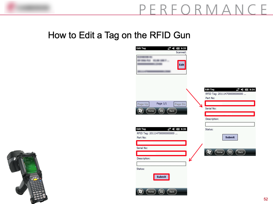
Current scanner's view & edit tag screen
Current scanner's scan tags screen
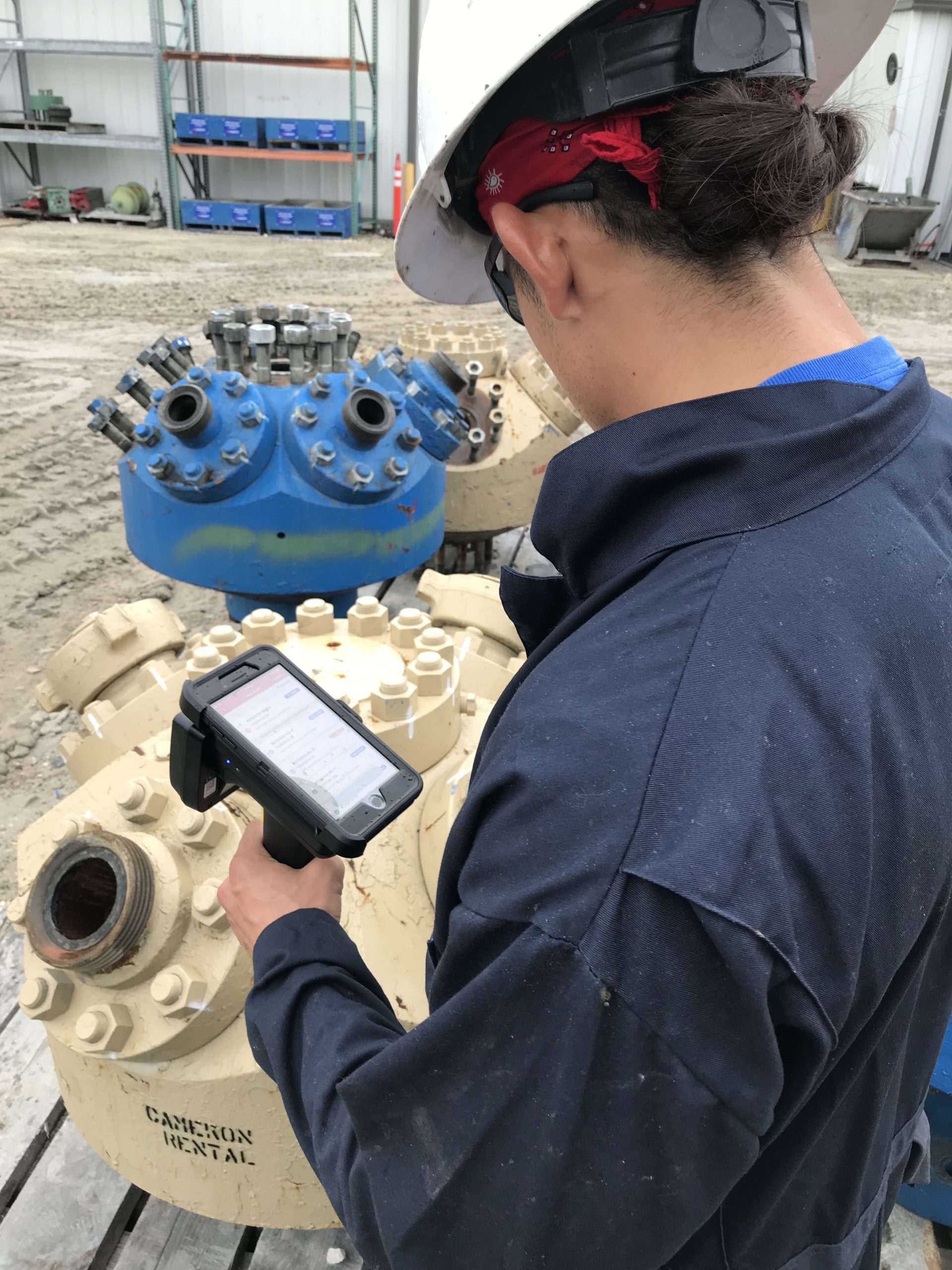
Field Research: Seeing How it All Works Together in the Real World
With input from stakeholders & the team, I developed UX research strategy and established proto-personas, so we had a starting point for which types of users to target.
We choose to do multi-day field visits to 2 different plants that had different volumes of activity and operational setup. This gave us a variety of environments & contexts, they were logistically easy to get to, trip costs were in budget and our stakeholder could accompany us to make introductions to the right users.
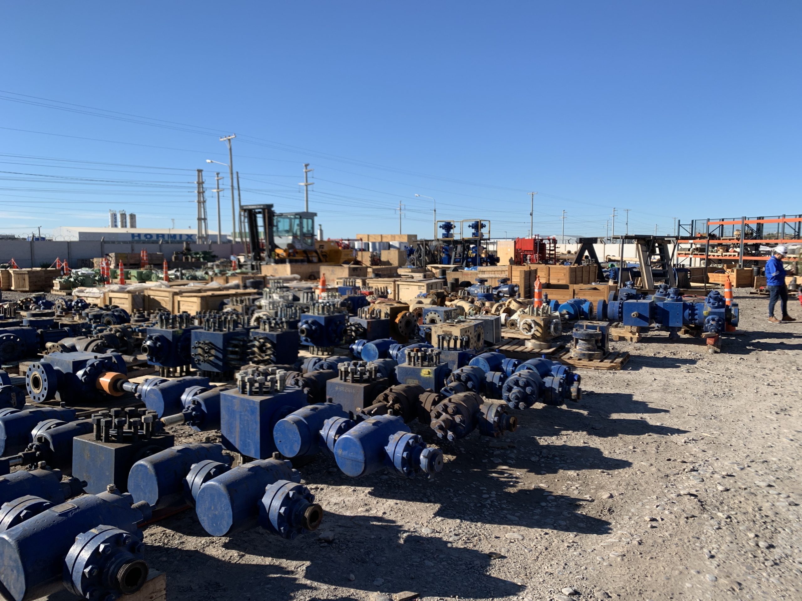
Field Visit 1 – Corpus Christi, TX
Field Visit 2 – Odessa, TX
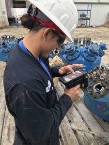
We conducted user interviews with multiple users throughout the day. Since users would be interacting with equipment, scanners and various personnel in a busy equipment yard, away from computers, it was essential that we observe their activities while dialoguing as well, via contextual inquiry.
Field Location
Rental equipment returned from the customer into the yard.
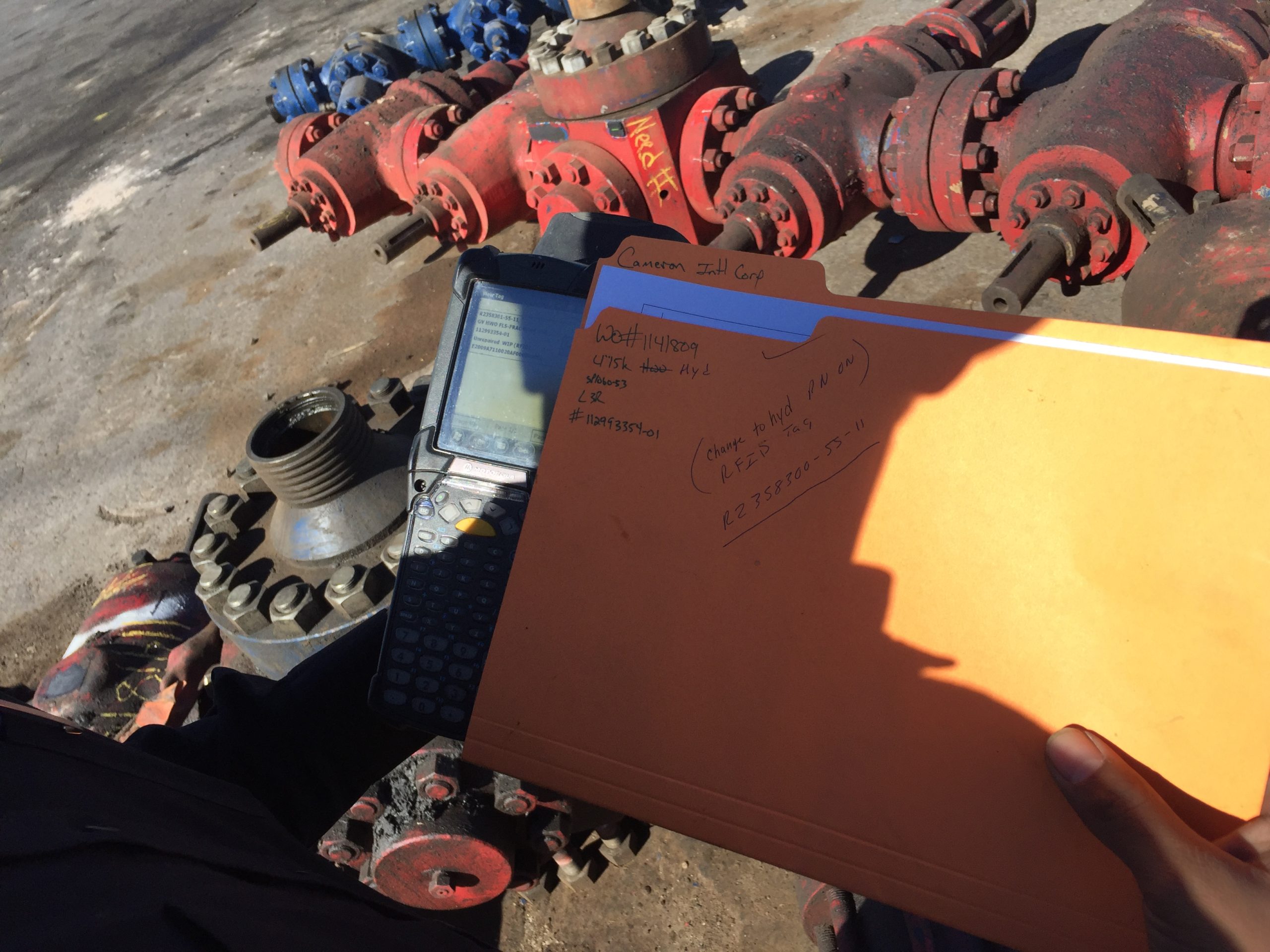
Old Scanner with Paperwork
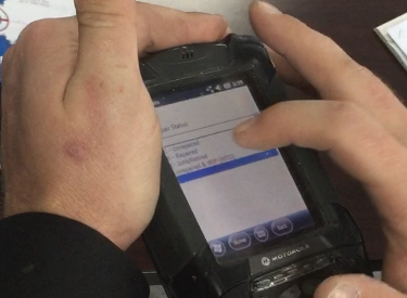
Old Scanner
DEFINE
Personas: Characterizing the User-base
Created 3 distinct personas They mostly aligned with different Coordinator job roles and combined with some general characteristics about the entire population. Do to the small sample size, we were unable to generate true personas based on behavior differences.
Different Types of Coordinators were the Users Coordinator (aka operators) managed the movement of rental assets, located at various bases across the USA and Internationally. They consisted mostly of full time users with senior staff and managers responsible for the optimal usage of inventory being more part-time users.
Primarily Targeted the “Asset Coordinator” Doing so would mostly address the user needs of the 2 other personas. Furthermore, the Asset Coordinator would deliver the most value since they represented the majority of the userbase, they’d be using the app the most and they were novice users, so would benefit the most from an optimal UX.
Sample Persona
Asset Coordinator 40-50 users Use the scanner the most compared to other personas. Novice User
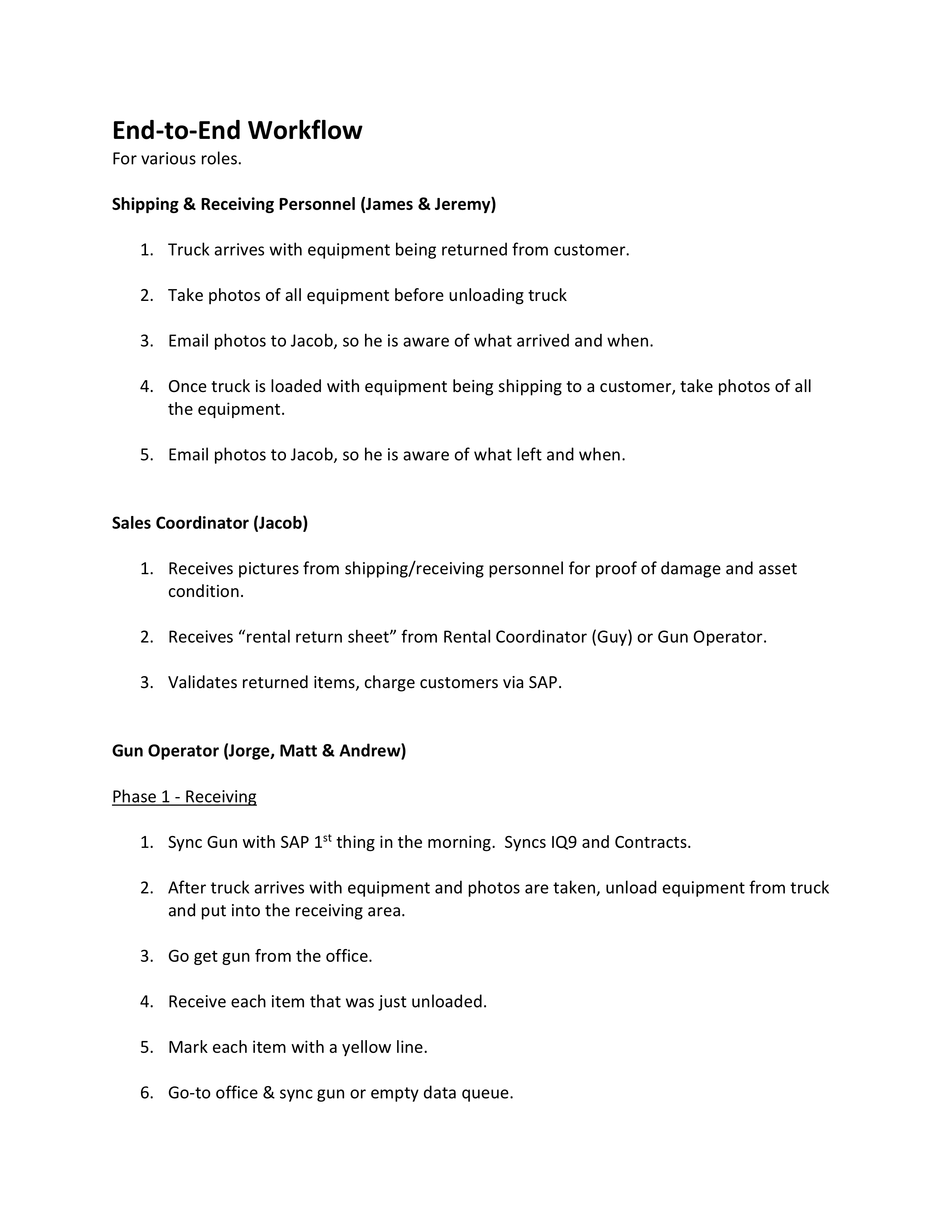
End-to-End Experience: Understanding The Process of Renting Equipment
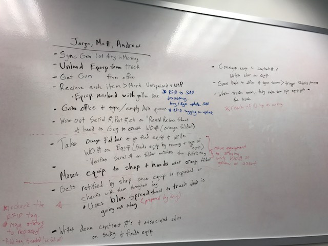
We captured the sequential flow of tasks & activities that different users executed to move a piece of equipment through its lifecycle.
Receive > Repair > Ship. Repeat Again This was a simplified representation of the cycle equipment went through during its lifetime.
Technicians Had Handoffs & Touchpoints w/ Other Teams Logistics, Maintenance and Sales were all involved at different points to coordinate different aspects of the rental. Asset Coordinators moved around the base in certain pattern depending on the equipment’s status through-out the day depending on the urgency, size and volume of rentals.
Paper-based Workarounds enable transactions Paperwork was used to fill gaps when the scanner didn’t provide data they needed when transacting. Sometimes users had to trek back to desktop systems to get data such as Work Order No., Equipment Status or Receive Status, interrupting their current task and wasting time.
End-to-End Workflow Whiteboarding
End-to-End Workflow
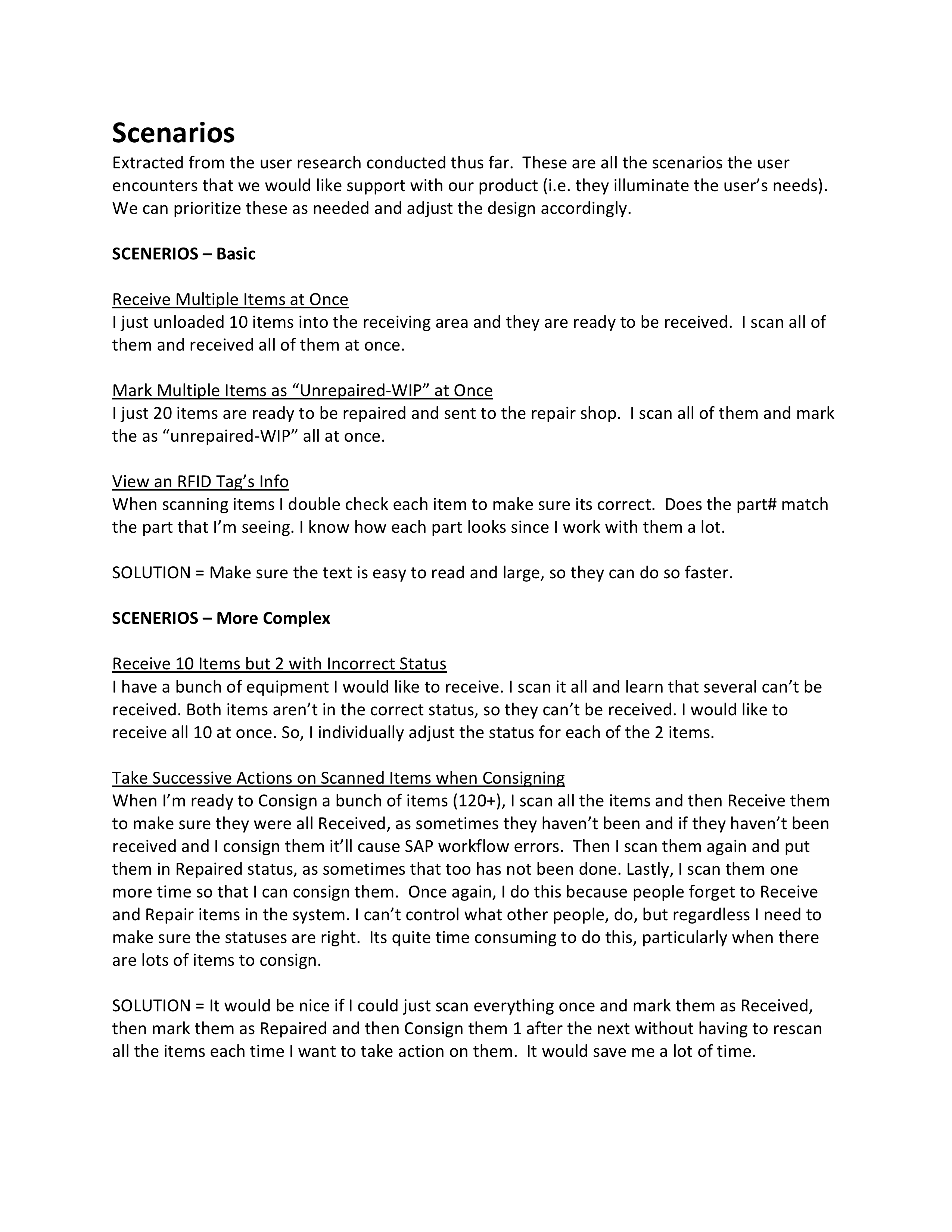
Opportunities: Areas Where the System Could better Support Users
There was plenty of variance in the tasks & activities the users were executing, so I captured those nuances in a series of scenarios to ensure we accounted for all the key user needs and pain points uncovered. Some of the learnings from the captured scenarios included:
Scenarios
Workflows involving Different Sets of Equipment are Interspersed with Each Other Usually users would execute 1 type of transaction on a set of equipment, then conduct a different transaction on another set. Sets of equipment were at different stages and moved along at different paces. As opposed to conducting all the transactions for a given set of equipment successively, before moving on to the next set of equipment. This is due to client priorities, the erratic nature when equipment arrives and other factors.
Tag Correction Tasks Interrupt Workflows Regularly Occasionally users encountered incorrectly tagged equipment mid-workflow and needed to correct the tag in order to proceed. However, the system required them to reverse out of the workflow, conduct the fix and then restart. This wastes alot of time, particularly when you are scanning a set of equipment with a 100+ pieces and only a few tags need to be fixed.
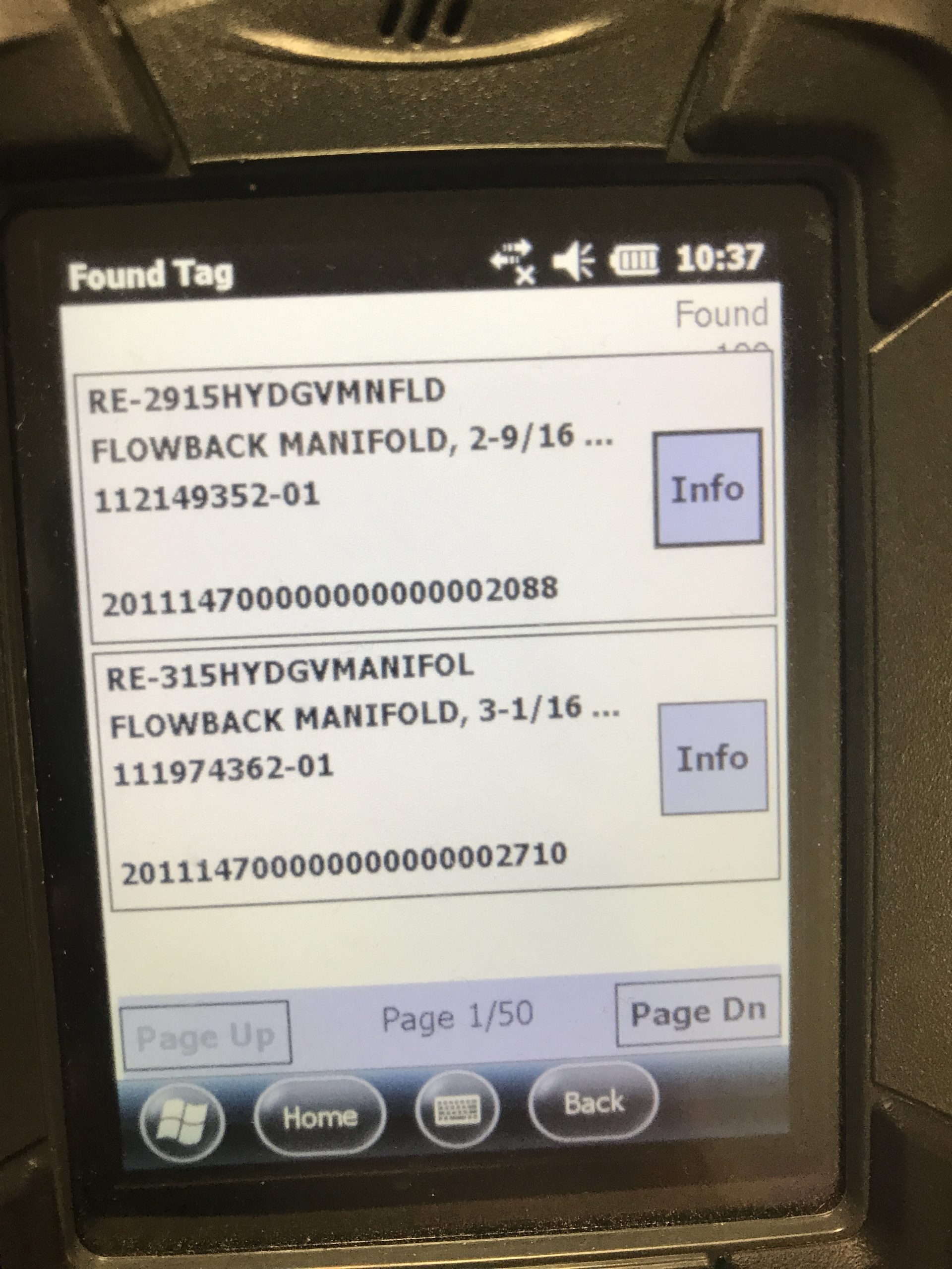
Execution of Redundant Transactions wasted time. Users conducted many unnecessary Receive transactions, because they didn’t know if they or another operator had already Received the equipment. The system didn’t indicate so, hence they couldn’t trust it.
Pain Points: Areas of Friction About the Experience
After synthesizing our observations & learnings, we correlated them with the businesses identified pain points & requirements some of themes included…
Resource Intensive User Onboarding The few senior resources were being tied up with preventable and training related issues, due to regular staff turnover and novice users.
High Volume of Preventable Workflow Errors Regular staff turnover meant more novice users who aren’t familiar with the best practices combined with a system that didn’t encourage & enforce proper behaviors, leading to unnecessary errors. These errors consumed the time of senior staff members and blocked operations.
Unreliable & Slow Syncs of Inventory Data SAP syncs failed for extended periods of time, were prohibitively slow or didn’t contain the most up-to-date data. They were manual, required daily and users would forget to initiate them. As a result, they’d have to work with out-dated data, which resulted in additional errors & clean up or they would have to do transactions manually, super cumbersome and a time sink!
Reduced Data Integrity The lack of input validation with screens and keyboards that made it easy to enter incorrect data, combined with a lack of quick search capabilities & serial number validation caused downstream errors in data.
IDEATE
Information Architecture: Establishing an Optimal Structure & Flow
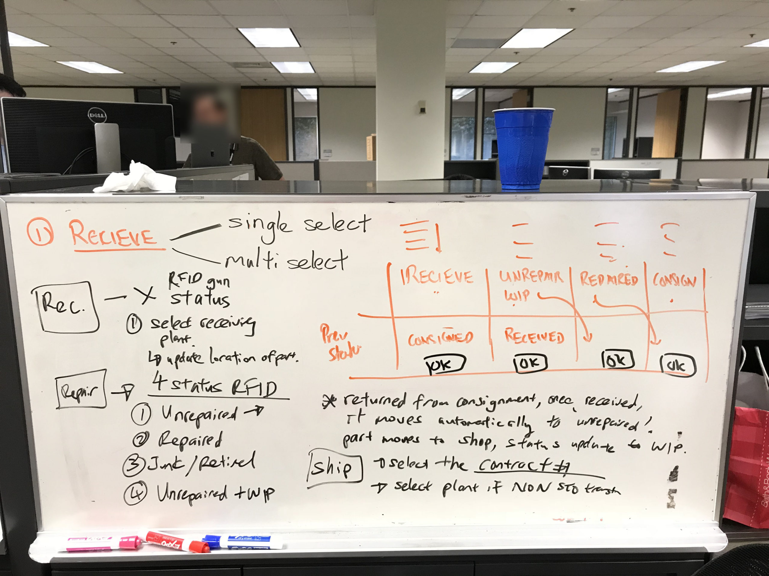
Informed by the research, we kicked off some divergent ideation with quick whiteboarding, coming up with 2 different approaches to app structure and navigation. The tradeoffs were significant and fairly complex to assess, with the 2nd approach being hard to visualize & communicate on a whiteboard.
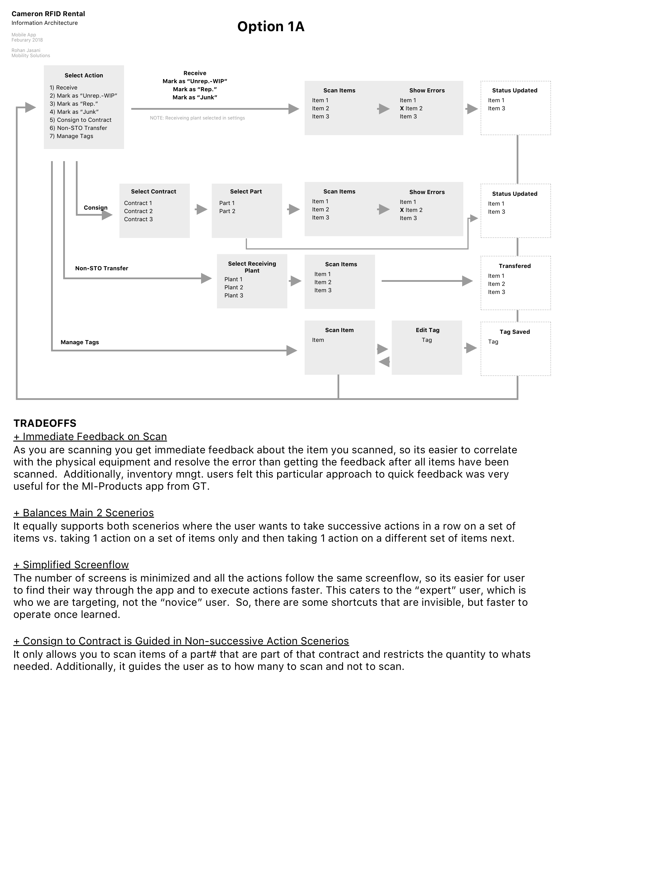
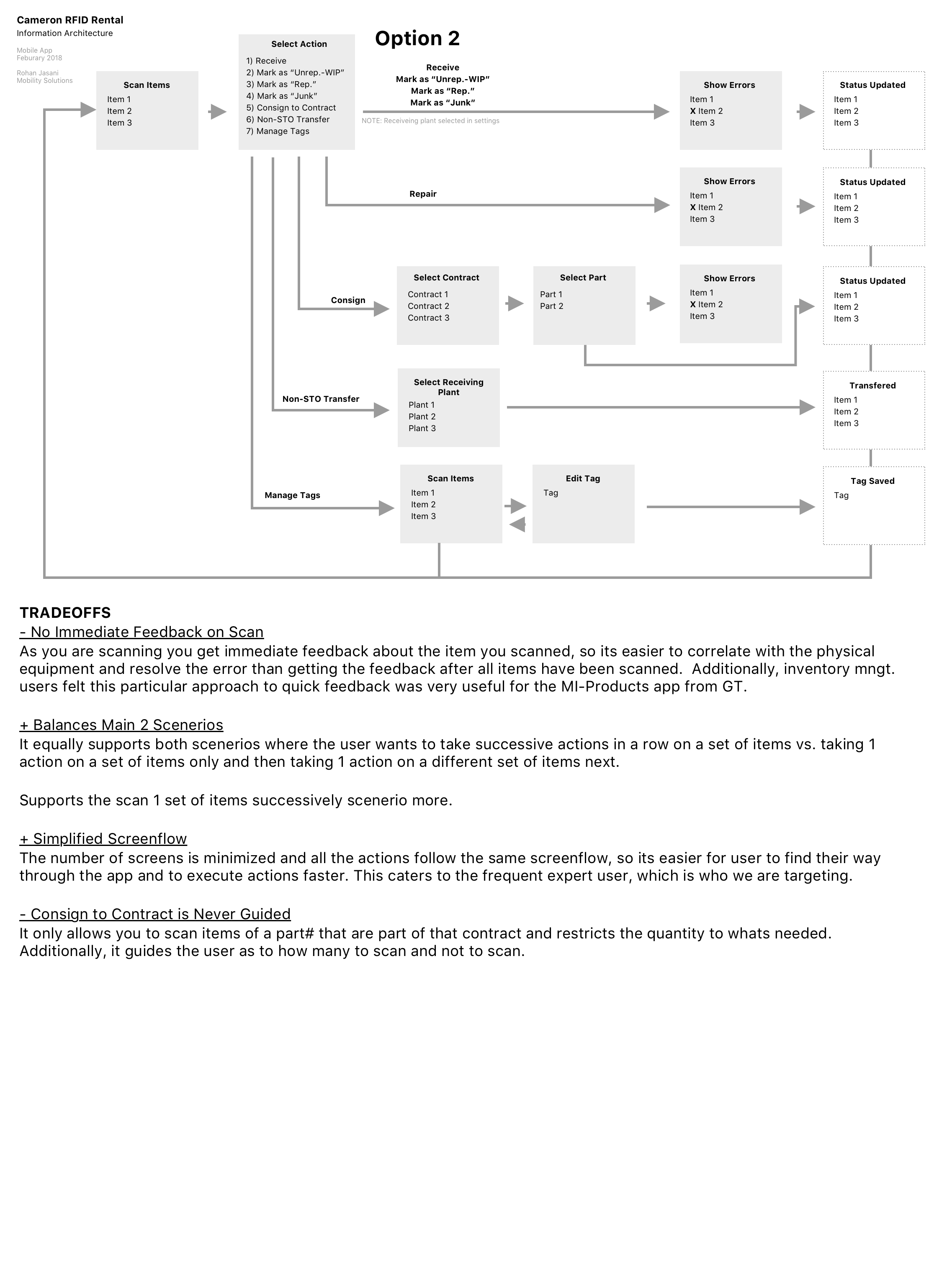
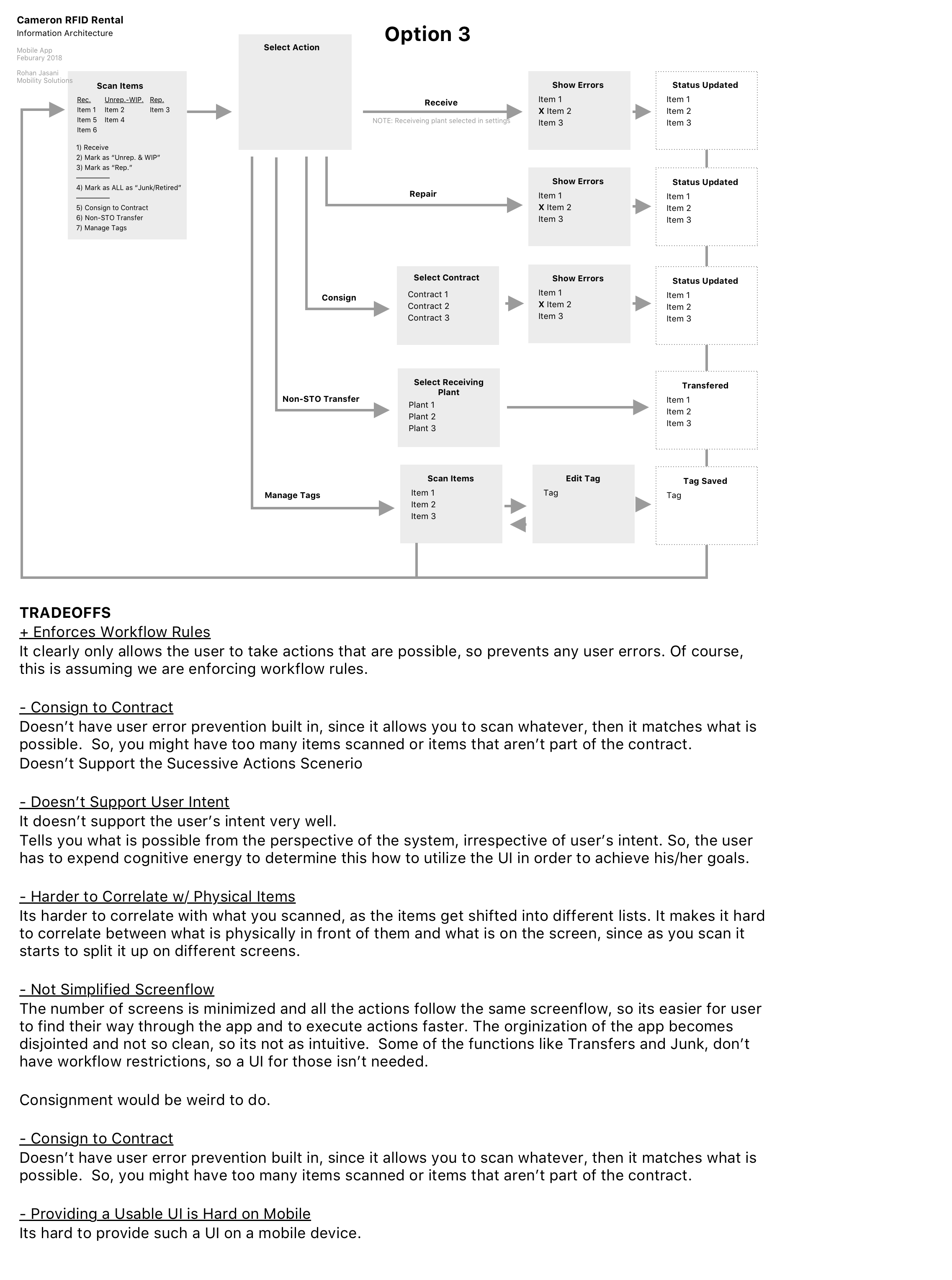
I diagramed both IAs more formally in Sketch, added a 3rd approach and laid out the tradeoffs, so the team could clearly decide on a way forward.
Whiteboard Sketch of IA Design 1
Whiteboard Sketch of IA Design 2
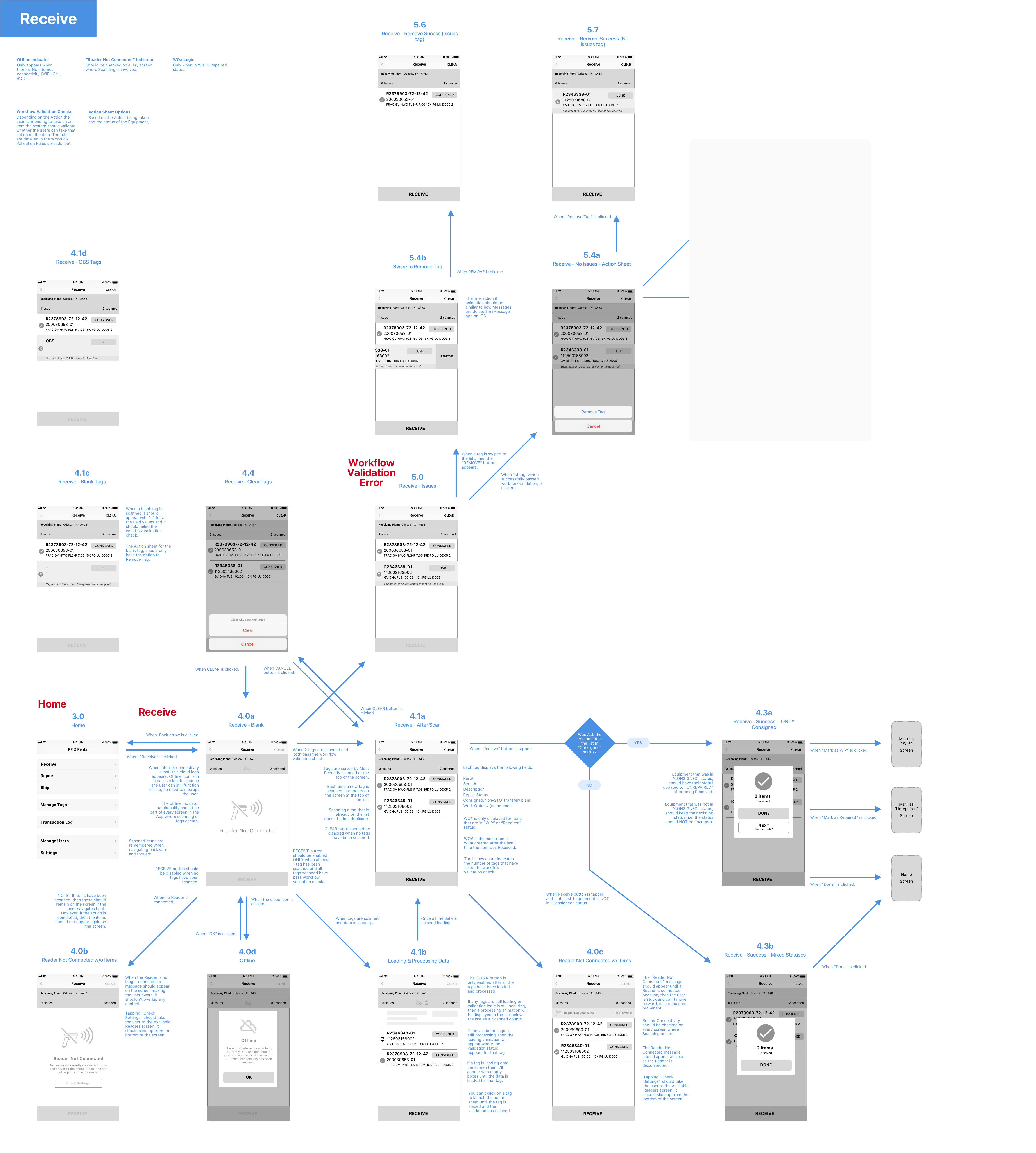
IA Design 1: Supports User Intent from the Start Users would choose the action they wanted to take, then scan equipment and immediately see errors. Its gave the user control and it allowed them to easily figure out how to resolve each error.
IA Design 2: Supports User Intent Later Users would have to first scan all the equipment then choose an action, then see errors. It didn’t provide the error feedback immediately upon scan, making it hard to correlate a tag with an error onscreen with the physical equipment associated with it.
IA Design 3: Supports System’s Intent More than the User’s Assumed that the user would scan equipment, then the system would tell them what action they can take on which pieces of equipment. But this takes the control away from the user, not supporting their intent/goal. Users knew what action they wanted to do with the equipment, if they couldn’t do it, they needed to know why, so they could resolve that and move forward. We needed to lead with that.
IA Design 1
IA Design 2
IA Design 3
Information Architecture: Oops! Backtrack & Iterate Some More
It was clear Approach 1 was the way to move forward. However, as I built out the screen-level interaction design I quickly realized the design didn’t exactly match the way the users worked in several different areas:
Frequency of Certain Workflows Not Accounted For Certain actions were given equal weight in the design, when in reality certain actions were more important and were conducted more frequently than others. Transactions like “Mark as Junk”, “Non-STO Transfer” & “Manage Tags” were conducted less frequently than “Receive” or “Mark as WIP” transactions.
Organization of Key Workflows Not Aligned with Business Processes They didn’t mirror business process naming and organization used in other business systems, making it harder for users to understand and quickly related to.
Transaction Success Not Clear The confirmation feedback approach was too subtle and not prominent enough. Coordinators faced lots of distractions in the yard when transacting and it was important to get clear confirmation before moving on, since transactions quite interdependent.
Initial Wireframes
I updated the wireframes and made sure the design met the identified scenarios and documented the tradeoffs between them. I presented all of this to the team and we moved forward after a lot of discussion.
Ideate + Prototype
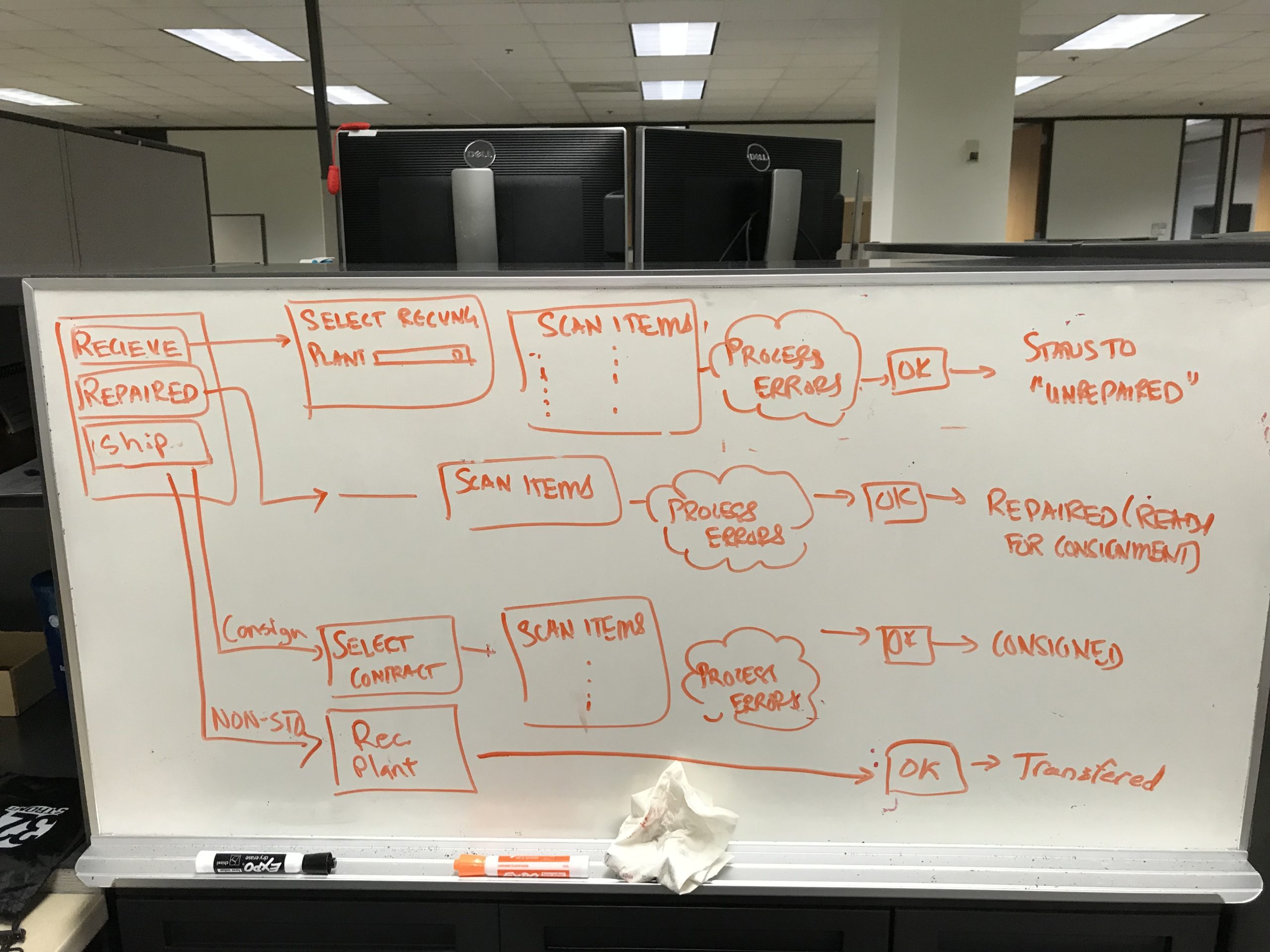
Interaction Design: Nailing Down the Screen-level Behaviors
We moved on to ideating the interaction design for each of the screens. We whiteboarded the flows just to iron out the major kinks in an easy to review & edit format.
Interaction Design of Manage Tags Workflows
Interaction Design of Receive, Repair & Ship Workflows
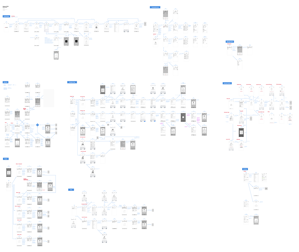
Next, I started to build out the screens and flows in Sketch, one flow at a time, adding all the necessary details to communicate the design. I included different screen states, screen transitions, interaction specs and more. Additionally, as development for one transaction was going on, the design for the next was occurring. Truly iterative, if I had to say so myself 🙂
Each screen and flow was design reviewed multiple times by Solutions Architects and Product Owners generating feedback that resulted in close to 40 versions of the wireframes!
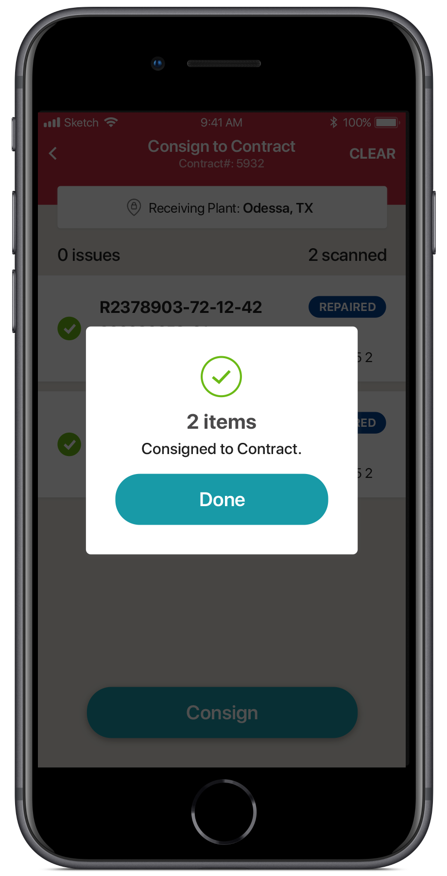
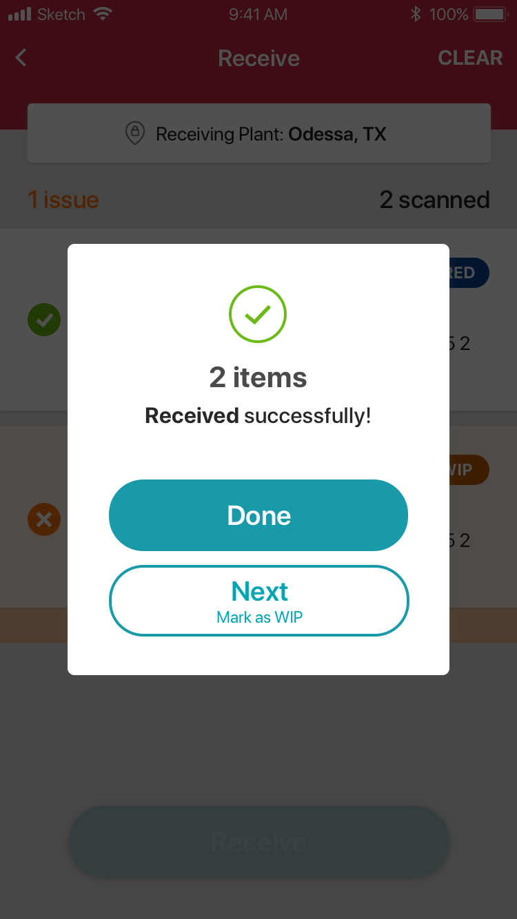
Success Confirmation for Receive Transaction
Here is a sample of the research-back design decisions that went into the Transaction Confirmation screens:
Explicit Success Feedback w/ Required Acknowledgement Blocking the entire screen and asking for an acknowledgement ensures they user knows the transaction was a success.
Visual Indicator of Success (Check Mark Icon) Users can quickly determine the transaction was successful, crucial when users are flying through transactions during a busy day.
Confirmation of Transaction & Quantity Users conducted lots of transaction during the day, so indicating which one they just conducted and on how many pieces of equipment, enables them mentally to double-check they are operating in the correct context (i.e. right set of equipment, right customer, right step in the process, etc.)
Large Tap Targets Full width buttons of adequate size make it easy & fast to tap for users on mobile.
Text-based Buttons for Clarity Text is quicker to recognize and understand for non-standard actions.
Sampling of different low-fidelity mockups from the wireframes.
Wireframes for Receive Transaction - Release 1.0
Wireframes for All Workflows - Release 1.0
Test
User Testing: Mitigating High UX Risks
Due to the complexity of the system and the UX risk involved with certain aspects of the design, I spent some time to validate those pieces. I conducted remote user testing with 2 end-users. Not near the recommended 5 users I needed, however, this is what I could get my hands on in the time allotted. It was more than usability testing, since it validated certain needs and uncovered additional user needs.
Using an Invision prototypes of the design, I validated certain features, uncovered new needs and issues with the current IA and interaction design, some of which include:
InVision Prototype
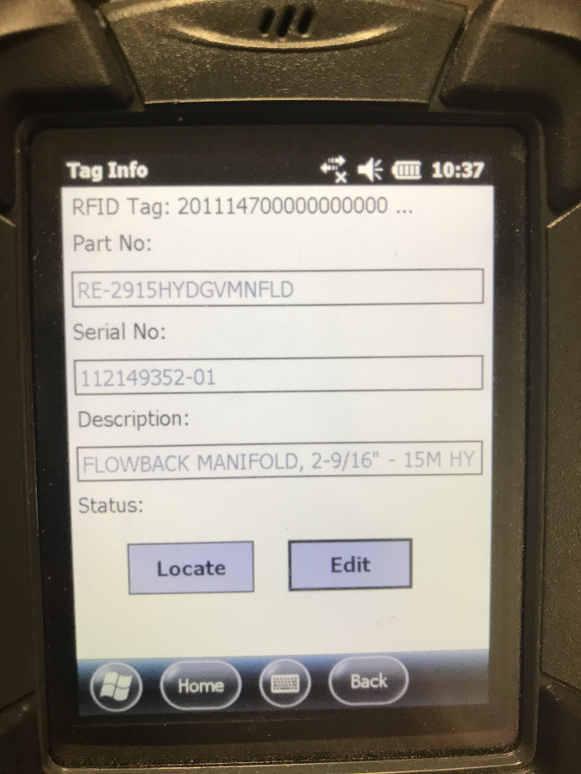
Don’t Make Users Reenter Serial No. Unnecessarily Usually when Editing a Tag, they are just changing the Part No., so having the Serial No. clear automatically, creates extra work for them.
Users need to be able to easily Edit Tags after Viewing them Combine the separate View & Edit tag screens, but giving users the ability to just View or Edit on the same screen, since its faster and a common occurrence
Button Text “NEXT” Too Ambiguous At the end of a transaction, instead of having a button say “NEXT”, explicitly state what the “next” action would be, as its not always understood by novice users.
In the usability report, I categorized the changes into Must-Haves & Nice-To-Haves, which ones required technical review and which required a review with stakeholders before proceeding. This helped quickly get decisions made and next steps moving.
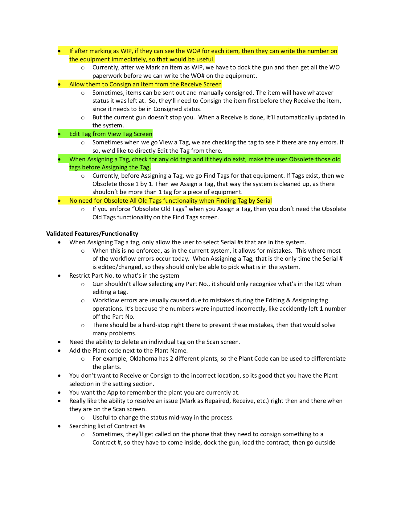
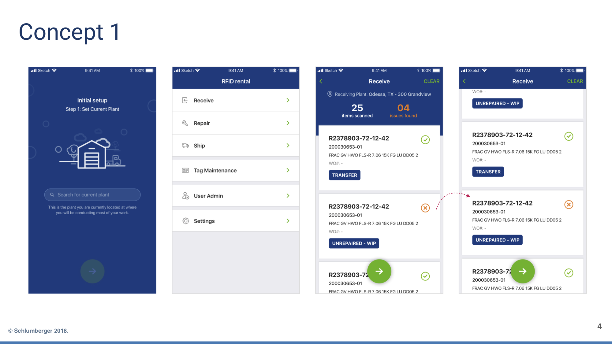
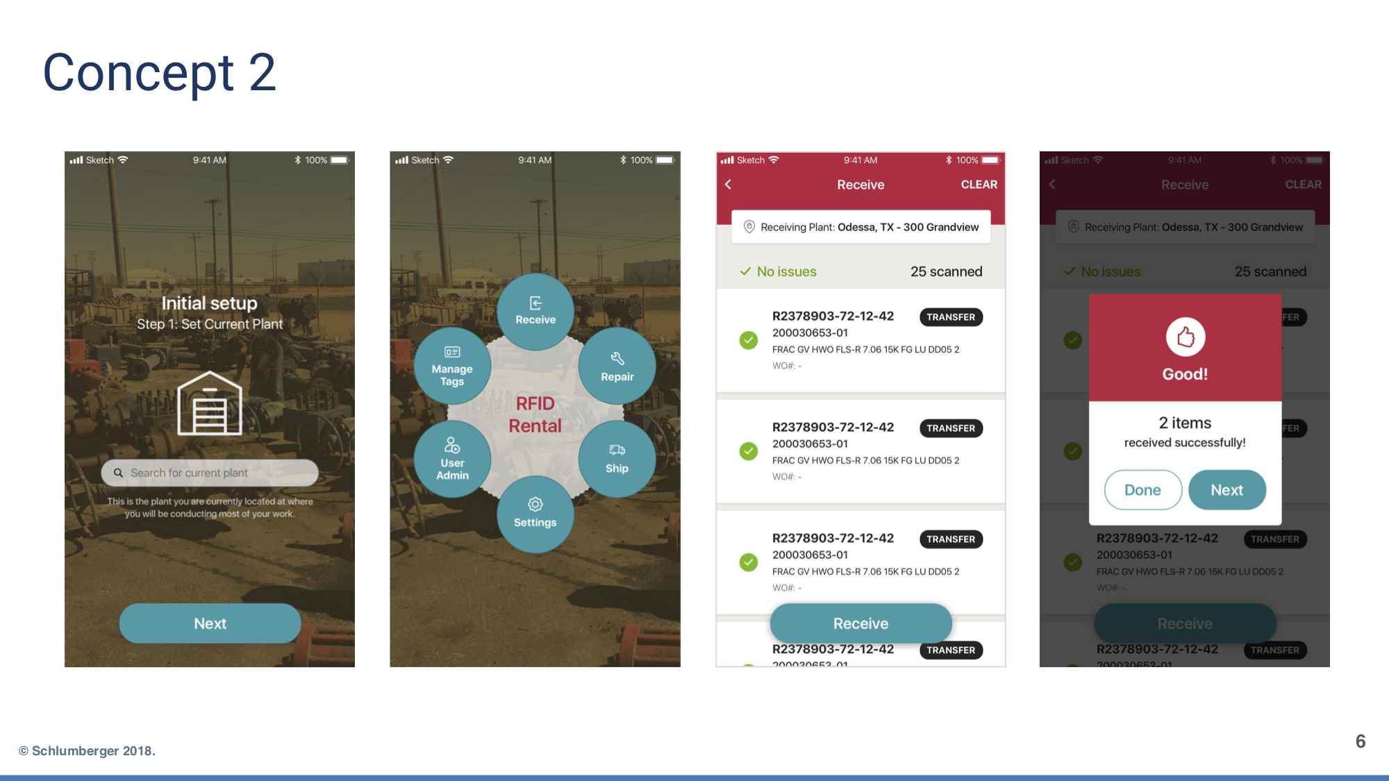
I provided the visual designer with a Design Brief based on the user research and design work that’d been conducted those far. I asked my visual designer for 3 different design concepts with design rationale, so as to diverge and fully explore design possibilities & the tradeoffs amongst them. I provided additional creative direction through several internal design reviews with the project team and then presented the final design to the client.
We chose Concept 2, for several reasons:
Matched the business unit’s branding
Supported the way the user would scan the screen (i.e. from left to right)
Displayed only the most relevant info.
The call-to-action was large enough and distinct compared to other UI elements, sitting at the top of the visual hiearchy.
Used the screen real estate the most efficiently.
After the general direction was selected over time we made tweaks to the visual design as needed and it evolved a bit more.
VxD Concept 1
VxD Concept 2
VxD Concept 3
Visual Design: Optimizing for Speed
iOS Platform Conventions for Greater Usability The design leveraged basic iOS conventions, since it was a utilitarian app intended for high volume repetitive tasks. These patterns are simple and most recognized on the iOS platform, since all the stock apps use these patterns.
A variety of other details in the UI supported usability in various ways:
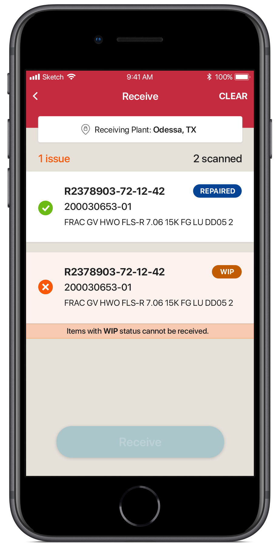
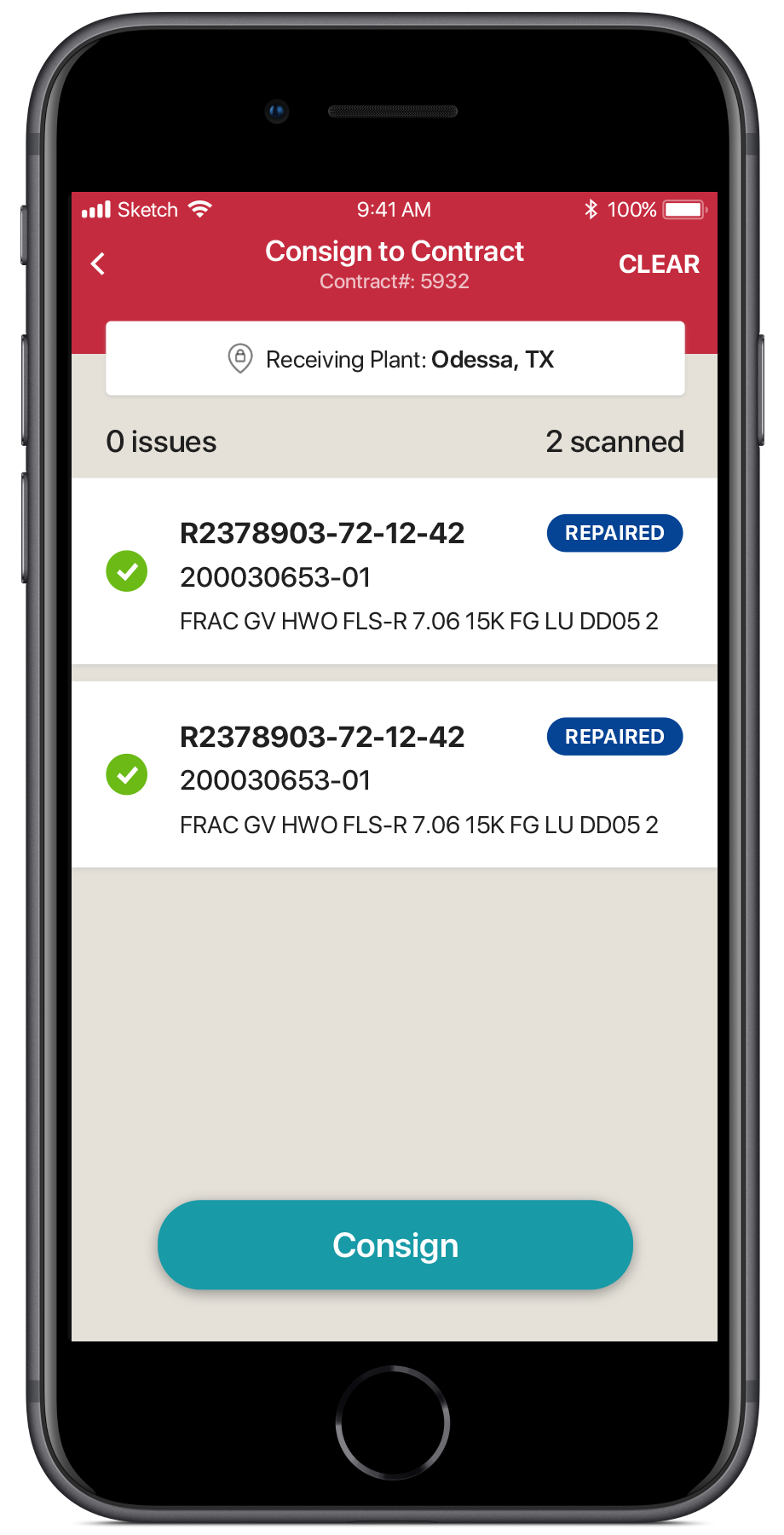
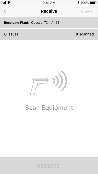
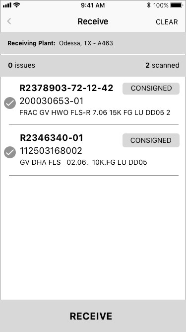
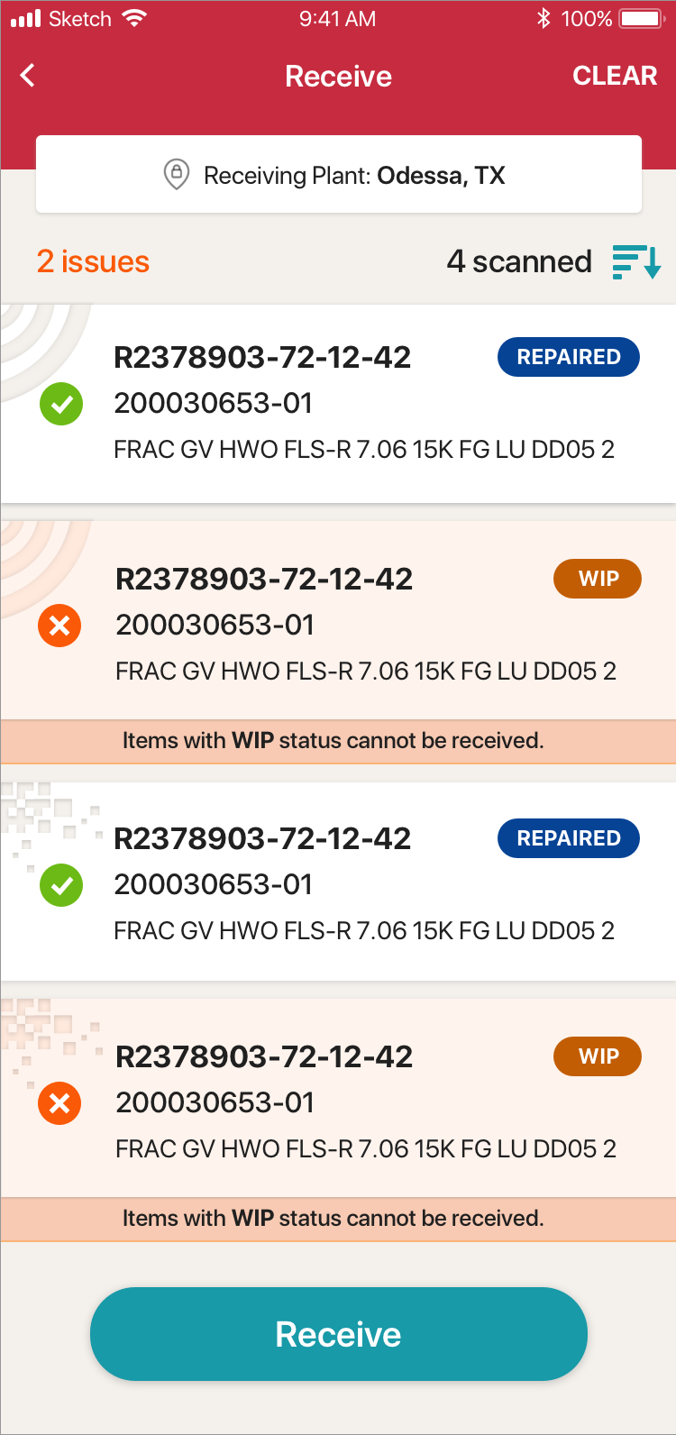
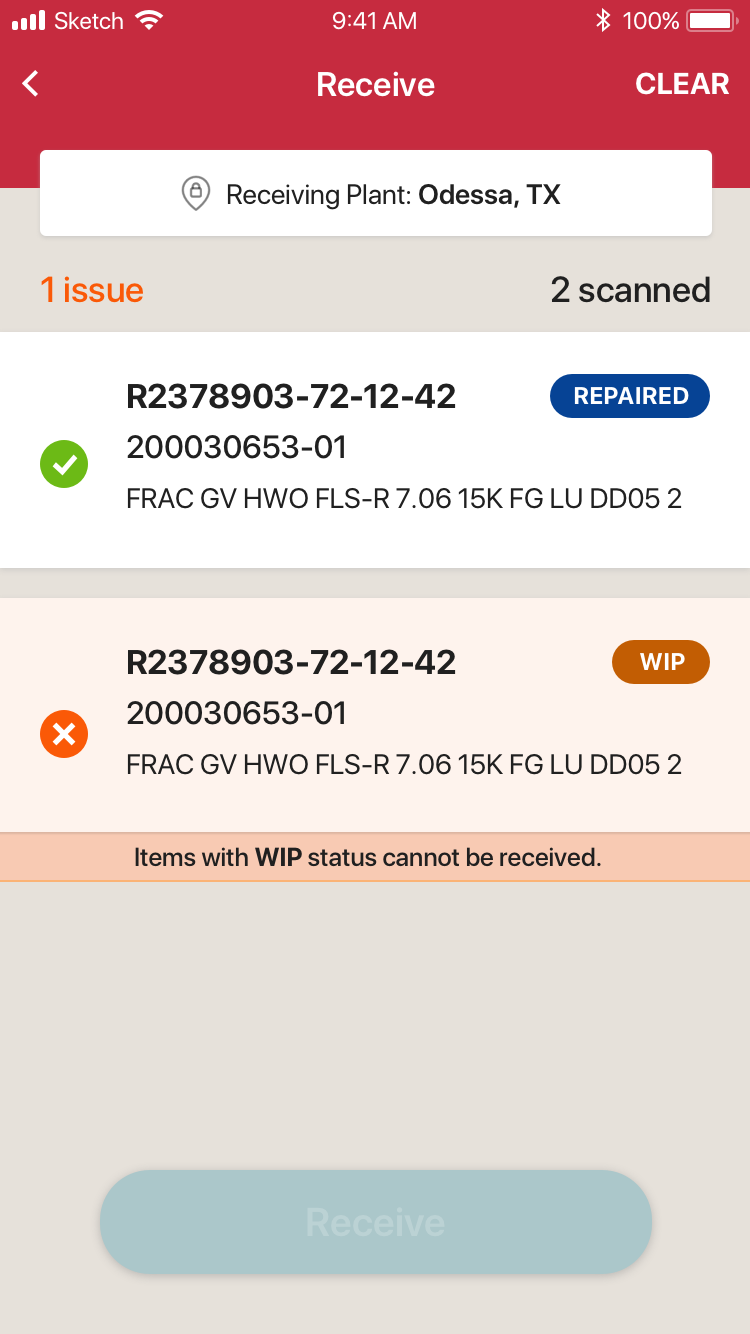
Receive Screen with Scan Errors
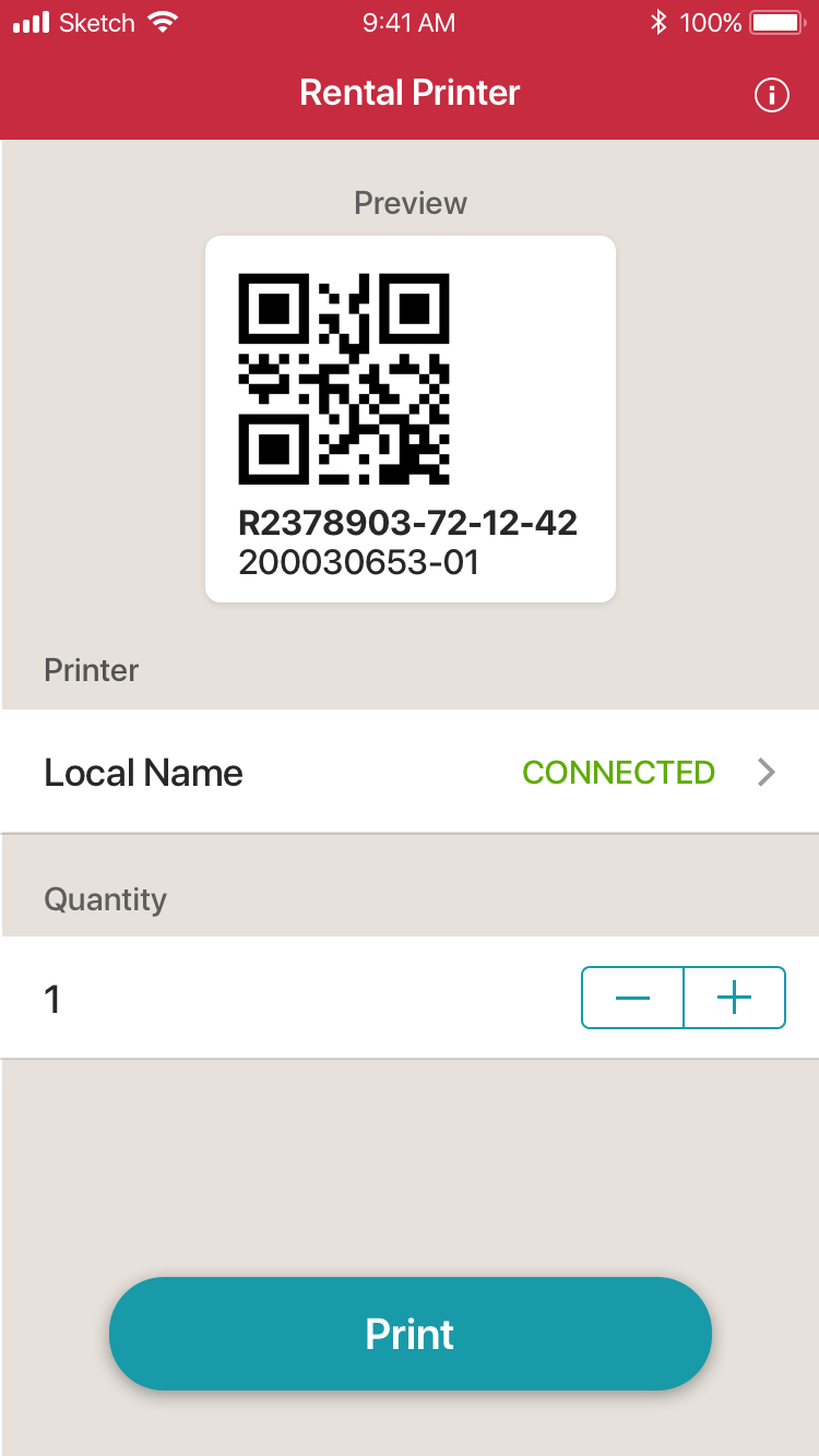
QR or RFID Watermark Enabled an additional and quick way to validate that the equipment the user intended to scan was indeed scanned. Additionally, provided a quick way to review the list of scanned equipment when double-checking the transaction prior to execution.
Z-Shaped Pattern Layout Task blocking errors on the left, equipment info in the middle and status on the right with CTA at the bottom. All this supports optimal way users scan screens.
Proximity-Based Error Message Errors associated to a tag appear as though they are part of the card UI element that represents the tag.
Accented CTA at Bottom Keeps it close to the fingers.
Leverage iOS Platform Conventions for Usablity Putting text-based actions in the top bar, using chevrons for back buttons, etc.
Final Product
Overview video of the main workflows.
Play Video
Features
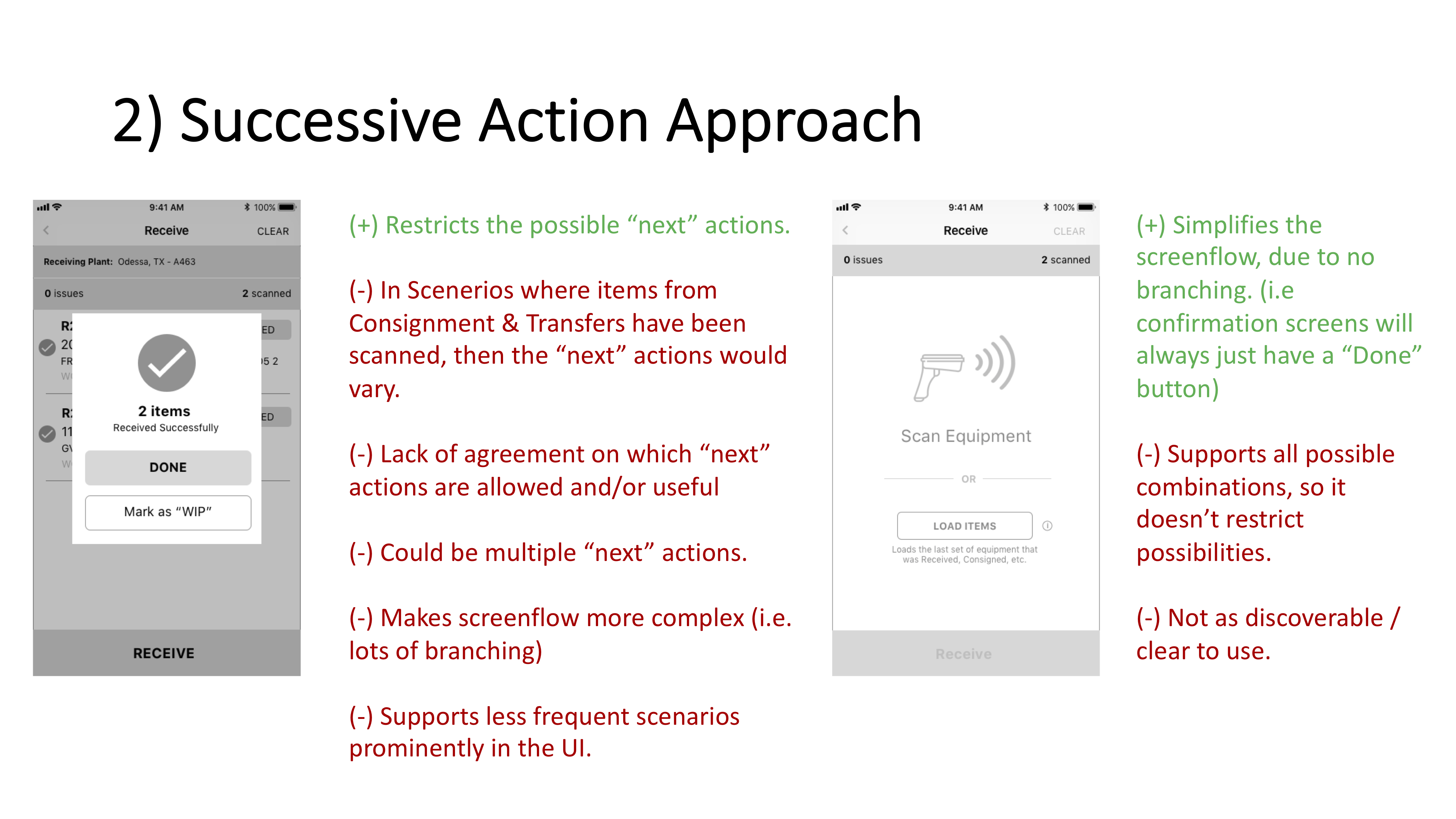
Task Accelerator: Speeding up Consecutive Transactions
Sometimes users need to quickly move a set of equipment (~100+ pieces) through several transactions, consecutively. Providing a simple task accelerator to allow them to scan the 100+ pieces once and execute multiple transactions on them, would save tremendous time.
Different Ways to Address the Need I designed 2 different approaches to addressing the user need documenting the pros & cons for each design to show the design rationale I used. I reviewed the approaches with the key stakeholder to get the business perspective, to validate them and then provide my recommendation.
Not All Transactions Needed the Accelerator For each transaction combo, I collected input from different users and correlated that with stakeholder & SME input to decide whether it should be available or not. This led to a simplified approach, instead of assuming all possible combinations were needed.
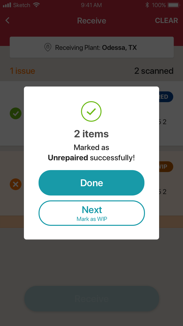
Next Action Screen
Successive Next Actions
Successive Next Actions - Options
“…we have the new choice to go straight to “consign to customer” status. Which is awesome! And by far one of my favorite things.“ – User
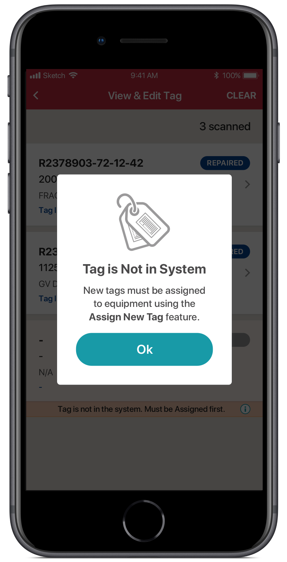
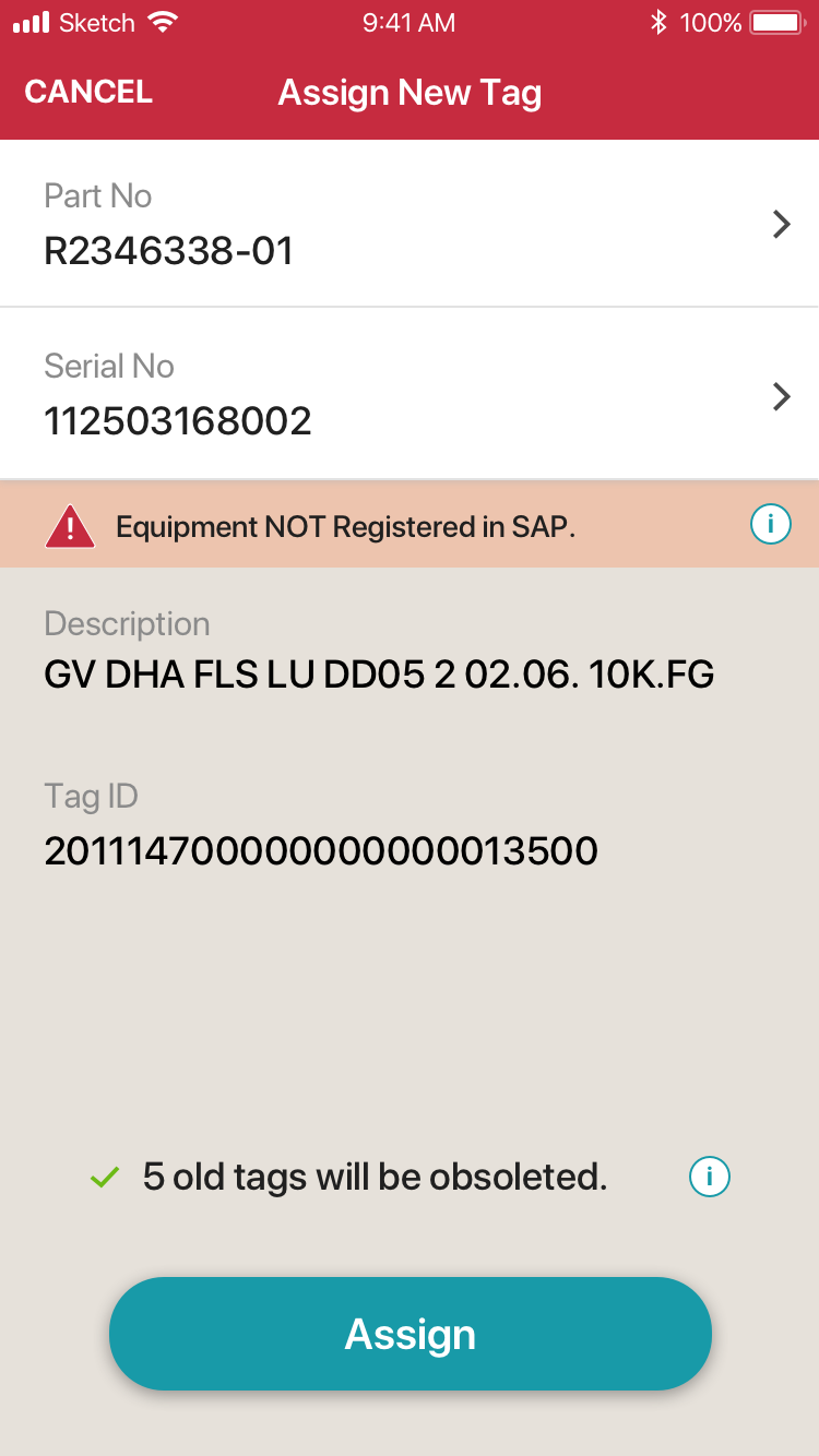
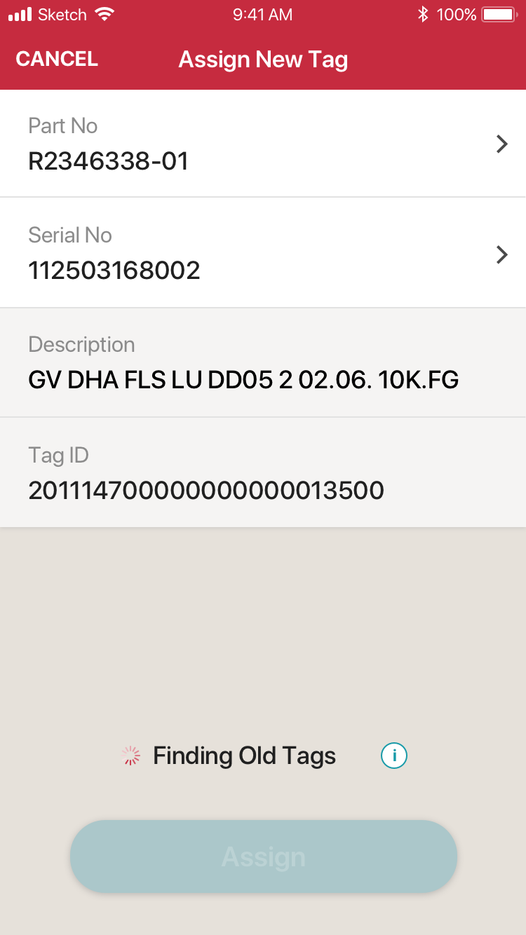
Automation: Eliminate Manual "Obsolete Tag" Tasks
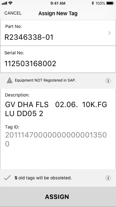
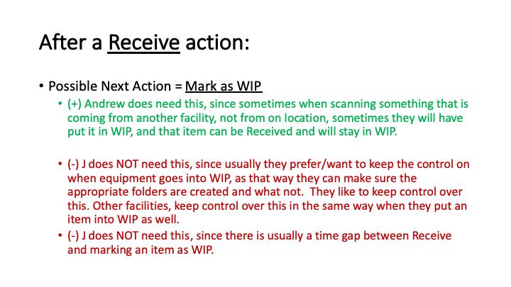
Users Don’t Obsolete Old Tags I learned through our SME interviews that, each piece of equipment should only have 1 tag. When users tagged a piece of equipment, they needed to manually remove (aka Obsolete) any tags already associated with the equipment. I learned from the field, many times users forget to do this because it required extra work and had no overt consequences to them if they didn’t do it. However, it impacted other users and the overall system’s data integrity & performance & troubleshooting.
When Assigning a New Tag, Automatically Obsolete the Old Tag I realized these 2 manual tasks should be executed one after the other (i.e. tied together), so we could have the 1st task automatically trigger the second. This would automate the Obsoleting of Old Tags when the user was Assigning a New Tag to equipment, ensuring old tags were always removed:
It would save the user time
Data analysis would be easier and more accurate, since old tag data wasn’t in the system.
Users can identify the correct tag much more quickly in multi-tag scenarios, since irrelevant data isn’t mixed in with good data. This led to reduced time-on-task for a frequent scenario.
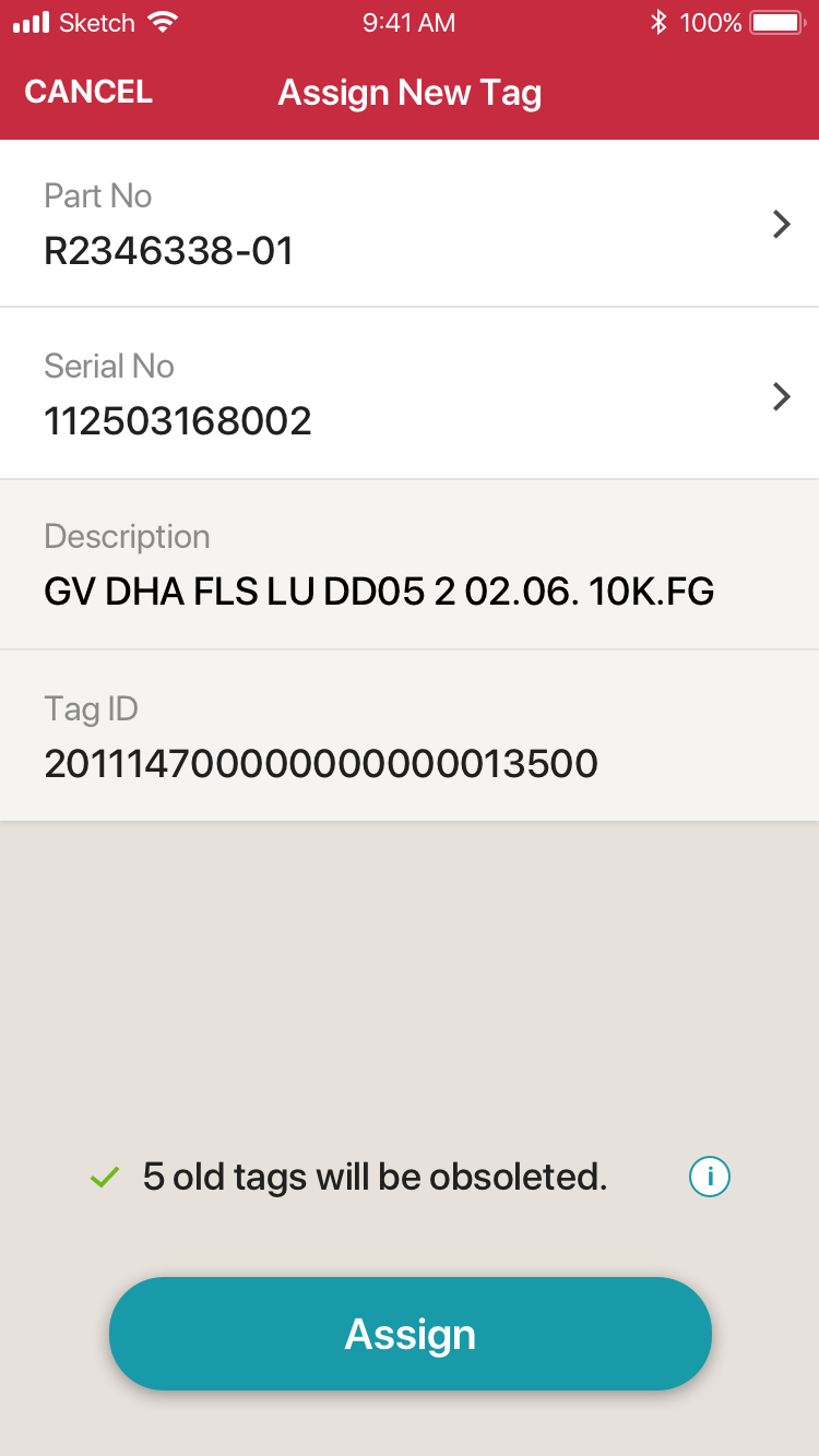
Automation - Obsoleteing Old Tags
Automation - Obsoleteing Old Tags - Found
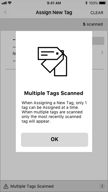
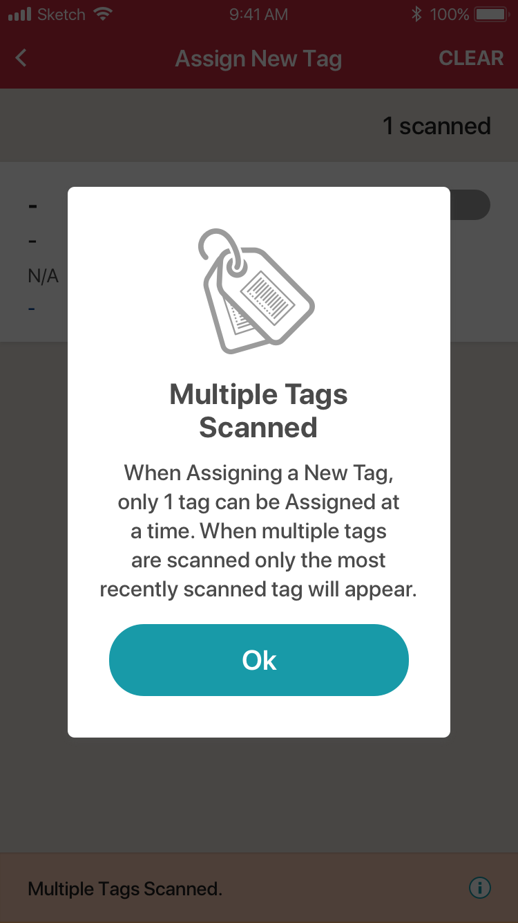
“It won’t let you create duplicate tags, which is great!“
– User
Error Prevention: Encouraging Proper User Behavior
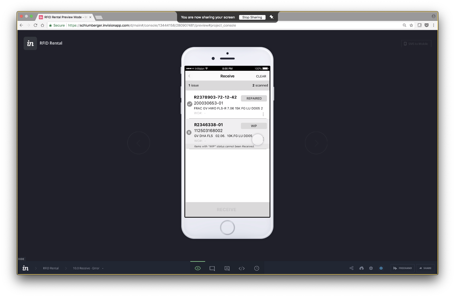
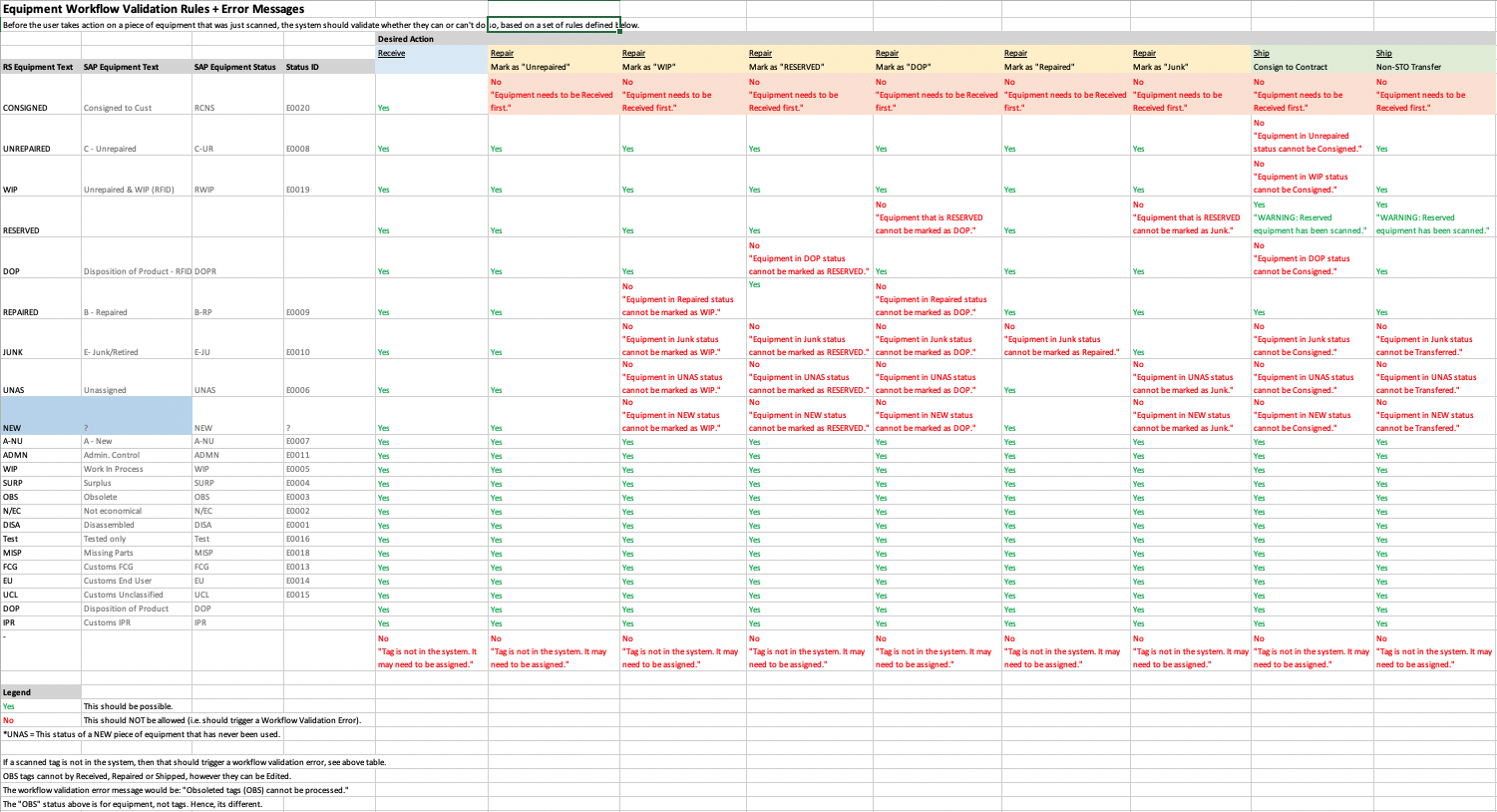
Lots of Preventable Errors As indicated earlier, lots of preventable workflow errors occurred and redundant Receive transactions were occurring. Many of the errors occurred because users didn’t follow a set of rules when deciding whether they can execute a particular transaction on a particular piece of equipment. The rules were based on the intended action and the status of the equipment, something we could easily program.
Simple Error Prevention Is All it Takes I documented all the rules in the app and everytime a user intended to conduct a particular transaction on a set of equipment, we would let them know if they could or could not and why, resulting in several benefits:
Reduced SAP workflow errors which reduced support time for senior staff.
Reduced transactions from blocking the movement of equipment to the “ready to rent” stage (ie. greater equipment availability)
Trained users on the rules of the system.
Receive Screen with Scan Errors
Equipment Workflow Rules
System Availability: Minimizing Blocks to Operations
A variety of features were added to improve system availability
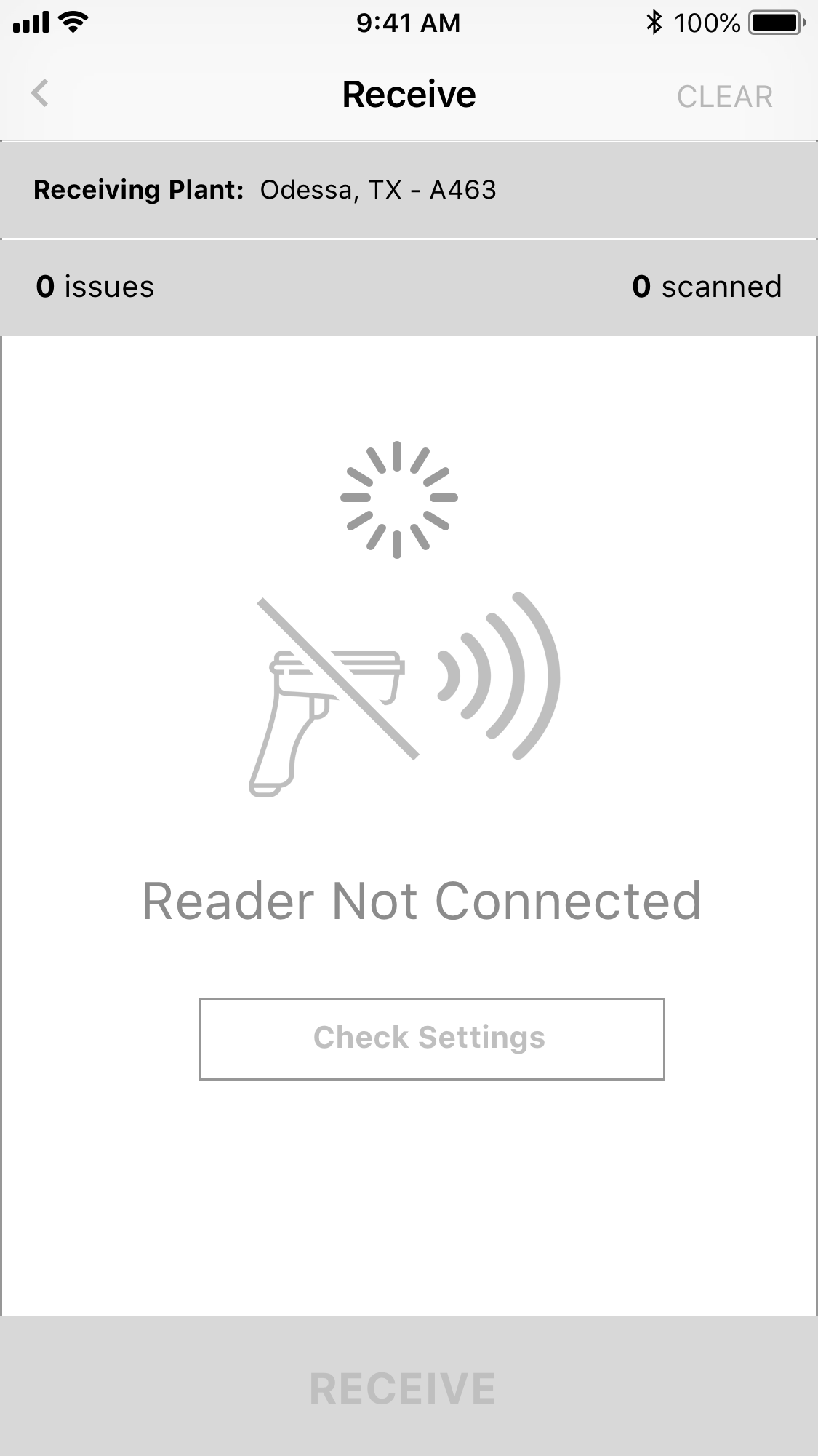
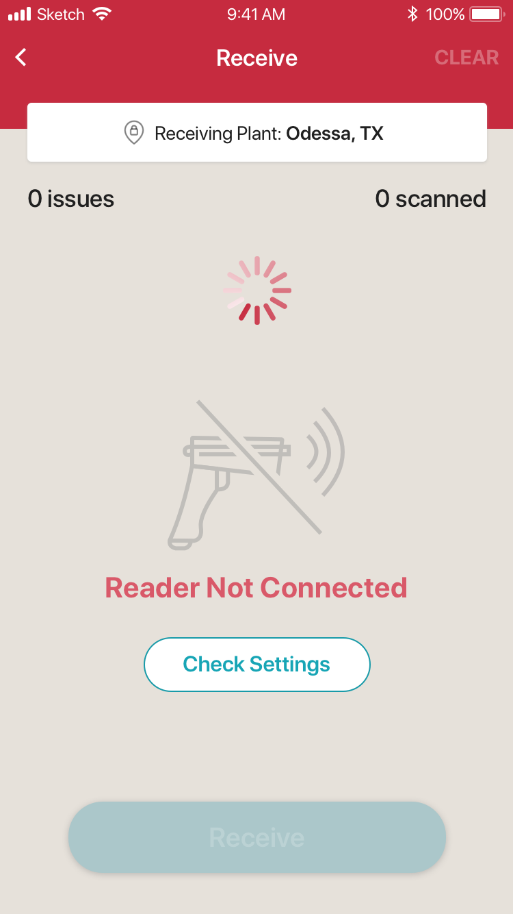
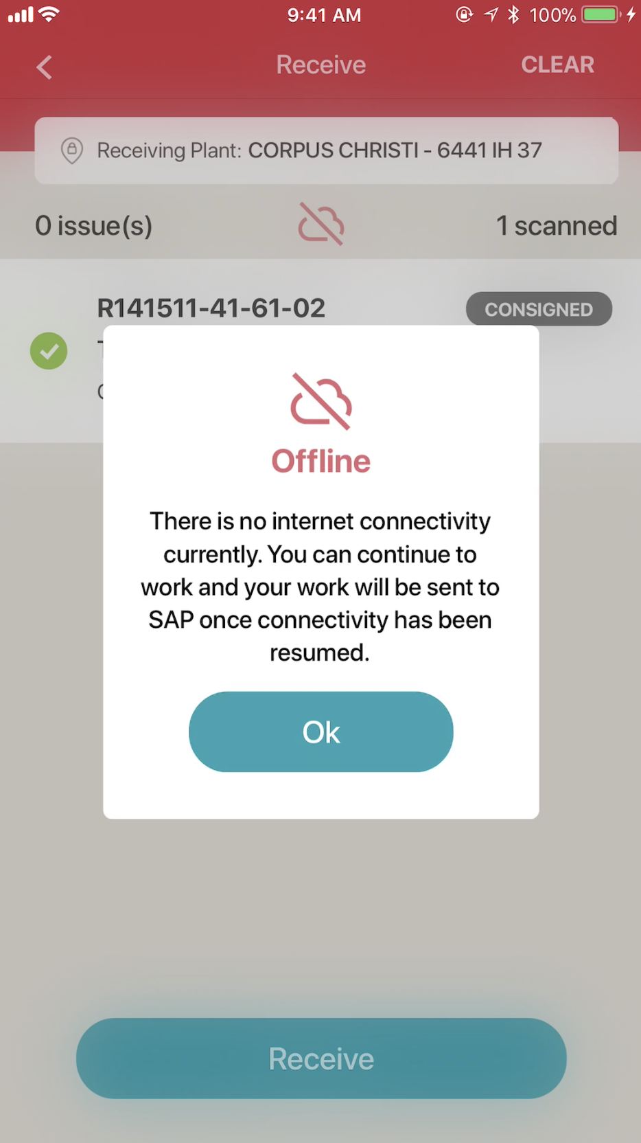
No Connectivity. No Problem Users could seamlessly work online or offline without being blocked and data would sync automatically in the background. Logins could also be conducted offline.
Fresh Data Always Through Automatic & Frequent Syncs The app conducted regular & faster syncs (every 5 min., as opposed to once a day) and we informed the user when they occurred to reflect the freshness of data.
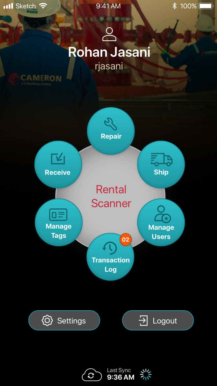
Easily Track Actions for Faster Troubleshooting A Transaction Log containing a history of all transactions executed from the scanner, sped up technical troubleshooting, particularly important since data was traveling through multiple systems. Specifically, the tracing of which statuses equipment has passed through and when, became quicker & easier to access.
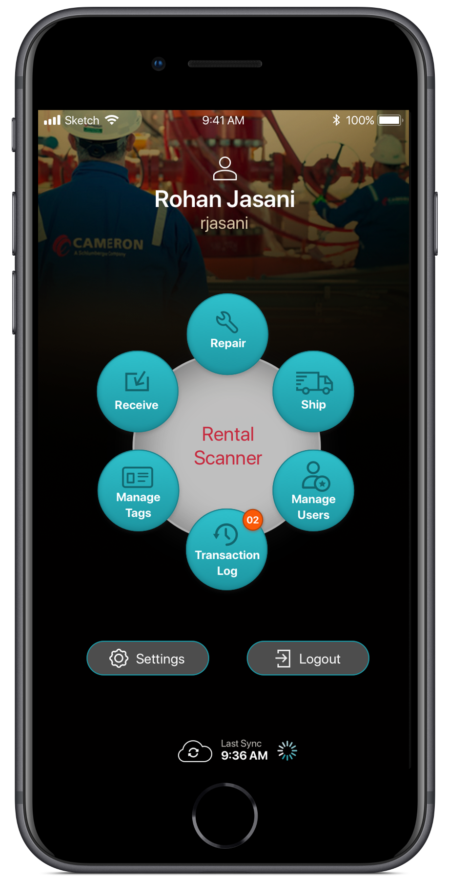
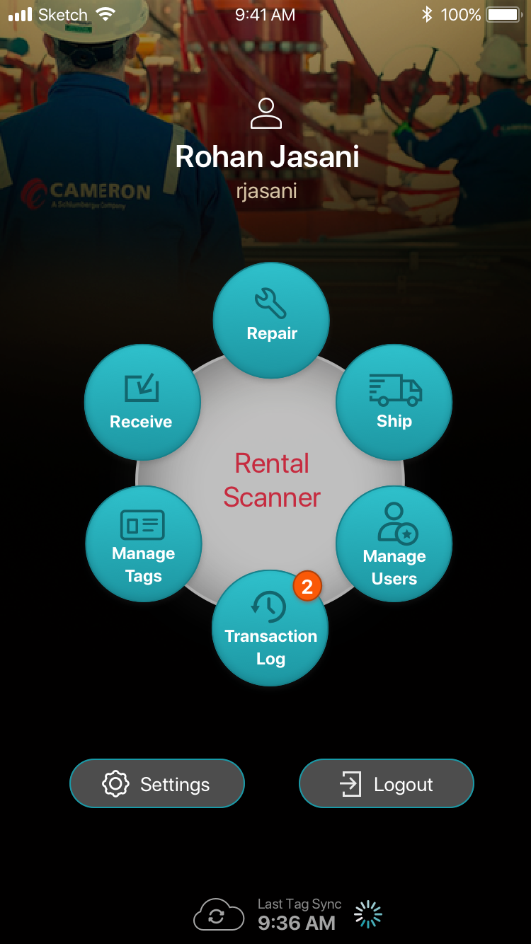
Home Screen
Transaction Log
Training & Support: Incremental Learning Through In-context Help
Given the frequent operator turnover and excessive time senior staff were spending on training and support, we added various elements to improve the user-onboarding experience at key points throughout the app.
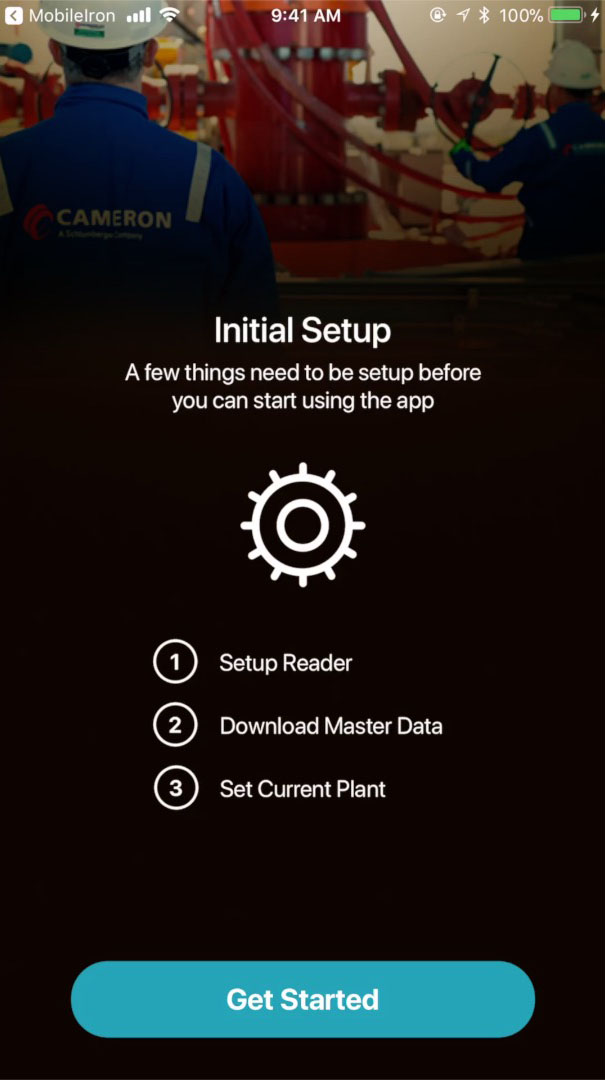
Initial Setup Wizard An easy to use wizard helped novice users quickly install & setup the device. Incidentally, this proved even more handy, whenever there was a show stopping bug. The temporary fix was to reinstall the app until a fix was developed. The friction associated to a reinstall of the device was minimal making this a relatively acceptable solution for users.
In-context Help + Thoughtful Microcopy Both really helped users incrementally learn, without much support, how to operate the app, what particular functions & pieces of info meant and the workflow rules enforced by the app.
Play Video
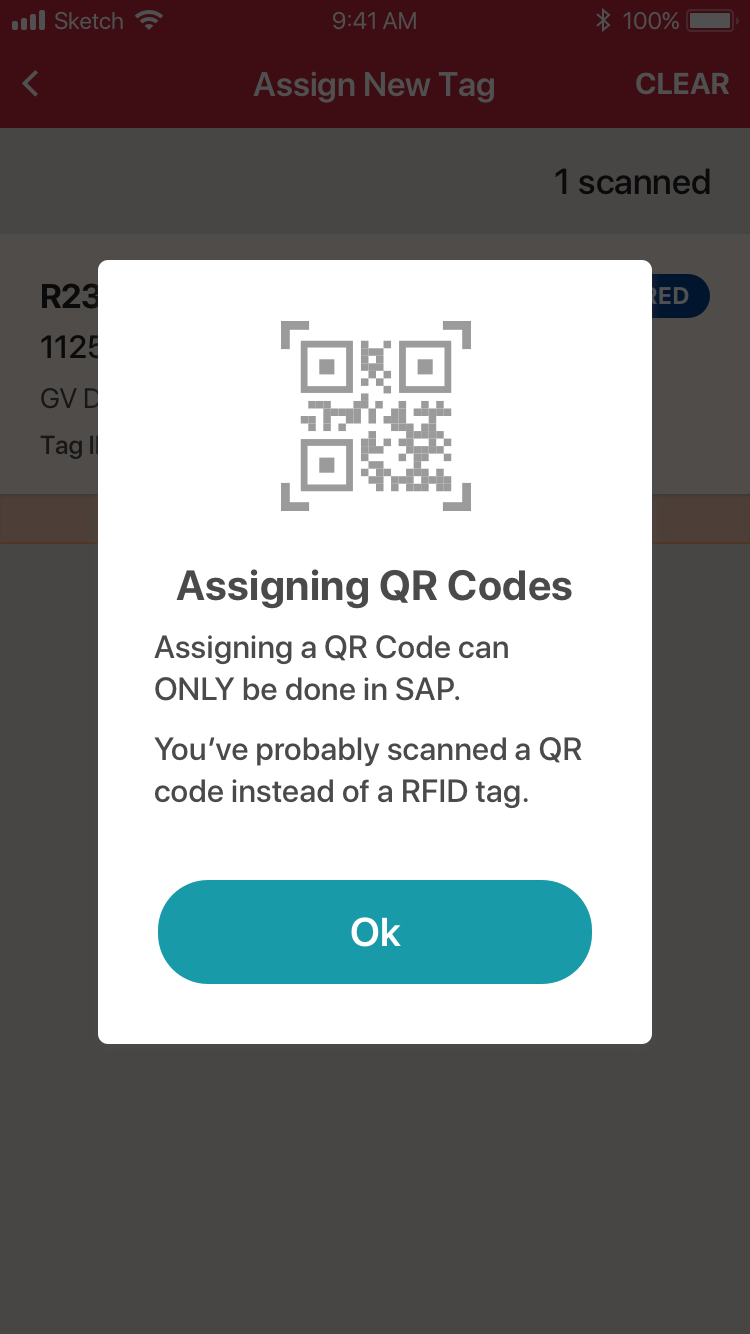
Incontext Help Dialog - QR Codes
Initial Setup - Overview
Outcomes
Delivered the initial 1.0 release on-time! One of the 1st Schlumberger business systems that was built around a mobile platform that integrated with SAP.
Positive word-of-mouth from user-base During the pilot, other plants that were still using the old system, were anxious to get their hands on it based on what they heard from colleagues. Alot of buzz was generated within the client’s organization, since we were able to deliver a system sooner than others, it was adopted fast and it made the job of operators easy.
Improved operator efficiency through automation We introduced several features that automated tasks for users: Successive Next Actions, Auto-Tag Refresh, Auto-syncs, Auto Old Tag Obsoleting,
Increased transaction speed through process digitization Transaction Log w/ Tag listing replaced paper version with manual handoffs.
Increased System Uptime through Seemless Offline operation Allowed users to work where connectivity was patchy, while easily being able to sync up automatically when connectivity returned.
Reduced time-consuming SAP workflow errors Enforcing process & promoting proper behavior through error prevention.
Faster user-onboarding Used in-context help, wizards and stock iOS design patterns.
Adoption was immediate at 6 major plants (95% of the transaction volume), in spite of the old system still being available in parallel.
Users opted to use the new system!
LEARNINGS
Conduct More Whiteboarding Early in the Process This would have possibly uncovered information architecture issues much quicker than building out wireframes in Sketch.
Double-check Technical Feasibility Early & Often Technical feasibility was not in sync or keeping up with design, that resulted in designs that were not feasible. We had to reengineer things and descope features that addressed certain user needs, when we could have thoughtfully addressed those needs in feasible ways.
Account for Delays due to Rigid Backend Limitations Complex business systems that integrate with SAP tend to impose rigid limitations upon the UX and negotiating these with other teams can cause delays and issues, especially when you don’t have a SME for that system.
Spend enough time with users to Catch Patterns Activity in the field can vary tremendously, so staying for an adequate amount of time is essential to ensure you see all the patterns in behavior that can sometimes have cadences in excess of a few days. This enables you to capture the key scenarios the system would need to support.
Access to SMEs is Key While this is not the end-user, in absence of getting the end-user due to budget and time constraints, they can serve as your next best thing. Additionally, sometimes when you have such disparate job profiles, a SME can fast-track the user characterization with fairly good proto-personas that you can validate later.